
What color is best for a bedroom? This question is essential for anyone looking to enhance their sleep quality. The color of your bedroom can deeply influence your mood, relaxation, and ultimately your restfulness. In this article, I will explore how various colors can impact your sleep and which shades you might want to consider for your sanctuary.
From calming blues to warm neutrals, understanding color psychology can help you create a bedroom environment that promotes better sleep. You’ll learn about the most effective colors for creating a restful space, along with practical tips for incorporating them into your decor. Get ready to transform your bedroom into a calming retreat that encourages a peaceful night’s sleep!
TL;DR
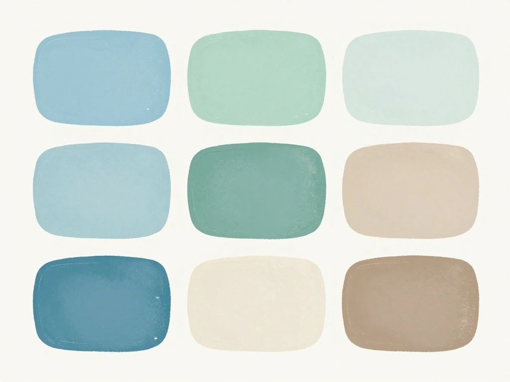
- Soft, muted tones like blues and greens are known to promote relaxation and tranquility.
- Warm neutrals create a cozy atmosphere but can be energizing if too bright.
- Dark colors can offer comfort, but may feel heavy if used excessively.
- Experimenting with accent colors can add personality while maintaining a calming ambiance.
Main Answer
Understanding Color Psychology
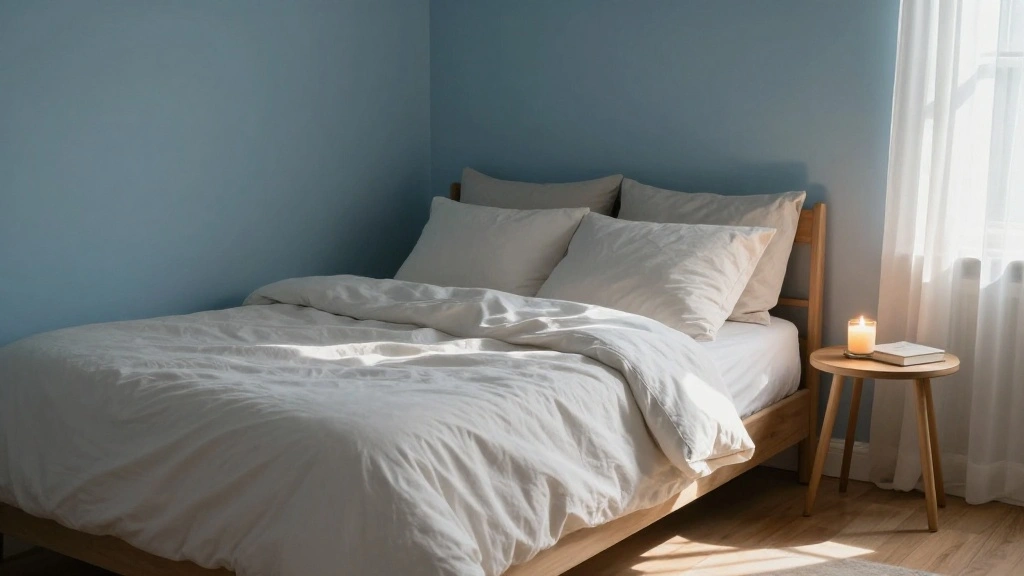
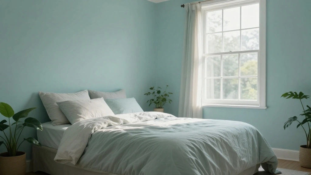
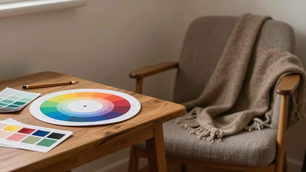
Color psychology plays a significant role in how we feel in a space. Colors can evoke emotions and influence our mental states. For example, blue is often associated with calmness and serenity, making it an excellent choice for a bedroom. It can help lower heart rates and promote relaxation, which is crucial for a good night’s sleep. Green, another calming hue, embodies nature and can create a refreshing and peaceful atmosphere.
On the other hand, red is a color of passion and energy, which may not be ideal for a sleep environment. Instead, consider using such vibrant colors as accents rather than the main wall color. This can add interest to your space without overwhelming your senses.
Choosing the Right Shades
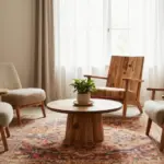
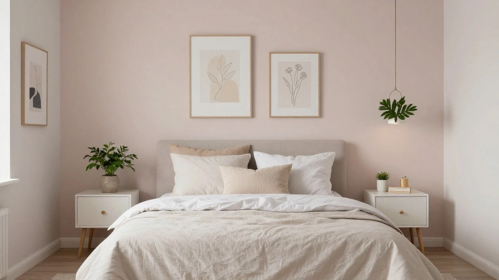
When picking shades for your bedroom, consider using soft pastels or earthy tones. These colors are generally soothing and can help create a relaxing environment. For instance, pale lavender or light taupe can evoke a sense of calmness and warmth. If you prefer a more dramatic look, deep navy or charcoal can create a cozy cocoon-like effect. Just be mindful of the balance between light and dark to avoid feeling trapped in a heavy space.
Lighting also plays a crucial role. The same color can look vastly different depending on whether it’s in natural light or artificial light. Experiment with paint samples in different lighting conditions to find the perfect shade for your bedroom.
- Key Takeaways:
- Color impacts mood and sleep quality.
- Blues and greens are calming; reds and bright colors may energize.
- Soft pastels and earthy tones create a relaxing atmosphere.
How to Choose the Best Color for Your Bedroom
I focus on light, room size, your style, and the colors of furniture when I pick bedroom paint. These four practical factors guide which hues feel calm, cozy, or bright in your space.
Assessing Room Size and Lighting
I check the room dimensions and count windows first. Small rooms benefit from light colors like soft pastels or warm whites because they reflect light and feel more open.
For larger rooms, I consider deeper colors such as slate blue or warm taupe to add coziness. Natural light changes how paint looks through the day, so I look at the room in morning and evening light before choosing.
I also test paint swatches on different walls and view them at different times. A swatch on the wall shows how color shifts with shadows, lamps, and sunlight.
Considering Personal Style
I think about how I want the room to feel: restful, romantic, or energizing. If I want calm, I pick muted blues, greens, or soft grays. For a more dramatic or modern look, I choose deeper jewel tones or a moody charcoal.
I keep my daily habits in mind. If I like to read in bed, I pick colors that reduce glare and make warm lighting look good. If I change decor often, I choose a neutral base and add color with bedding and art.
I write down three adjectives that describe the vibe I want. That list helps me narrow color families and avoid choices that clash with my style.
Coordinating With Furniture and Decor
I take photos of my furniture and lay them next to paint samples. Wood tones, metal finishes, and large upholstery pieces set the palette I must match or contrast with.
I use a simple rule: pick one dominant color for walls, one accent color for trims or a feature wall, and one neutral to tie pieces together. For example, warm wood and beige sofa pair well with olive walls and cream trim.
I also think about textiles and patterns. Rugs and curtains influence whether a color feels warm or cool. I test swatches together in the room to make sure everything looks balanced under my room’s lighting.
Related Questions
What colors should I avoid in my bedroom?
It’s best to steer clear of bright, bold colors like electric blue or vibrant red in your bedroom. These shades can be stimulating rather than calming, which is not conducive to a restful environment. Instead, opt for softer, muted tones that encourage relaxation and peace.
How does lighting affect color perception in a bedroom?
Lighting plays a crucial role in how colors appear in your bedroom. Natural light can make colors look brighter and more vibrant, while artificial light can soften them. It’s essential to test your chosen paint colors at different times of the day to see how they interact with the light in your space.
Can I mix colors in my bedroom?
Absolutely! Mixing colors can add depth and personality to your bedroom. Consider using one primary color for the walls and then incorporating complementary colors in your bedding, artwork, or accessories. Just be sure to keep the palette cohesive to maintain a calming atmosphere.
What is the best accent color for a calming bedroom?
Soft neutrals, like beige or light gray, often work well as accent colors in a calming bedroom. They can complement primary colors without overwhelming the space. You could also consider muted tones of blue or green as accents to maintain a tranquil vibe.
How often should I repaint my bedroom?
It’s typically recommended to repaint your bedroom every 5 to 7 years, but this can vary based on wear and tear or if you want a change in ambiance. If you feel your current color no longer promotes relaxation, it might be time for a fresh coat!
Conclusion
Choosing the right color for your bedroom is more than just a design choice; it’s a step towards enhancing your sleep and well-being. Soft, calming colors like blue and green can help create a peaceful sanctuary, while darker hues can provide comfort when used thoughtfully. Remember to consider the impact of lighting, and don’t hesitate to mix colors to find the perfect balance for your space.
I encourage you to take the time to select colors that resonate with you personally. Your bedroom should be a place where you feel relaxed and ready to unwind. So, go ahead and transform your space into the calming retreat you deserve!