
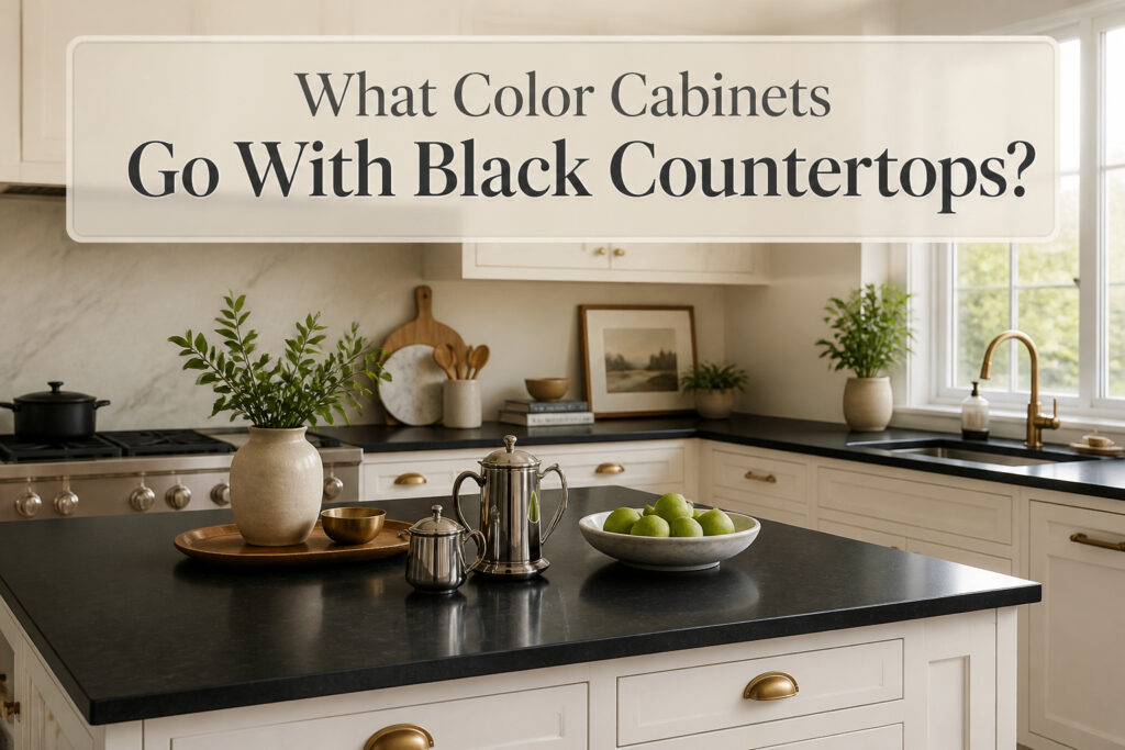

White cabinets are the first pairing every kitchen designer tries with black countertops, and they usually stick with it, but only if you can live with the upkeep. Both surfaces show every mark: white paint broadcasts scuffs and fingerprints, while black counters spotlight every crumb and water spot. A warm white like Sherwin Williams Alabaster keeps the room from feeling clinical, and the combo works across nearly every kitchen style going.
White Cabinets
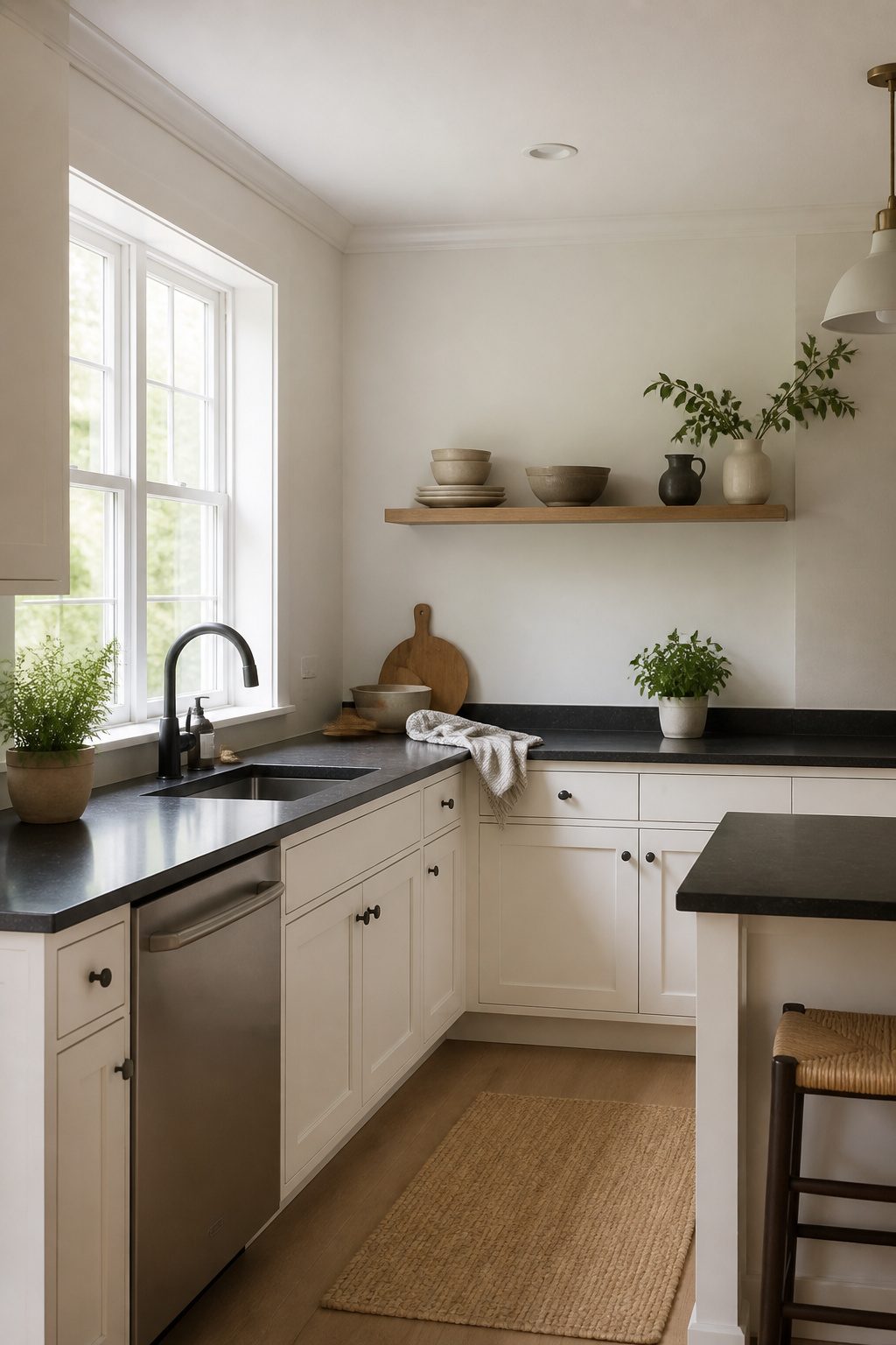
Black countertops against white cabinets is the pairing every kitchen designer reaches for first, and for good reason. The contrast reads instantly clean and gives even a cramped galley kitchen a shot of breathing room. Light cabinets bounce daylight around while the dark counter anchors the whole room, so the space feels grounded rather than floating.
Not all whites behave the same way, though. A warm white like Sherwin Williams Alabaster or White Dove softens the sharpness and keeps the kitchen from feeling like a clinic. Cooler, starker whites work if you are aiming modern, but skip anything with a blue undertone unless the rest of your finishes already read contemporary. Softer shades such as Benjamin Moore Seapearl or a straight cream give you that same brightness without the chill.
The downside is the one you already suspect. White cabinets show every fingerprint, every splatter, every scuff from the vacuum hose. Black counters hide nothing either: dust, water spots, crumbs all telegraph against the dark surface. You are signing up to wipe both surfaces more often than you would with a mid-tone pairing. For some cooks that rhythm becomes automatic; for others it becomes the thing they resent by month three.
Style-wise, this combo travels almost anywhere. Traditional kitchens, farmhouse spaces, coastal looks, and sleek contemporary rooms all handle it without strain. The real question is whether your tolerance for maintenance matches the visual payoff.

CABINET TRANSFORMATION: Refresh outdated cabinets, vanities, furniture and trim with rich Pure White color and a smooth semi-gloss finish

Warm Cream Elegance: Antique White offers a warm, light cream shade reminiscent of ancient Egyptian Ivory, perfect for both classic and contemporary settings.

ALL-IN-ONE PAINT KIT - CIONIA all match paint kit includes essential painting tools and combines paint + primer in one water-based formula, helping you complete DIY furniture and home painting projects faster and easier with minimal preparation.
Gray Cabinets
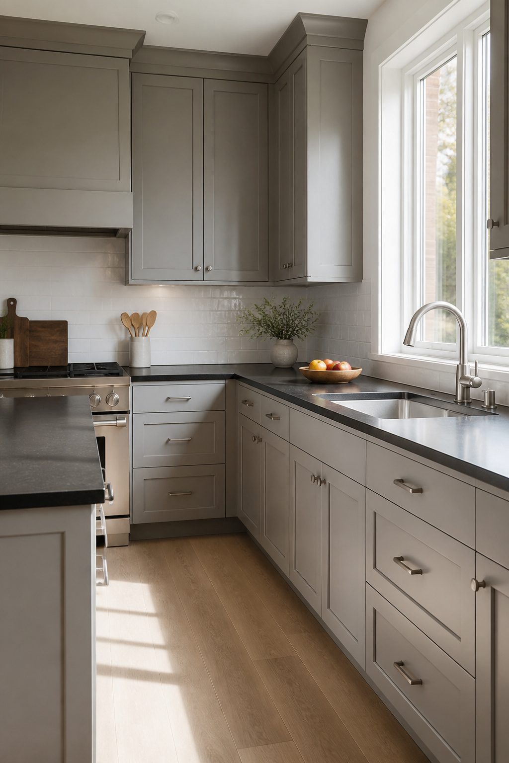
Gray cabinets hit a middle note that white can’t quite reach with black countertops. Light gray keeps the kitchen airy without the glare of an all-white room, while charcoal adds depth that doesn’t close in the way true black cabinets would. The trick is reading the undertone. Warm grays, the kind that lean taupe, soften a space with big windows and lots of natural light. Cool grays, especially a muted blue-gray, read more contemporary and pair cleanly with stainless steel appliances.
Stone gray in particular bridges that gap between white walls and black countertops without the harsh contrast. In a smaller kitchen, I’d stick to the lighter end and add a white or cream backsplash to bounce light around. Darker shades work, but only where you’ve got overhead or under-cabinet lighting to keep things from feeling heavy. For a modern or urban kitchen, this is the pairing I’d point to first: neutral enough to last, current enough to feel intentional.

Dimension: Bar width: 9/16 inch(14.5mm); Overall length: 5-25/32 inch (147mm); Projection: 31/32 inch (24.6mm); Hole centers: 5 inch(128mm). Measure the distance between the centers of the two installation holes, not edges of the holes

Quality Wood: The ready to assemble cabinet features 36 W x 24 D x 34.5 H (inch) cabinet size and 44 lbs load capacity. The main structure is crafted from high-quality particle board, while the drawer is made of MDF, ensuring long-lasting durability. All exposed panels are protected by corner protectors and carefully packaged to protect the surface from scratches

STURDY AND DURABLE: The buffet sideboard is constructed using high-quality materials, including sturdy honeycomb panels and MDF board. The combination of these materials creates a durable and stable structure that is built to last.
Wood Tone Cabinets
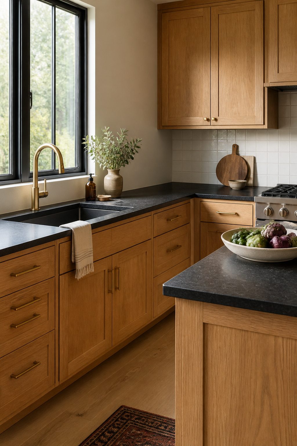
Wood tones soften black countertops in a way paint rarely manages. Light oak brightens the room without fighting the counter’s weight, while walnut or maple deepen the palette without tipping into gloom. The grain itself matters: a pronounced, open grain reads rustic and casual, a tighter grain feels cleaner and more modern.
Stained wood saves labor if you are refinishing existing cabinets rather than starting fresh. The black counter does the visual heavy lifting, so the wood can stay quiet and natural.
Caporaso prefers to avoid orange or yellow-toned woods. "This can become less appealing over time."
That bias toward cooler, earthier stains holds up well in farmhouse kitchens and beyond. Pick a tone you will still want to live with in five years, since stained cabinets are harder to repaint than you might expect. Good lighting, natural or otherwise, keeps the wood from disappearing against the black and lets the texture show through.

【Premium/Upgrade Material】Our vanity tray have an upright 90°edge, which fits perfectly in the corner or counter edge. After research, we increased the overall thickness of the bathroom vanity tray by 40%, improving the stability of the tray for bathroom countertop.Silicone trays are waterproof, do not discolor or peel, are heat resistant, reusable. Toilet tank tray is easy to clean and store and can be brushed or dishwasher cleaned.

Super Bright - The super bright LEDs gives out good enough brightness for your lighting applications, expecially for kitchen under lighting that has not enough natural light

Adjustable Lighting Options: These under counter lights for kitchen feature 3 adjustable color temperatures (2700K, 3000K, 4000K) and 2 brightness levels, creating the perfect level of ambiance.
Black Cabinets
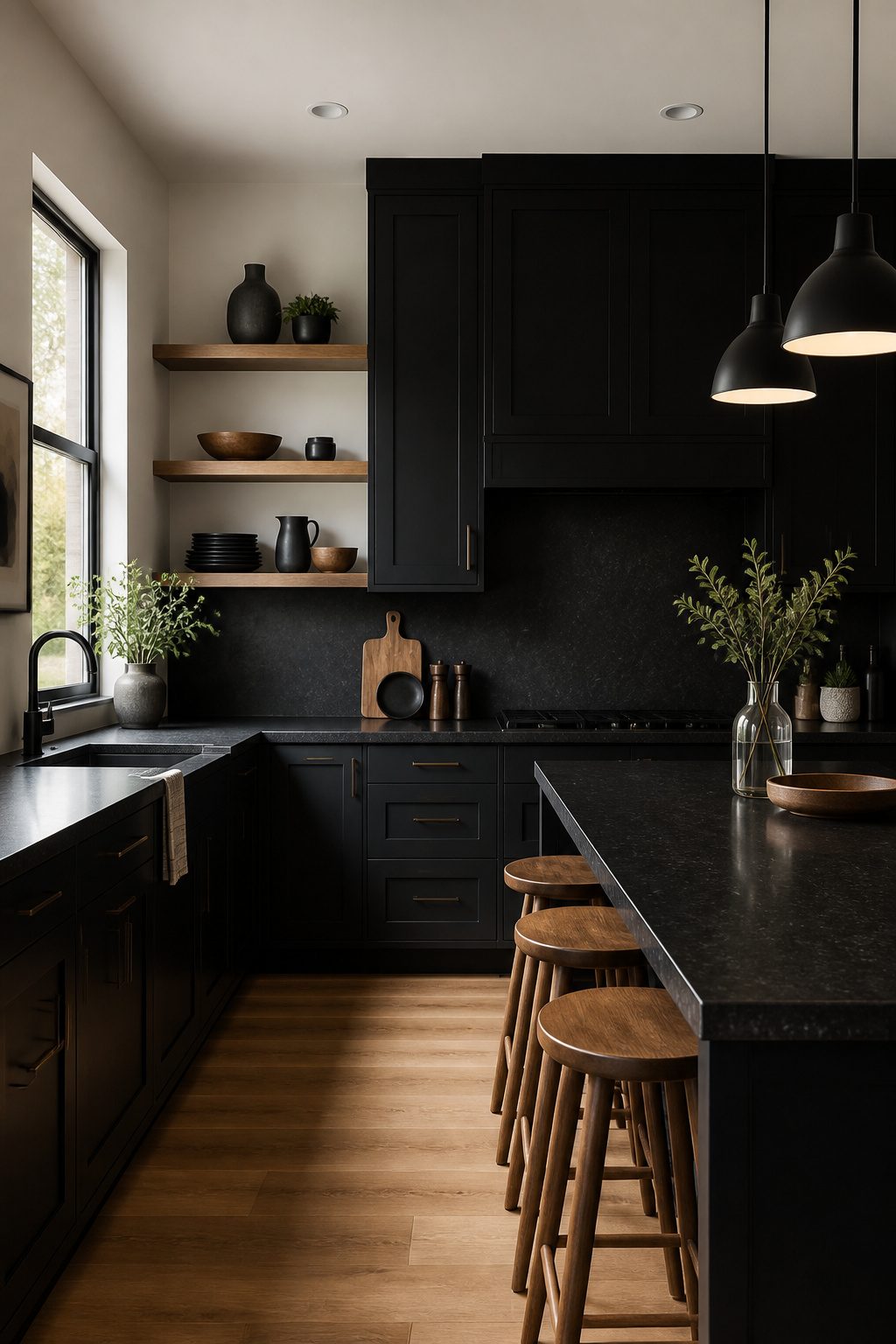
Black cabinets with black countertops deliver the sleekest, most minimal look on the list, but the room has to earn it. The pairing only works in spaces that already get plenty of natural light or where you are willing to add serious fixtures; overhead pendants and under-cabinet strips are not optional here, they are what keeps the kitchen from feeling like a cave. I have seen this combination read as intentionally dramatic in a bright, open plan and unintentionally oppressive in a galley with one small window, and the difference was almost entirely the lighting budget.
Texture breaks up the flatness when the light is right. A countertop with subtle patterning, something like a speckled or softly veined surface, adds depth that plain black-on-black flattens out. Light walls and floors help too, and so do wood tones or metallic accents if you want to soften the edges without abandoning the monochrome idea. Black appliances, a black sink, and black hardware keep the scheme cohesive, though I would paint any window trim black as well rather than leaving it white, which can look like an afterthought against this much darkness.
The look is bold, editorial, and not forgiving of shortcuts. If your kitchen lacks windows and you are not running new wiring for fixtures, this is the one option to skip.

PACKAGE CONCENTS--24" X 394"/Roll(In other words,1.97’x 32.8’/Roll ), it covers 64.6 sq.ft per roll.Comes with a plastic scraper ,Installation instruction and LIFETIME WARRANTY .

Modern Form, Lasting Appeal: Clean lines and balanced simplicity define this BARNET Collection baker's rack, combining a steel frame with rustic panels to create visual depth and pair easily with matching storage units for a cohesive, modern interior

Enjoy the Kitchen Time: The size of this kitchen island with storage is 18.9"D x 35.4"W, which provides you with extra space for preparing meals or dining. The kitchen island are neatly placed on the island to save kitchen space. The side enclosure can well prevent the pots, kettles from falling down
Navy Blue Cabinets
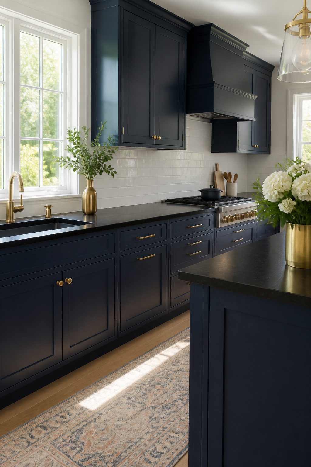
Navy blue gives black countertops something brighter blues can’t: depth without drama. Where a cobalt or royal blue fights the countertop for attention, navy sinks back just enough to let the stone read as the anchor. The undertone matters. A deep inky navy, something like Sherwin Williams Navy Masterpiece, reads almost as a dark neutral until the light hits it and the color wakes up. Farrow & Ball’s De Nimes does the same trick, rich but never loud.
The pairing works across eras. In a traditional kitchen, navy cabinets with black granite feel like a clubby library translated to morning coffee. In something cleaner and more modern, the same combination turns sleek, especially if you push the hardware toward brass or gold. That warmth keeps the two dark surfaces from flattening into one blob.
Light is the variable you can’t ignore. A kitchen with good windows can handle navy lower cabinets or a full wall of them. In a darker room, I’d limit navy to an island or base cabinets and keep uppers white or a pale natural wood. Brass hardware against navy and black is the move that pulls it together, softening the edge without adding clutter. Skip chrome or brushed nickel here; the cool metals make the whole thing feel like a showroom floor.

Durable finish and easy to maintain. Upgraded brackets. Construction hurricane grade brackets. Heavy Duty hydraulic soft closing hinges. Completely finished panels, including...
Green Cabinets
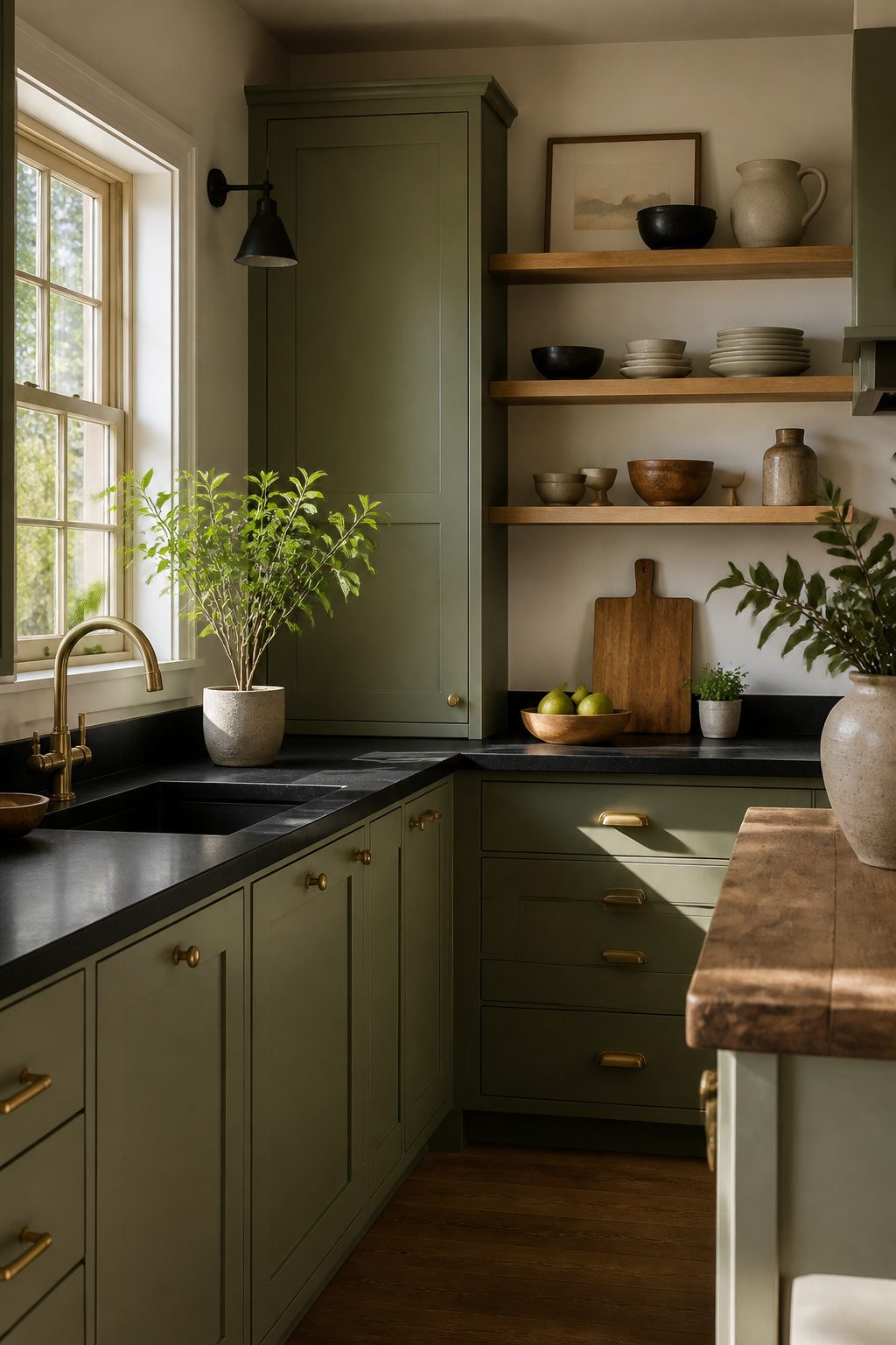
Green cabinets bring an earthy, grounded feel that works surprisingly well with black countertops, whether you are leaning rustic or modern. The trick is choosing the right shade. Sage green keeps things light and airy, almost like bringing a bit of the outdoors in without overpowering the room. Forest green, on the other hand, goes deep and moody; paired with matte black finishes, it adds character without feeling like a design stunt.
I have noticed green gaining traction lately, and it makes sense. Paint colors like Sherwin-Williams Pewter Green or Ripe Olive, and Benjamin Moore Tate Olive, all tap into that same desire for calm, nature-connected spaces. They also play beautifully with the natural stone connection: black granite or veined quartz reads as organic material, and green cabinetry echoes that rather than fighting it.
If you are worried about darker greens blending into the countertop, brass hardware breaks the line just enough. Wood accents help too, warming up the whole palette so the kitchen feels finished, not flat.
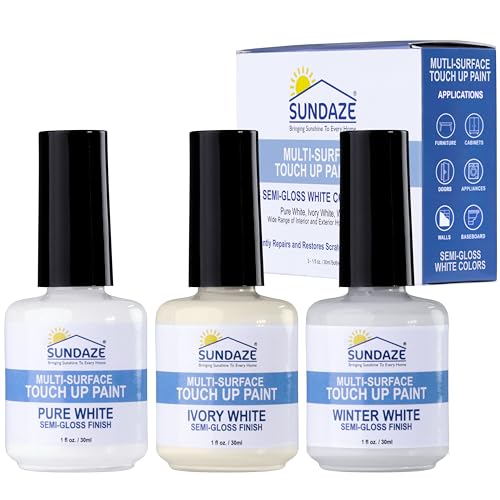
Instant Color Matching (3-Color Shades Kit): This Sundaze 3-pack touch-up paint kit includes 1 fluid ounce bottles of Semi-Gloss White paint in color shades: Pure White, Ivory White, and Winter White. Premium paint formulated for use alone or mixed to achieve a perfect, seamless color match on almost any surface. Instantly eliminate color-chart guesswork and perfectly repair scratches, chips, and stains.

Use for a variety of indoor and outdoor project surfaces including wood, metal, plaster, masonry or unglazed ceramic

Easy Application: The innovative bottle design features a built-in precision brush, eliminating the need for extra tools. The fine brush allows for accurate and detailed repair of small blemishes and scratches, making the touch-up process effortless and worry-free. Suitable for both beginners and experienced DIY enthusiasts.
Beige and Cream Cabinets
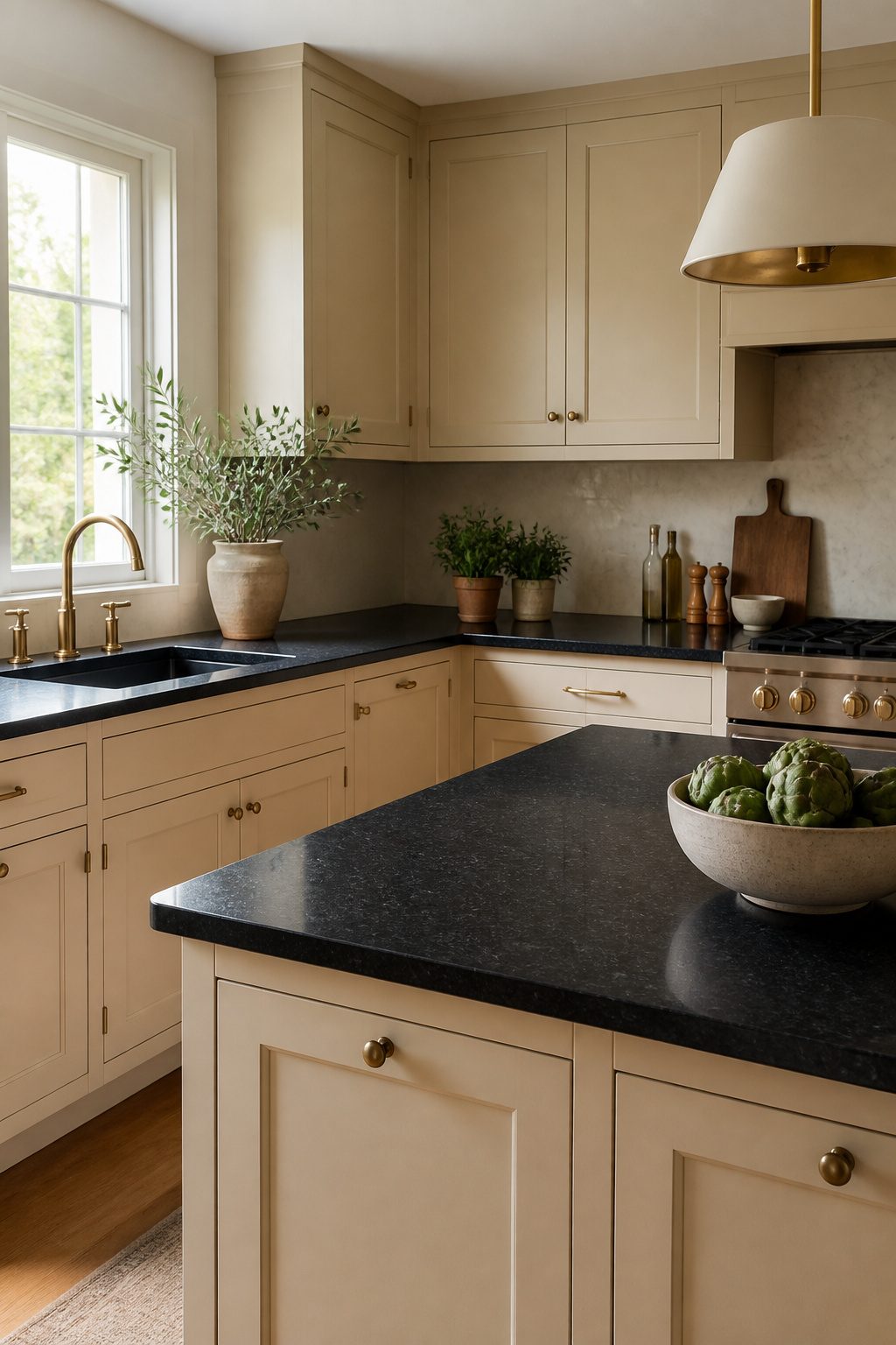
Beige and cream cabinets soften the edge that comes with black countertops in a way white simply doesn’t. Where white pushes contrast, these warm neutrals absorb it, letting the kitchen feel bright without feeling sterile.
The difference matters more than you’d think. White reflects light straight back; beige bends it, so the room glows instead of glaring. Cream especially pairs well with brass hardware and soft lighting, which keeps the space from reading as a showroom.
There’s a risk here, though. Beige and cream carry strong 90s associations, and the wrong shade, too yellow, too muddy, or matched with dated finishes, can slide into that territory fast. The revival works when the tone stays clean and the surrounding materials feel current: matte black fixtures, simple cabinet profiles, maybe a wood accent or two.
For paint, Sherwin-Williams Accessible Beige and Benjamin Moore Revere Pewter both hit that modern-warm balance. Stone Hearth or Pashmina work if you want something with more weight. The rule is to keep the undertone consistent with your flooring so nothing fights.
The 90s look creeps in through yellowed beige and ornate hardware, not the color itself. Pick the right shade and pair it simply, and you get a kitchen that feels lived-in, not leftover.

365-Day Evaluation: We believe you'll value these cabinet pulls. Use them for a full year, and if they don't meet your needs, we're here to assist

[Maximize Your Storage Space] Our large wall cabinet feature 2 shaker-style doors and genuine metal hardware in matte black handles, it could storage more ample space
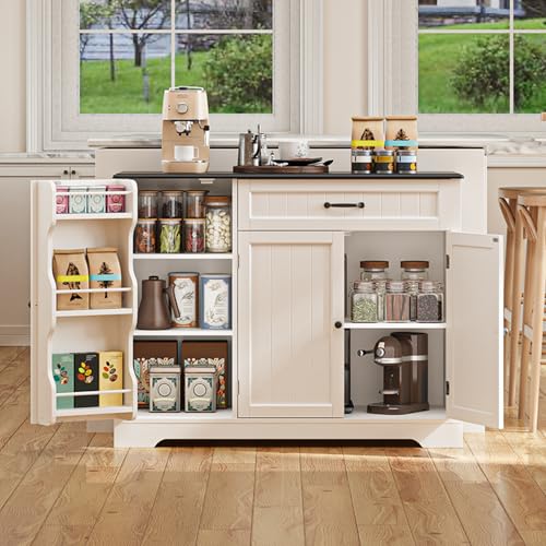
Assembly Takes Time, But It's Worth It: Gizoon coffee bar cabinet might take some time due to the many parts involved. However, don’t worry! We provide clear, step-by-step assembly instructions complete with pictures and a total of 35 labeled pieces to make the process easier. We promise that once you’re done, you’ll be thrilled with the results!
Two-Tone Cabinets
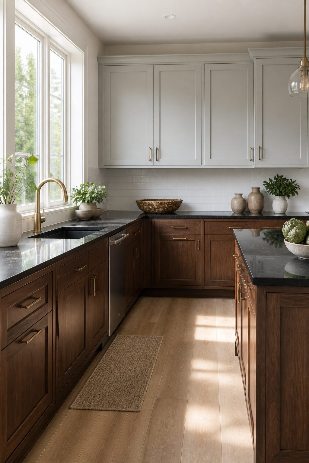
Two-tone cabinets keep a kitchen with black countertops from feeling too heavy or too stark. The usual move is lighter up top and darker below: white or gray uppers draw the eye upward and keep the room open, while black or wood bases ground the space and hide the daily wear that collects near the floor.
White upper cabinets with wood lowers are the combination I see most often in farmhouse and transitional kitchens. The white brightens, the wood adds texture, and together they balance the visual weight of black countertops without competing for attention. Gray uppers with black lowers work better for a contemporary look; the contrast stays softer than white against black, and the lower cabinets read as an extension of the countertop itself.
Proportion matters. Most successful layouts run the lighter color on roughly the upper third of the wall and the darker tone below, keeping the darker mass where it naturally belongs. The island is another place to drop a darker accent if the perimeter stays light all around; it defines the work zone without breaking up the cabinetry line. Backsplashes and lighting get more room to show off when the uppers stay quiet, and the black countertops stop feeling like a dark band across the room.

Ultra-slim, linkable design provides maximum illumination at a minimum footprint

<b>PRODUCT SPECIFICATIONS:</b> Color: Bronze and Black;Hole Center: 3"; Length: 4", Height: 0.43"; Width: 1.34". Package includes selected 2 x handles, 4 x 1" screws, 4 x 1.77" screws.

Timeless Modern Farmhouse Design: Elevate your kitchen with a refined aesthetic that blends rustic charm and contemporary elegance. Featuring a crisp white finish, warm wood accents, distinctive X-grain barn doors, and minimalist black metal handles, this pantry serves as a striking yet inviting focal point that complements a variety of home décors
Lighting Makes or Breaks the Pairing
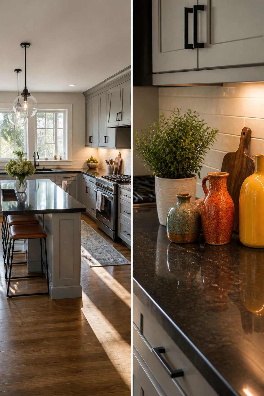
The same cabinet color can read as rich or muddy depending on what hits it. Morning sun from an east window pulls warm undertones forward and makes darker cabinets feel intentional rather than heavy. A north-facing wall does the opposite; what looked charcoal in the store turns flat against black granite by noon.
Bulb temperature matters as much as window placement. 2700K bulbs throw yellow that fights cool cabinet grays, while 4000K tends to read sterile against warm wood tones. I lean toward 3000K in kitchens with black countertops; it keeps the contrast crisp without turning the room into a showroom.
Your real test is spending twenty minutes in the space at three different hours. Tape a paint swatch to the wall, pour coffee, and watch how it shifts. What holds steady from 7 a.m. to 7 p.m. is your winner; the sample that looks perfect at 10 a.m. and disappears by dusk is a pass.
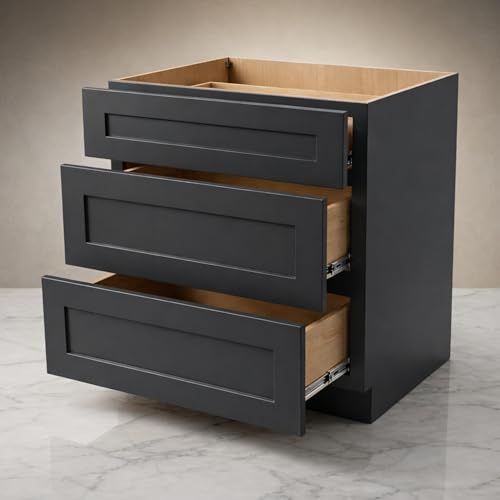
MAXIMUM KITCHEN STORAGE: This 30" kitchen base cabinet features three spacious drawers providing extensive kitchen storage space for pots, pans, kitchen utensils, and cooking essentials. Perfect for kitchen organization and maximizing kitchen counter space efficiency.

Elegant Printed Charcoal Black White Floral Rug: This accent rug features a stylish floral pattern in blended charcoal, gray, navy and white tones for a softer, more nuanced look. Slight color variations may occur due to lighting, screen settings, and room environment

Large Capacity Storage Rack: This kitchen bakers rack measures 22.4"L x 13.8"W x 51.9"H with 4 storage shelves for various daily necessities. The 6 S-shaped hooks are an ideal choice for storing little things, greatly improving the tidiness of the space
Countertop Material Matters
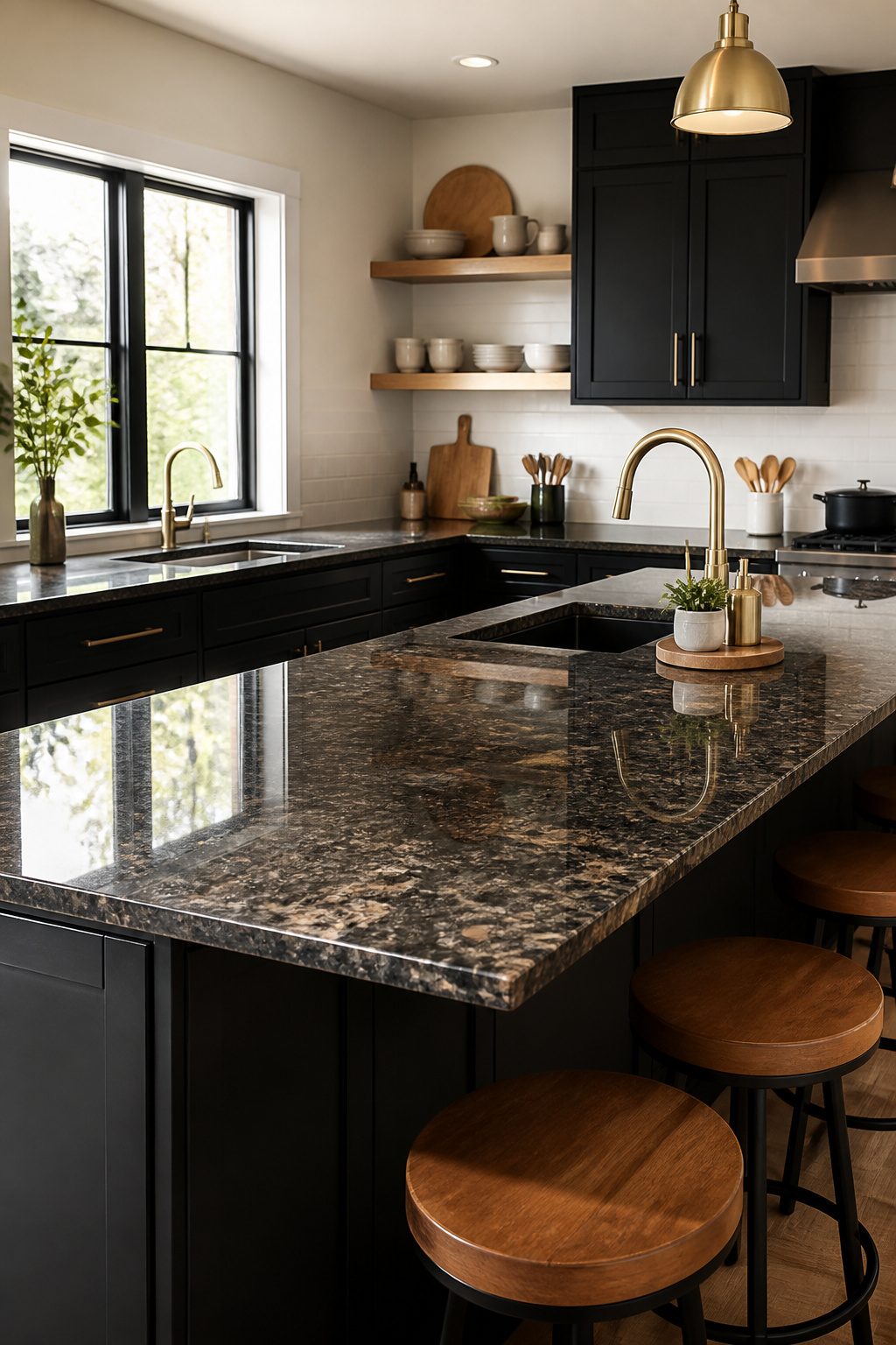
Not all black countertops read the same way under your kitchen lights, and that changes which cabinet colors actually work.
Polished granite throws light around the room, so the surface looks almost mirror-like and pushes back against whatever cabinets sit below it. That reflectivity can make dark cabinets feel heavier than you wanted, or it can give light cabinets a crisp, high-contrast edge that reads modern. Honed or leathered granite does the opposite: it absorbs light and softens the whole effect, which is why I tend to steer weekend renovators toward those finishes when they want warmer wood tones or cream cabinets to feel relaxed rather than stark.
Quartz sits in the middle. It is consistent, almost glass-smooth, and reads cooler than most granites. With quartz, the cabinet color you pick needs to do almost all the tonal work, because the countertop itself is not bringing much warmth or variation to the party.
Marble, even black marble, carries veining that picks up light differently across the slab. Those veins can read warm or cool depending on the batch, so the cabinet color that looked perfect on the sample board might shift once the full piece is in. If you are choosing between a warm gray cabinet and a cool one, hold the swatch against the actual slab, not a photo.
The finish matters as much as the stone itself. Polished surfaces reflect; honed surfaces swallow. Match the cabinet mood to that behavior, not just the color on the chip.
Mistakes That Flatten the Room
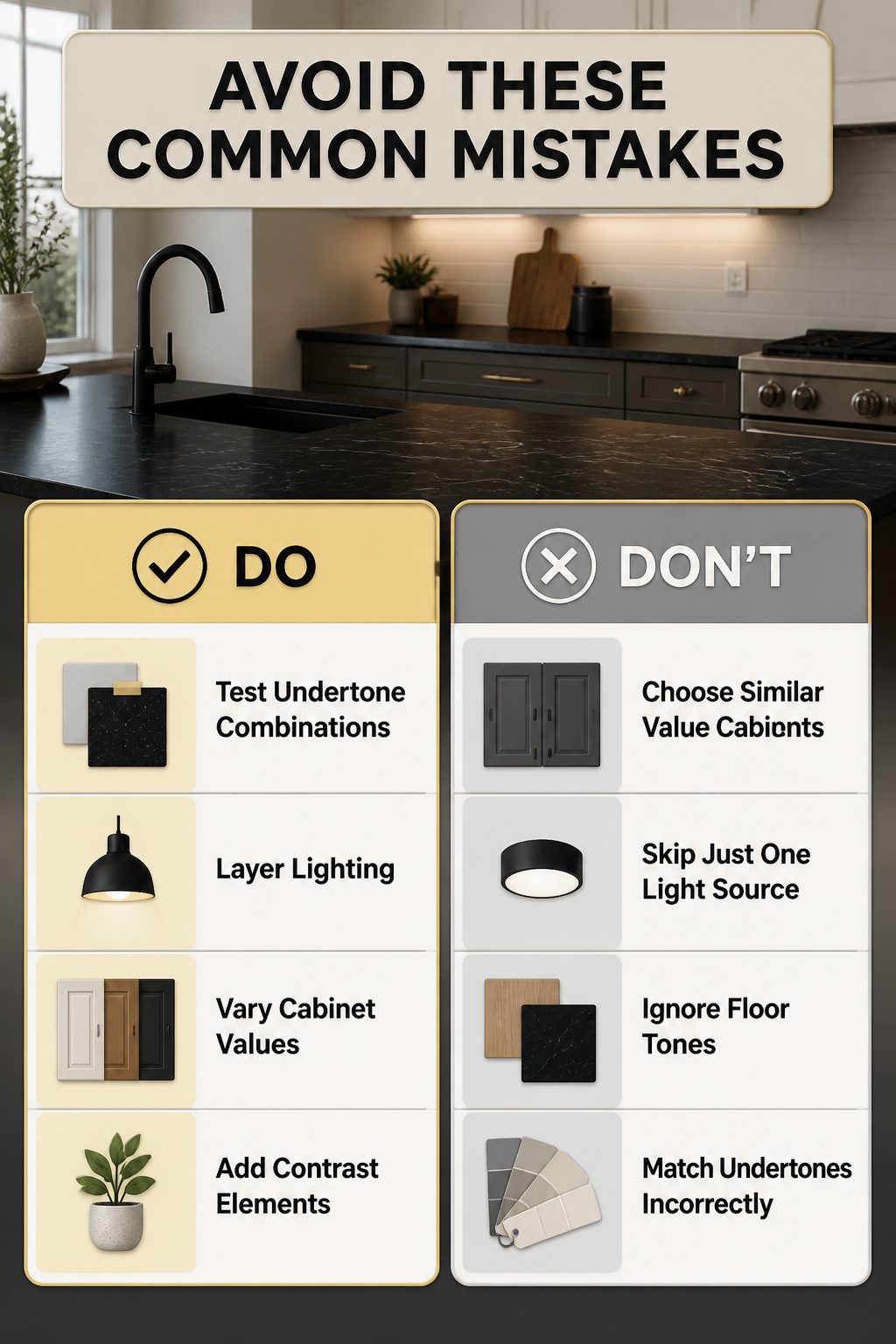
Black countertops already pull a lot of visual weight, so the mistakes that flatten a room usually come from playing it too safe. The biggest one is matching undertones incorrectly: a cool cabinet gray against a warm black granite reads off even when each swatch looks fine on its own. The fix is simple, and I learned to stop trusting my memory for this: tape samples together and look at them at 10 a.m., at 4 p.m., and under the actual kitchen bulbs. If the pair goes muddy in one of those lights, it will go muddy every day.
Cabinets too close in value to the countertops kill depth just as fast. A charcoal cabinet against a near-black counter turns the whole wall into a single dark stripe with no place for the eye to rest. The same flattening happens when you ignore the floor: a medium wood cabinet, black counter, and medium wood floor stack into one uninterrupted band of similar tone. You need at least one element to step lighter or deeper so the layers read as separate planes.
Lighting is where I see renters give up too early. Black surfaces absorb light instead of bouncing it back, so a single overhead fixture leaves the counters looking like holes in the room. Layered light, overhead plus task plus accent, is what keeps the black from swallowing the space. Without it, even the best color pairing goes flat.
Style Compatibility
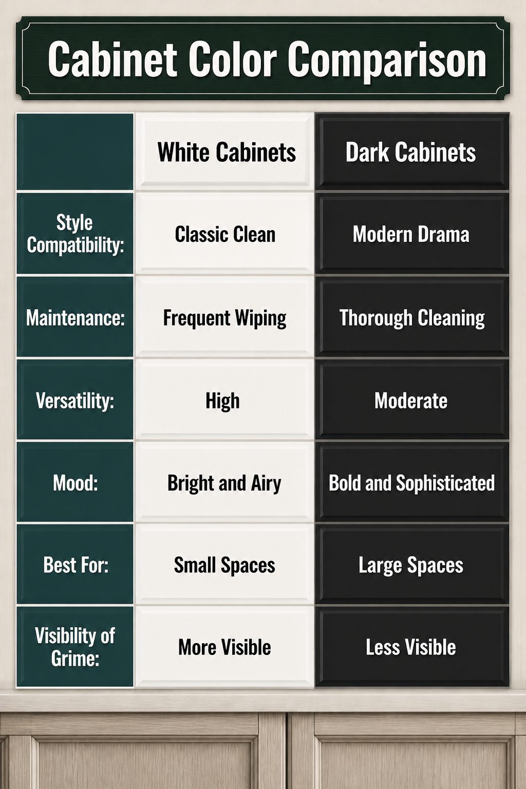
Black countertops sit at the center of more kitchen styles than you’d think, so the cabinet color you choose needs to push in a deliberate direction rather than drift. White cabinets against black granite read as classic and clean, a pairing that works across traditional, contemporary, farmhouse, and coastal looks without fighting any of them. That versatility is useful if you rent or plan to sell, though it can also feel safe to the point of bland if every other kitchen on your block chose the same route.
Darker cabinets amp up the drama and lean contemporary or modern, while gray splits the difference for something more current without going fully stark. Oak brings a timeless, almost nostalgic weight that suits traditional spaces or anything aiming for warmth. The real move is picking one lane and committing enough that the choice looks intentional: a farmhouse kitchen with cream cabinets and black counters wants natural wood accents and matte hardware, not glossy pulls that belong downtown. Push the style through the details, and the cabinets stop looking like a default answer.
Maintenance Reality
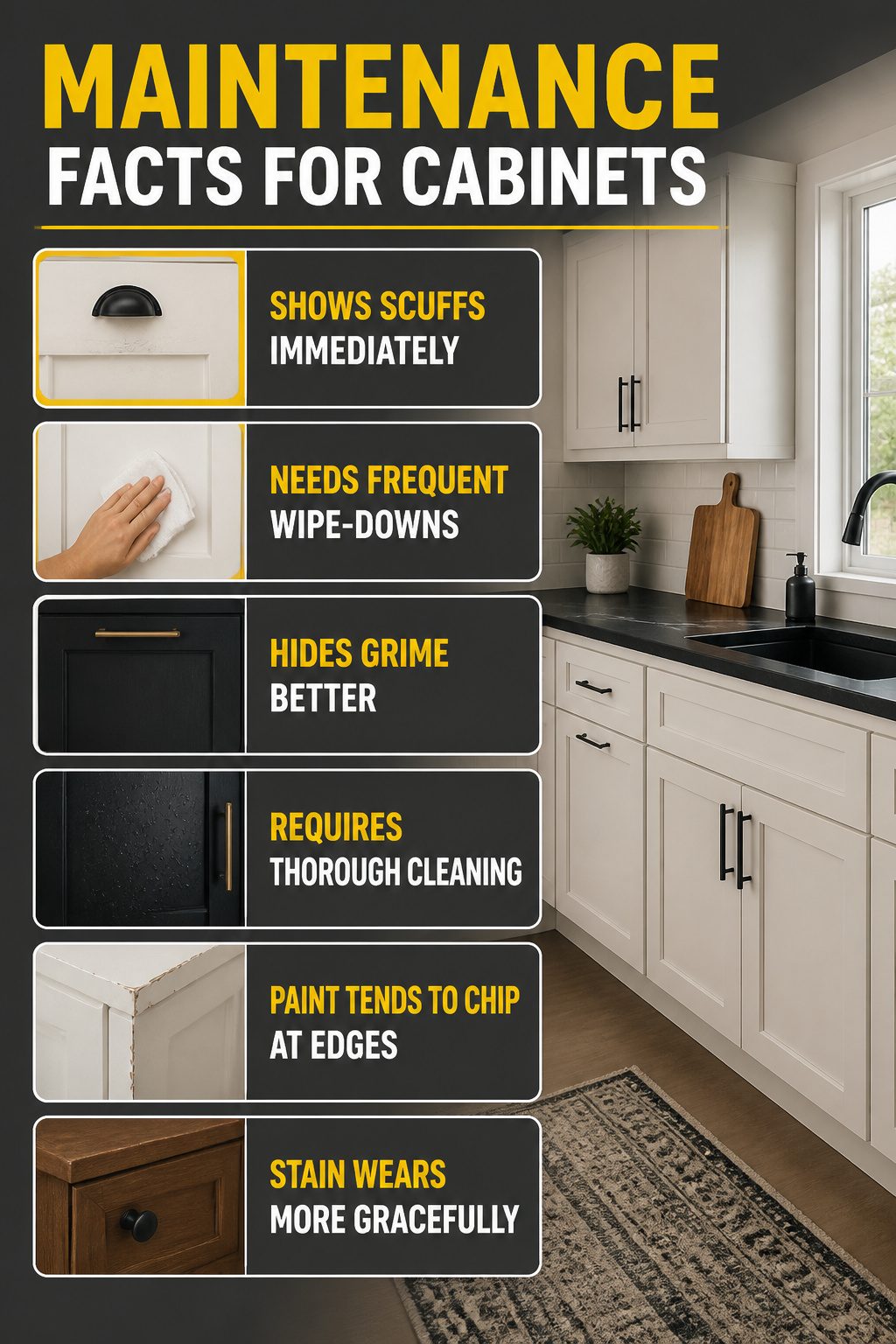
Lighter cabinets with black countertops look crisp, but they will show every scuff and splash the moment it happens. White paint in particular makes staining and discoloration immediately visible, which means wiping down the fronts more often than you might expect. If you cook daily and do not want upkeep to become a part-time job, that contrast comes with a real time cost.
Darker cabinets hide daily grime better, yet they bring their own maintenance load. Fingerprints, grease film, and water spots stand out on deep tones, so you are trading one visible problem for another. The finish matters more than the color here. Paint tends to chip at edges and corners where hands pull doors open all day; stain soaks into the wood and wears more gracefully, though it will still darken unevenly near the stove and sink over time.
For busy cooks, the practical split is this: lighter cabinets demand quick, frequent wipe-downs, while darker ones need fewer but more thorough cleanings to keep their depth from looking dull. Neither choice is maintenance-free. The question is which kind of upkeep fits your actual routine, not the one you imagine having on move-in weekend.
Frequently Asked Questions
What cabinet color is safest for resale with black countertops?
White, beige, or soft gray are the safest bets for resale because they appeal to the widest range of buyers. These neutrals age well and let the black countertop stay the focal point. The article notes that white in particular reads classic and clean across traditional, contemporary, farmhouse, and coastal kitchens.
Do black countertops make kitchens look smaller?
Not if you balance them with lighter cabinets and good lighting. The article emphasizes that black counters anchor the room while light cabinets, especially white or pale gray, bounce daylight around and keep the space open. North-facing rooms or galley layouts need extra task and accent lighting to prevent the counters from reading as dark holes.
Are black countertops hard to maintain?
They show dust, water spots, and crumbs clearly against the dark surface, so daily wiping is part of the deal. The article points out that lighter cabinets add to the upkeep load: white fronts reveal every scuff and splatter too. If you cook often, expect the pairing to demand more attention than mid-tone alternatives.