
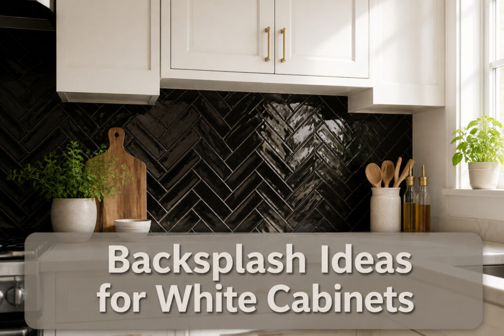

The right backsplash for white cabinets sits anywhere from a $200 weekend of subway tile to a Calacatta marble install that demands resealing every six months. What separates the two is not budget alone but how much maintenance you will actually follow through on. A glossy black subway tile grounds the room with almost no upkeep; Carrara asks for a calendar reminder and a tolerance for etching. Most first-home owners land in the middle, where standard white ceramic hits the sweet spot of bright, wipeable, and easy to live with long-term.
1. White Subway Tile

White subway tile is the answer you’ll see first in almost every search for what backsplash goes with white cabinets, and there’s a reason it has stayed at the top for decades. The 2-by-8 or 3-by-6 rectangles in a running bond pattern give you clean lines that read as classic, not basic, and the slight tonal shift between a glossy tile and matte cabinet paint keeps the white-on-white look from going flat.
A weekend install is genuinely doable here. Ceramic and porcelain options run cheap at the big-box stores, the cuts are straight, and the pattern is forgiving if your walls aren’t perfectly square. If the all-white kitchen starts feeling sterile to you, the fix is small: swap in brass knobs, stack wood cutting boards on the counter, or switch out a red bowl for a green one when the seasons change. The tile stays; the accessories do the work.
Beveled subway or hand-glazed Zellige will cost more and take longer to source, but they add depth without abandoning the neutral palette. For most renters and first-home owners, though, standard glossy white subway tile hits the sweet spot of bright, easy to wipe down, and easy to live with long-term.

Easy DIY, Just Peel & stick, cut with tin snip, utility knives or hand saws, saving large amount on labor

Includes 15 Pieces per Case | 4.845 Square Ft. Per Case | Case Weight 13.95 lb |TILE SIZE: 12 in. W x 4 in. L x 0.39 in. T

𝐏𝐫𝐞𝐦𝐢𝐮𝐦 𝐏𝐞𝐫𝐟𝐨𝐫𝐦𝐚𝐧𝐜𝐞: Our peel and stick wall tiles are designed with high-performance PVC polymer material, offering waterproof, heat-resistant, stain-resistant, anti-scratch, and fadeless properties. Rest assured, the super-strong adhesive ensures the tiles stay securely in place!
2. Marble Backsplash
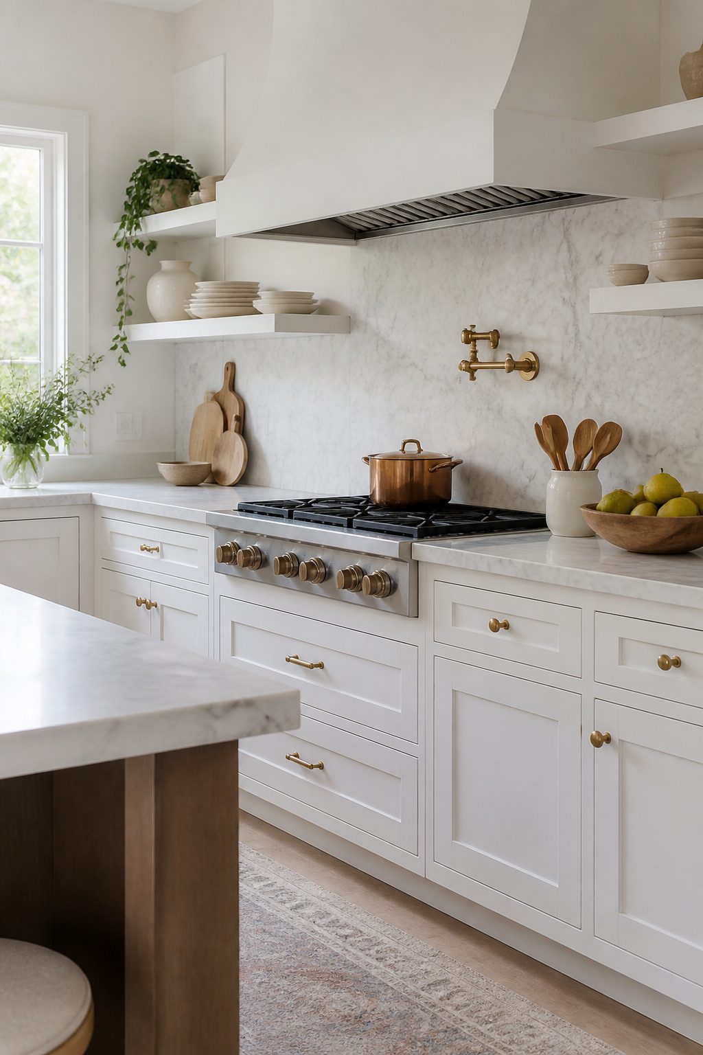
Carrara marble, with its soft gray veining on a cool white ground, reads as intentional rather than accidental against white cabinets. The contrast is quiet enough that the wall does not fight the cabinetry for attention. Calacatta steps that up: the veins run bolder and warmer, sometimes carrying gold or taupe notes that pick up brass hardware or wood accents without requiring them. I have seen a 4-by-12 Calacatta Gold subway in a straight stack pull a whole kitchen together that way; the base stays cohesive, and the warmer threads do the connecting.
Both stones need sealing. Marble is susceptible to staining and scratching from acidic substances, so proper sealing and maintenance are essential in a kitchen environment. Skip it if you are not willing to reseal every six to twelve months. The high-gloss finish catches light beautifully, but the upkeep is real. For renters or anyone who treats the kitchen as a workspace first, the maintenance load may outweigh the luxury. For owners who want the upscale look and will put in the care, the pairing with white cabinets is among the most timeless options available.

Minimalist Design: The simple design is timeless and won't cause aesthetic fatigue, as simplicity often exudes a more sophisticated charm

Easy to install: These wall tiles are simple to install—just peel and stick, no extra adhesive required.

SIZE AND COVERAGE: Come in a box of 32 sheets premium PVC subway tiles, 4"x8"x0.08" each, cover about 7.11 square feet.Made of PVC and EVA composite laminate.Marble look design.Glossy surface.
3. Black Backsplash
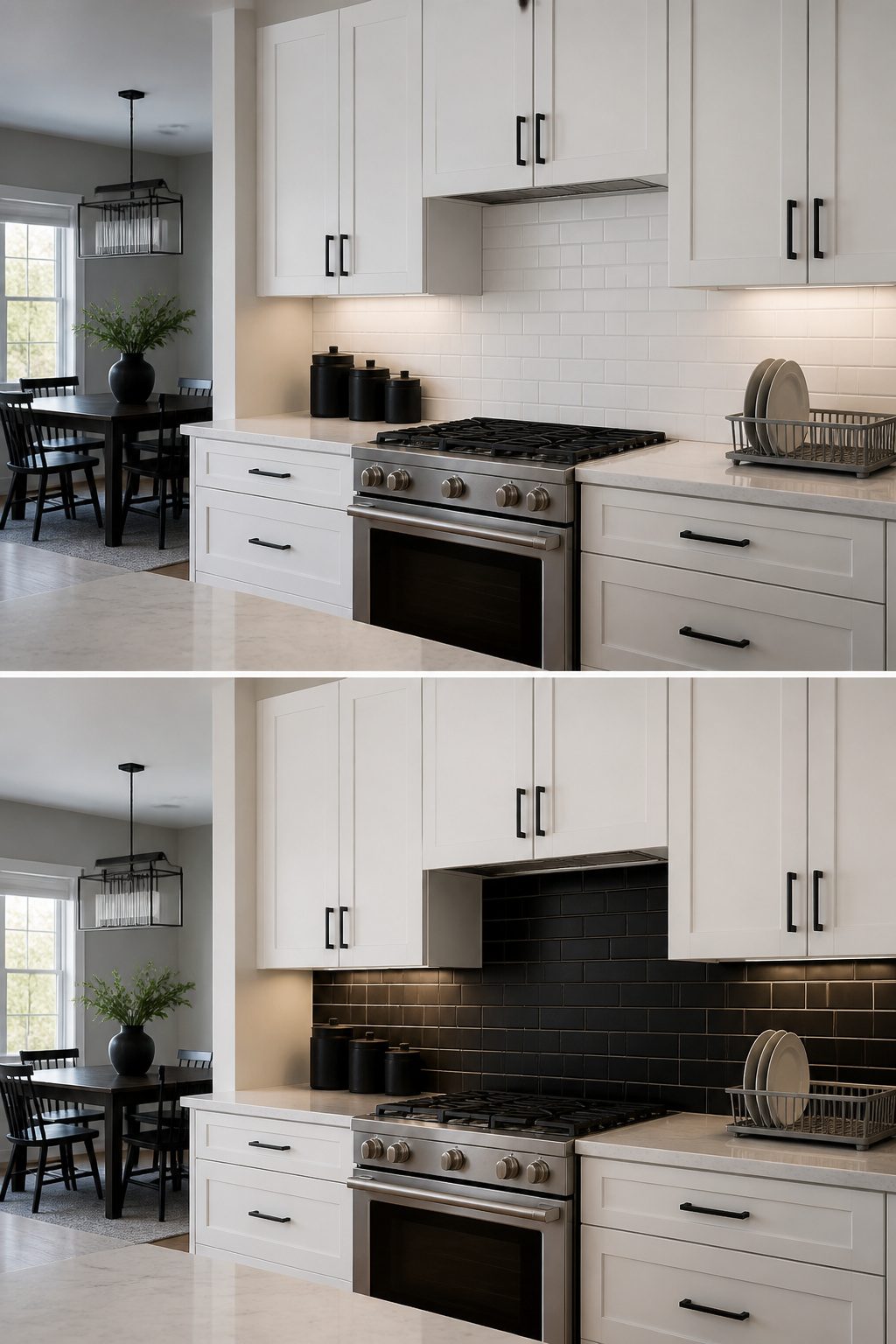
Black creates the sharpest possible break against white cabinets, and that contrast is exactly why it works. A matte black subway tile, something like the narrow Groove Black Deco format, sits there with real weight; no reflection, no shine, just a solid band of color that makes the cabinetry read even crisper. Glossy black plays the opposite game. Black glass tiles pick up under-cabinet light and bounce it around, so the kitchen keeps an airy feel even with a dark backsplash in the mix. Textured black, whether cement or a hand-finished ceramic, lands somewhere between: the surface catches light unevenly, which hides splashes better than a mirror finish but still gives the eye something to travel across.
The question I keep seeing is whether backsplash should be lighter or darker than the cabinets. Darker backsplashes ground the room; lighter ones recede. With white cabinets, going darker adds depth the space would not otherwise have, especially in kitchens where everything else reads pale. Black hardware, dark window frames, even a black range hood wrapped in the same tile can repeat the tone so it does not look dropped in by accident.
Oversized black pendants and black countertops help balance the mix if you are already committed to the contrast. Under-cabinet lighting matters more here than with paler tiles; without it, matte black especially can go flat and disappear after sunset.


4"x8" Wide Beveled Soft White Ceramic Subway Tile

𝐏𝐫𝐞𝐦𝐢𝐮𝐦 𝐌𝐚𝐭𝐞𝐫𝐢𝐚𝐥𝐬:Made of PVC composite laminate, anti-scratch, high impact, color fadeless, more durable and stronger than other plastic self-adhesive tiles. Polished surface finishing with realistic look, high waterproof and stain-resistant performance, protect the walls from splash and iol.
4. Colorful Mosaic Tile
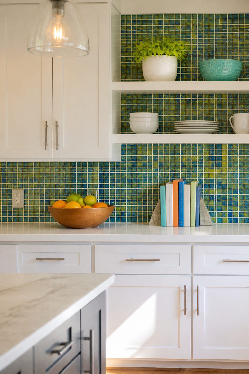
A mosaic backsplash packs the most personality per square inch of anything you can hang behind white cabinets. The small format, the mix of colors, the texture of the material itself, glass or ceramic or mother of pearl, all work together to break up the blank canvas without needing a full kitchen overhaul.
You have three ways to deploy it. A single accent wall behind open shelving gives you the color hit without the commitment. A framed inset behind the range, maybe a bold geometric or a tonal pattern, reads custom and high-end while the rest of the kitchen stays neutral. Or run it the full length for a retro diner effect, especially with penny rounds in a contrasting grout.
The catch is maintenance. Those tiny tiles mean more grout lines, and more grout lines mean more surface area to scrub. If you cook with oil or sauce on the regular, that matters.
The limited footprint of a kitchen backsplash makes it affordable enough to swap out in years to come without renovating the whole kitchen, so feel free to experiment with color, pattern, and texture.
That limited footprint is exactly why I would risk the bolder mosaic over a safer choice. Worst case, you are out a weekend and a few hundred dollars, not a whole kitchen.

1.4 Times Coverage Area: 10 sheets thickened self-adhesive tiles, 12.6" X 10.6" each (The small piece is 4.9" X 2.6"), which covers 40% more area than 10"x10" tile

Natural Stone Tiles - Crafted from natural stone, These backsplash tiles offer a timeless look. They are fade-resistant, scratch-resistant, and easy to maintain. 6" x 3" x 0.28" for each piece, 1pc=0.125 sq. ft., 40pcs=5 sq. ft. Please Note: We recommend measuring your space before installation. Please also verify the color upon receipt. Should you have any questions or concerns, please do not hesitate to contact our customer service team.

【𝐒𝐩𝐞𝐜𝐢𝐚𝐥 𝐃𝐞𝐬𝐢𝐠𝐧】Faux marble tile. Product is designed to be with Carrara white color, the glossy surface and natural texture make it more realistic. Close-joint tiles with clear edge bevel processed, no grouting required, the seamed design make it just like a real caulked tile
5. Textured Tile
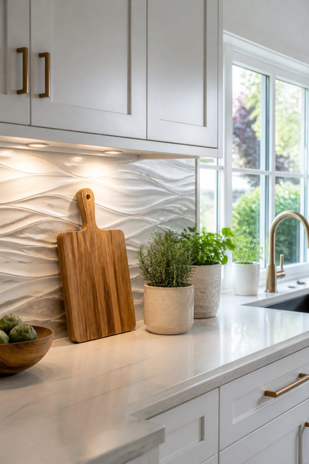
Textured tile gives a white kitchen its depth back without bringing in competing color. A wave-shaped ceramic, a hand-formed zellige, or a 3-D pattern like the Tangram Asas Branco catches light at different angles throughout the day, so the wall never reads as flat. Shadow does the work that a second color would, and in an all-white space that shadow is what keeps things from feeling sterile.
I have watched kitchens where the cabinets and counters are already white on white; the backsplash is the only place left to create visual weight. A crackled surface or raised dimensional tile adds warmth you can actually feel, not just see. Pearl White 18-by-48 textured ceramic in a large format works here because the scale stays modern while the surface stays interesting.
Under-cabinet lighting matters more with these tiles than with flat subway. The same fixture that would wash evenly across plain tile will pick out every ridge and valley on a sculpted surface, turning the backsplash into something that changes as you move through the room. If your kitchen runs short on daylight, that play of light becomes the main event.
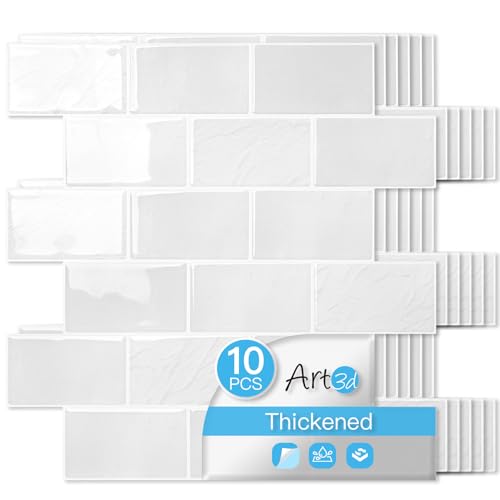
Upgraded Thicker Build: 2–3 times thicker than regular peel and stick tiles, resistant to tearing and bending for easier installation.

Details: Blue peel and stick wall tile, 12"x12" each tile, 0.05" thickness, 6 sheets per box, around 6 square feet coverage. Subway tile design with realistic 3D effect and sky blue faux stone pattern, light weight, flexible design for easy installation

Grout-Free Installation: Achieve a sleek finish for your diy kitchen backsplash with easy-to-install, interlocking edges that require no grout, saving you time and effort; no dust and minimal mess
6. Glass Tile
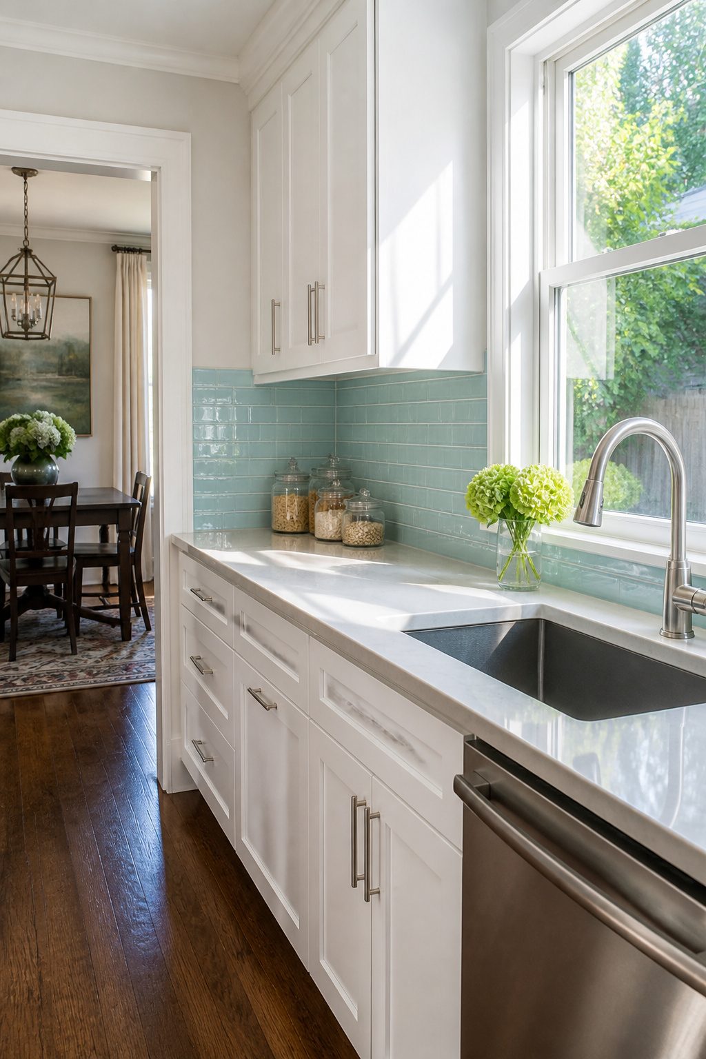
Glass tile bounces light around a room like almost nothing else. In a kitchen with white cabinets, that reflection keeps the whole space feeling open and a little more modern without trying too hard. I’ve seen glossy white glass tile used wall-to-wall behind a range, and the effect is clean but not flat; the surface catches under-cabinet lighting and makes the white-on-white palette feel intentional rather than default. For anyone working with a smaller kitchen, that extra brightness can make the walls feel farther apart than they are.
If pure white sounds too safe, blue glass tile heads in a livelier direction. A soft aqua or dusty teal against white cabinetry reads coastal and calm, not loud. The easy-clean surface matters here too; grease and sauce splatter wipe off glass without the scrubbing porous stone demands. One choice to make early: grout close to the tile color keeps the focus on the reflective surface itself, while darker grout adds definition that can ground the whole wall.

Coverage and Quantity: Listing is for 12.5 square feet, which is 100 pieces of 3x6 tiles

Premium White Glossy Finish: 2x4 White Glossy Ceramic Subway Tile Backsplash with a smooth, reflective surface that enhances any space

✿ 1.4 Times Coverage Area: 10 sheets thickened self-adhesive tiles, 12" X 12" each (The small piece is 3.3" X 1.8"), which covers 40% more area than 10"x10" tile
7. Geometric Tile
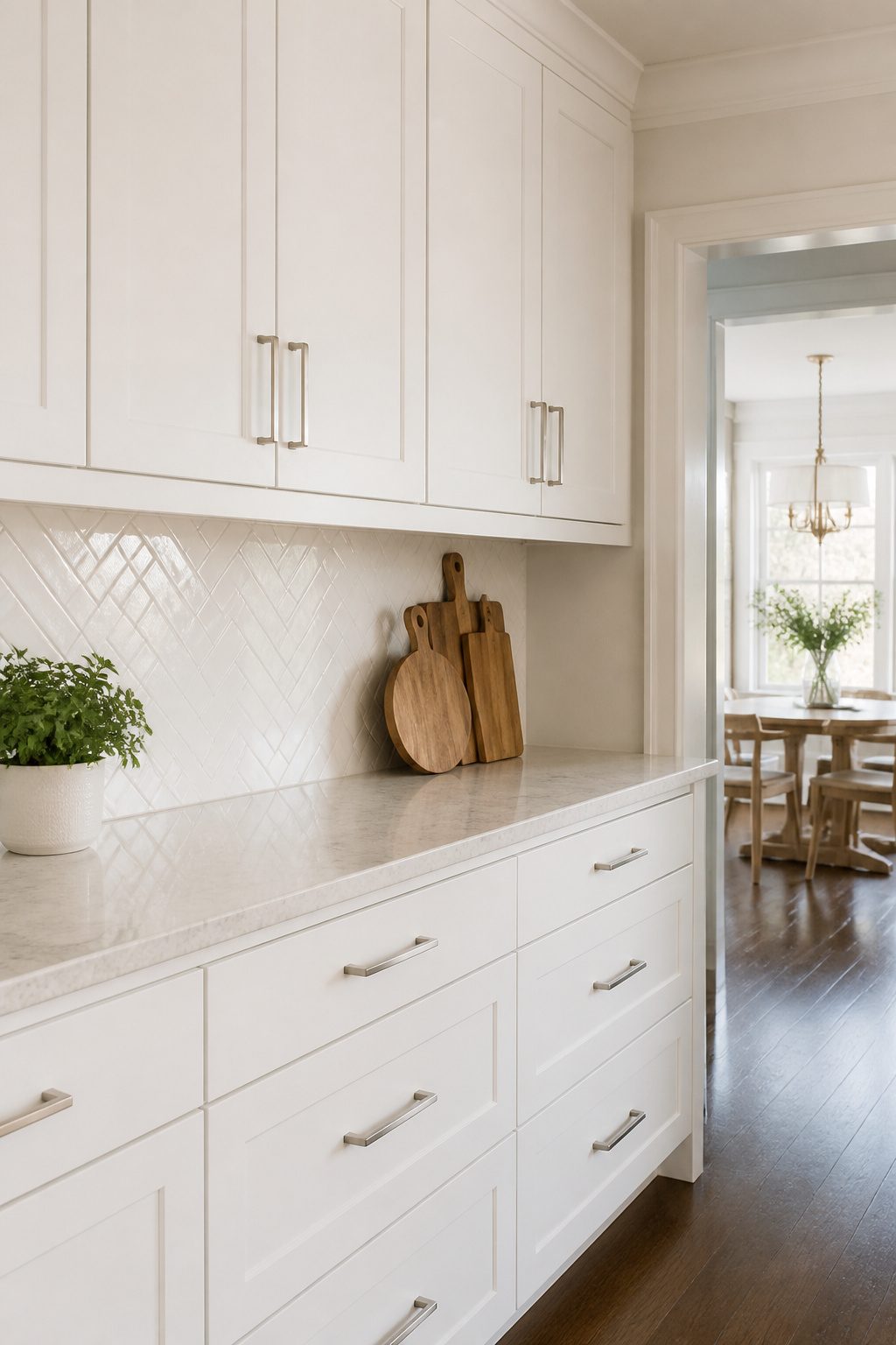
Geometric tile gives white cabinets exactly what plain subway tile withholds: a pattern that moves without shouting. Hexagons, triangles, diamonds, and chevrons all read as deliberate choices on that blank canvas, and the shape itself carries the design so you don’t need to chase trendy colors.
The real decision is how loud you want it. A black-and-white diamond pattern in encaustic tile hits like wallpaper, eye-catching from across the room. That works if your kitchen has enough breathing space elsewhere, but in a tight galley it can feel like the walls are closing in. Subtle geometric repeats that read as texture from ten feet away solve that problem. A herringbone layout in white-on-white, or a picket tile with closely matched grout, still catches light and casts tiny shadows under cabinets without adding another color to manage. The glossy glaze on something like an elongated picket shape bounces under-cabinet lighting around a room that white cabinets can sometimes flatten.
Penny rounds sit in between. The small mosaic size adds depth and a retro lean, especially with contrasting grout, but the repetition stays gentle because the shape is so simple. Honed marble penny tile softens the geometry further.
For renters or first projects, I’d start with the quieter end. Bold geometry is hard to undo if you tire of it, and white cabinets already give you a clean stage. Let the tile shape whisper; you can always add color later with towels and bowls that move with you.
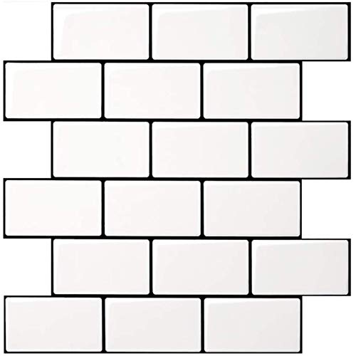
Upgraded Thicker Build: 2–3 times thicker than regular peel and stick tiles, resistant to tearing and bending for easier installation.

Box Math: 10 pieces cover 1.25 sq ft — 8 tiles per square foot.

Black with Glossy Finish
8. Herringbone Pattern
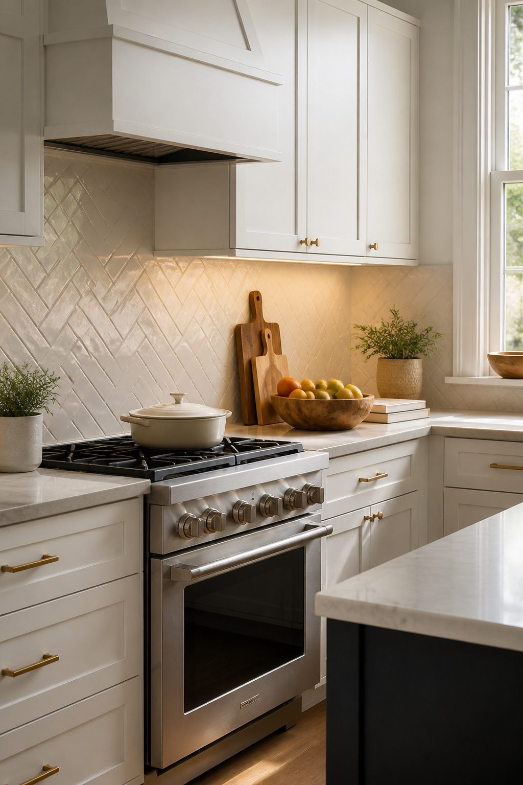
A herringbone backsplash brings instant movement to white cabinets without introducing a new color. The zigzag layout reads as texture rather than contrast, which keeps the kitchen calm but not flat.
The pattern works with almost any material you are already considering. Classic white subway tile in herringbone reads traditional; wood-look porcelain warms things up; natural stone turns the wall into a quiet feature. I have seen all three work, and the choice comes down to whether you want the backsplash to disappear or to do a little more.
The extra cutting means roughly 10–15% more tile and a longer install, so a tight weekend budget needs to account for both material waste and labor time. If you are tiling yourself, renting a wet saw with a good blade saves frustration. If you are hiring out, ask whether the quote already includes the pattern markup. Some installers fold it in; others do not, and that difference can push a herringbone backsplash from manageable to something you postpone.
Colored grout changes the whole effect. A darker gray line traces each zigzag and makes the geometry explicit; matching grout softens it into texture alone. Both are valid, but they are different rooms when you step back.
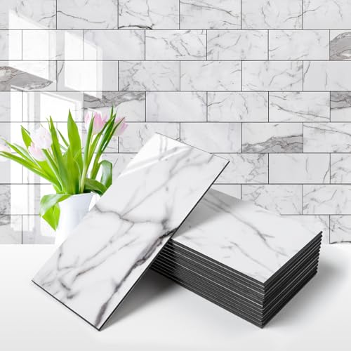
Material:Made of PVC composite laminate, anti-scratch, high impact, color fadeless, more durable and stronger than other plastic self-adhesive tiles. Glossy/Poished surface finishing with realistic ceramic look, high waterproof and stain-resistant performance, protect the walls from splash and oil.

Beveled Subway Ceramic Tile Dimensions: 3x6 inches with 1/4 inch thickness for standard installation requirements

𝐏𝐫𝐞𝐦𝐢𝐮𝐦 𝐌𝐚𝐭𝐞𝐫𝐢𝐚𝐥𝐬:Made of PVC composite laminate, anti-scratch, high impact, color fadeless, more durable and stronger peel and stick subway tiles than other plastic self-adhesive tiles.
9. Penny Round Tile
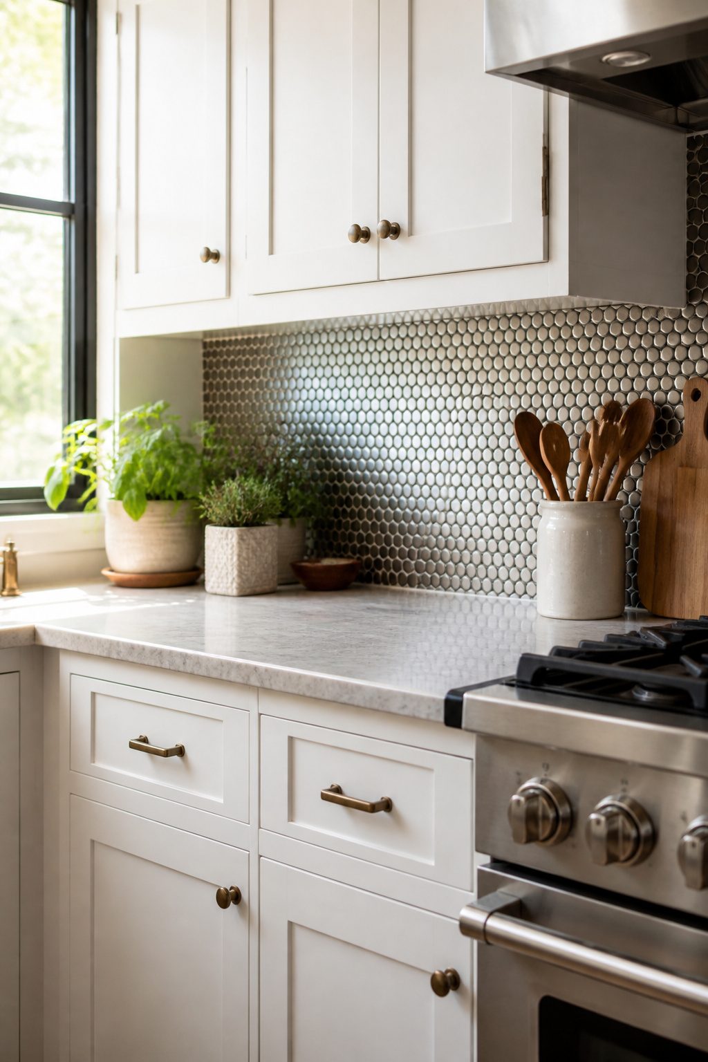
Penny round tile carries the same small, circular shape that covered 1950s bathroom floors, but the look translates surprisingly well to a kitchen backsplash behind white cabinets. The rounded edges create movement that breaks up all those straight cabinet lines without fighting them. You will find these mosaics in porcelain, ceramic, glass, or even metal, which gives you room to push the vintage feel or pull it back toward something more current.
The retro-modern mix works because white cabinets read as a blank canvas; the tile supplies the personality. A classic white penny tile with white grout stays subtle and timeless, while contrasting grout turns every circle into a graphic shape. That choice is worth sampling against your actual cabinet shade, since a bright white grout, warm white, beige, or gray each changes how the two surfaces relate.
The upkeep is the tradeoff. Hundreds of small circles mean hundreds of small grout lines. More grout equals more scrubbing, more staining, and more sealer over time. I would not put this behind a daily-cook stove unless you are committed to the maintenance routine. For a lighter-use kitchen or a rental where the look matters more than the long-haul durability, the charm usually wins.

Premium Grade Carrara White Marble 4 inch Octagon Mosaic Tile w/ Nero Marquina Black Dots Honed. Italian Carrara White Marble Matte 4 inch Octagon Octave Mosaic Wall & Floor Tiles are perfect for any interior projects. The 4 inch Carrara White Marble Octagon Octave Mosaic tiles can be used in both residential and commercial spaces for any wall and floor, such as kitchen backsplash, bathroom flooring, tub surround, shower floor, dining room, entry foyer, entryway, hallway, corridor, balcony, etc.

Premium Grade Long Octave Rhomboid Diamond Carrara White Mosaic Tile w/ Nero Marquina Black Dots. Italian Venato Carrera White Bianco Marble Polished 1-3/4x3-1/2 Long Octave Rhomboid w/ Black Dots Mosaic Wall & Floor Tile are perfect for any residential / commercial projects. The Carrara White Marble Long Octave Rhomboid w/ Black Dots Mosaic Tile can be used for kitchen backsplash, bathroom flooring, shower surround, dining room, entryway, corridor, spa, etc.

Super Strong Adhesive: Stronger backing glue than ordinary vinyl pee and stick backsplash tile. It has a strong stickiness, so please confirm the installation position, otherwise it will be difficult to tear off and cause waste.
10. Brick Backsplash
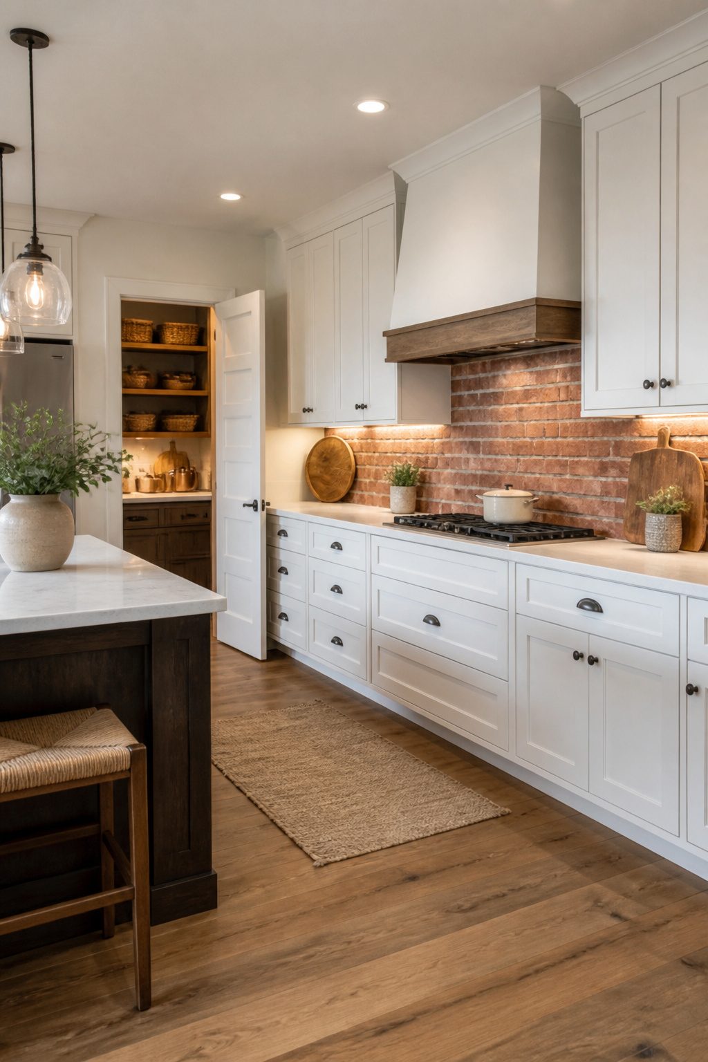
Brick gives white cabinets something they can’t generate on their own: weight and history. The warmth of the material plays against the crispness of the paint in a way that reads as intentional, not accidental.
You have three ways to get there. Actual brick brings the most texture but also the most maintenance; seal it properly behind the stove or grease will settle into every porous surface. Brick-look tile skips the sealing headache and costs less, though up close the repetition can give it away. Painted brick, whether whitewashed or fully covered, lands closer to shabby chic; it softens the industrial edge and keeps the palette quiet.
The farmhouse feel comes from the mortar lines and the slight irregularity. Run it floor to ceiling if you want to maximize the vertical space, or stop at cabinet height for a more contained moment. I lean toward leaving some of the natural color variation visible; all-white brick against white cabinets can flatten into one undifferentiated plane unless you have strong lighting or wood accents to break it up.

🔷 8K UV-Printed Tempered Glass Backsplash for Kitchen 🔷 High-resolution 8K UV printing ensures vibrant, fade-resistant colors on a 4 mm tempered glass panel. Available in 40 fixed sizes and custom size options. The design is printed on the back of the glass for lasting protection and a smooth, glossy surface.

🔷 8K UV-Printed Tempered Glass Backsplash for Kitchen 🔷 High-resolution 8K UV printing ensures vibrant, fade-resistant colors on a 4 mm tempered glass panel. Available in 40 fixed sizes and custom size options. The design is printed on the back of the glass for lasting protection and a smooth, glossy surface.

🔷 8K UV-Printed Tempered Glass Backsplash for Kitchen 🔷 High-resolution 8K UV printing ensures vibrant, fade-resistant colors on a 4 mm tempered glass panel. Available in 40 fixed sizes and custom size options. The design is printed on the back of the glass for lasting protection and a smooth, glossy surface.
11. Bold Colored Tile
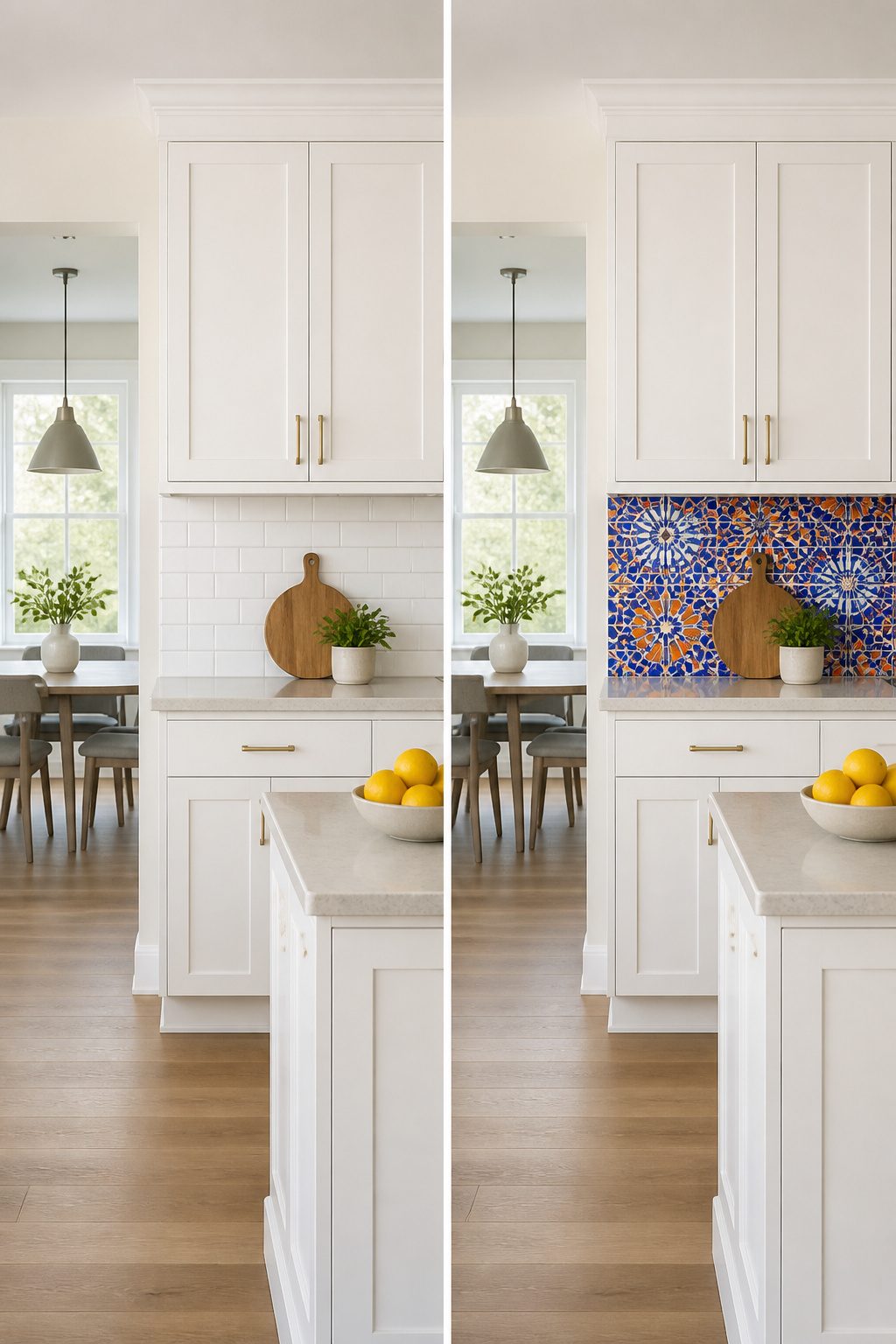
A bold backsplash behind white cabinets is the fastest way to stop a kitchen from feeling like a rental showroom. Deep emerald green tile or a black-and-white checkerboard pattern turns the wall into the personality of the room, not the cabinets.
The question is usually where to put it, not whether to do it. Wrapping every wall in a strong color can feel like the tile is shouting at you while you make coffee. One concentrated area does the opposite. A framed section behind the range or sink, done in a contrasting pattern or a saturated solid like electric blue or sunshine yellow, draws the eye without taking over the whole space. The rest of the kitchen stays bright and neutral, which matters when your square footage is modest and your budget is a weekend’s worth of work.
I have seen kitchens where the owner kept the main run in a quiet white subway tile and let a small diamond pattern in tiki blue or mandarin orange live only behind the stove. That single move reads as custom and intentional, not like someone emptied a paint can on the wall. The inset is the trick: strong color needs a boundary to feel designed rather than accidental.
12. Soft Pastel Tile
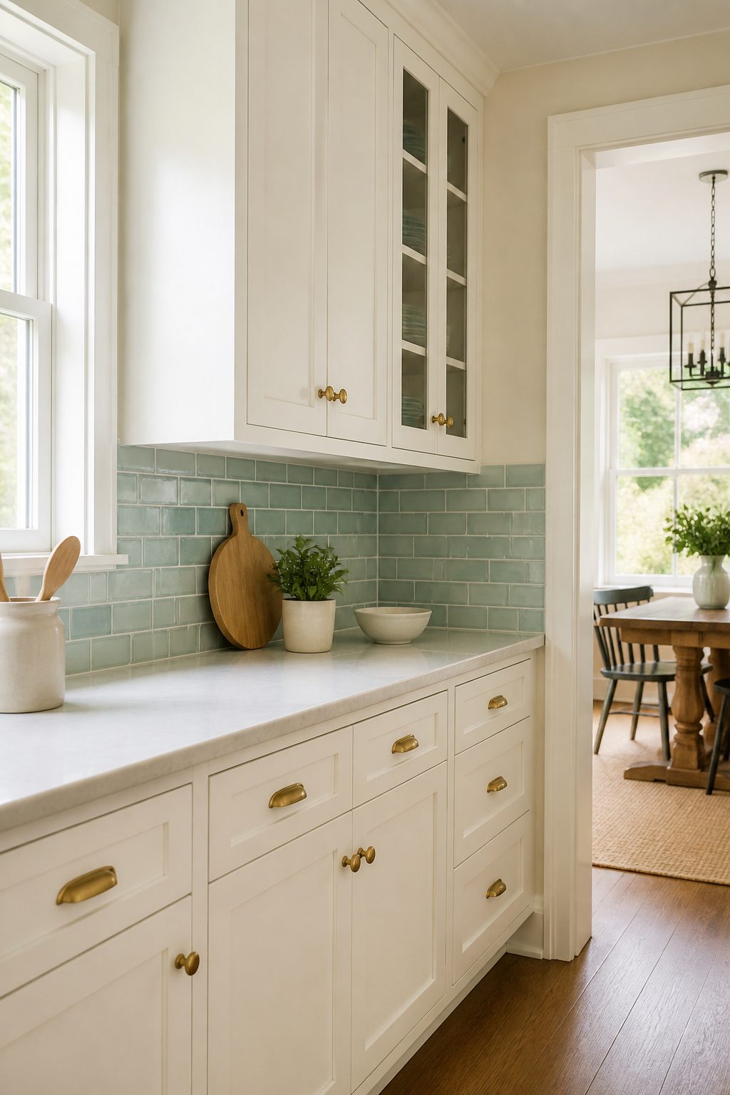
Soft pastels settle a kitchen in a way pure white sometimes can’t. A pale green tile, something in the eucalyptus or manzanita range, backs white cabinets with just enough warmth to keep the room from feeling like a clinic. The color reads as neutral after a week, but it still catches your eye when you walk in.
I used to think an all-white kitchen sounded peaceful, then I stood in one that felt like a waiting room. Pastels fix that without dragging in high contrast or busy pattern. A soft aqua or dusty teal subway tile keeps the airy quality you wanted from white cabinets, but adds the bit of personality that makes a space feel finished.
The tile format matters as much as the color. Glossy 1-by-6 or 3-by-9 shapes give you that serene, slightly coastal vibe without committing to a theme. Mellow sage works here too, though I’d steer toward the greener side of sage rather than gray if your cabinets run cool white. Hand-glazed ceramics catch light differently than machine finishes, which helps in a kitchen with limited windows.
For renters or first-time owners, this is a forgiving direction. Pastel tile doesn’t fight your existing hardware or countertop the way a bolder choice might, and it photographs well if you’re planning to sell in a few years.
13. Fish Scale Tile

The curved silhouette of fish scale tile brings a softness you do not often find in a kitchen full of right angles. Each piece overlaps like a mermaid’s tail or the glazed edge of a Moroccan fountain, and against white cabinets that geometry reads as movement rather than pattern. The shape catches light differently across its ridges, so a glossy finish in an ocean tone turns the whole wall into something that shimmers when you walk past.
I would not run it everywhere. A single strip behind the stove, or a panel framed between upper cabinets and range hood, gives you the effect without the visual weight of full coverage. The curves do enough work in a small dose; spread across every wall and the kitchen starts to feel like a themed restaurant. White cabinets keep the look grounded, but the tile itself should be the one moment of drama. Save the straight lines for somewhere else.
14. Terrazzo Tile
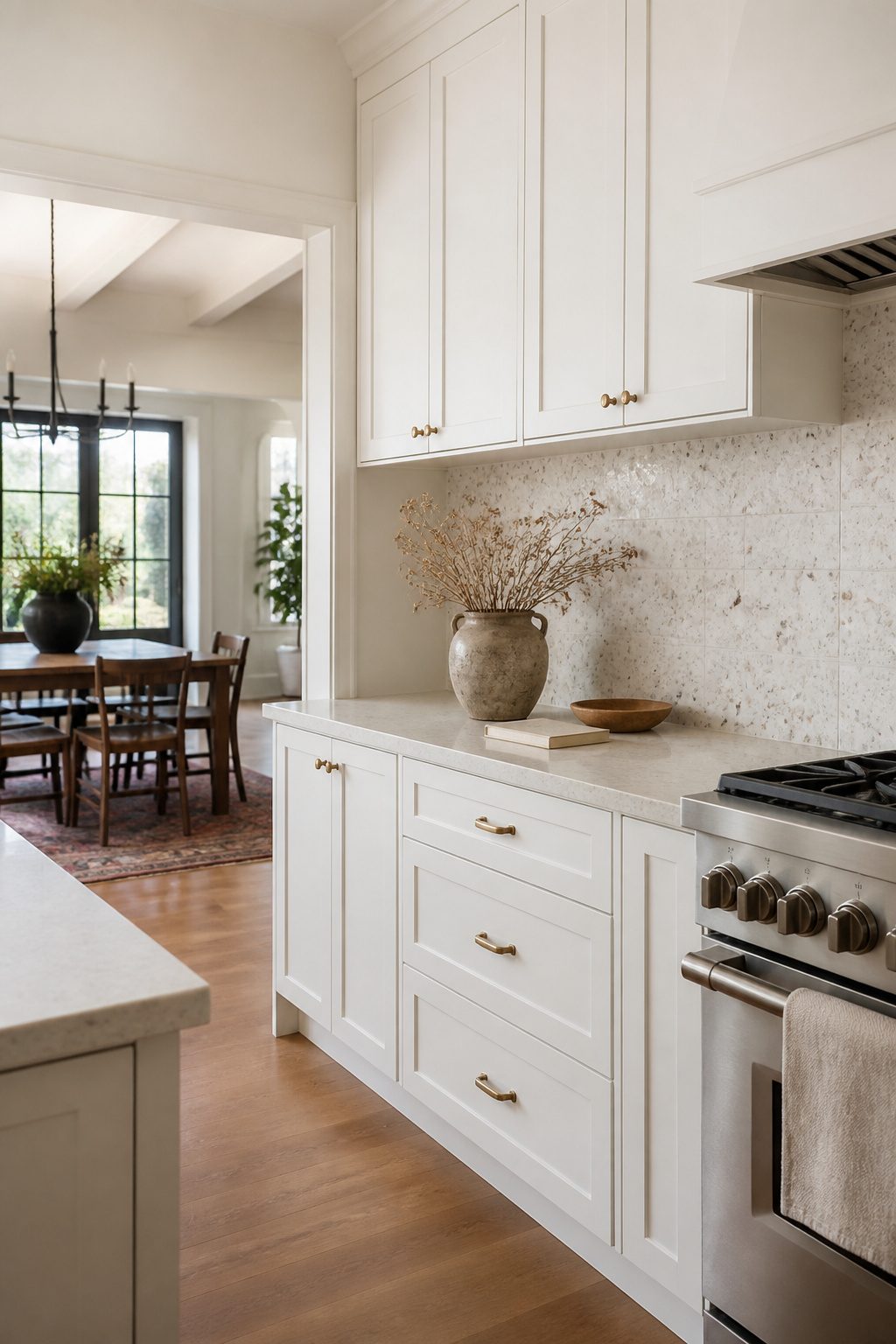
Terrazzo is a composite material made from chips of marble, quartz, or glass set into a binder, and it’s having a real moment again after decades in the design wilderness. The 1970s revival makes sense to me because the busy, speckled surface hides everyday kitchen splatters better than a solid color ever could. You can go weeks without noticing a pasta sauce flick or oil spot.
Traditional poured terrazzo is gorgeous but heavy, expensive, and requires a pro to install. For a weekend project with white cabinets, large-format terrazzo-look porcelain is the smarter move. The tiles give you the same visual texture at a fraction of the weight and hassle, and your standard tile saw handles the cuts. The contrast between crisp white cabinetry and those scattered chips, whether muted neutrals or bolder colors, gives a kitchen personality without demanding a full renovation budget.
15. Wood Backsplash
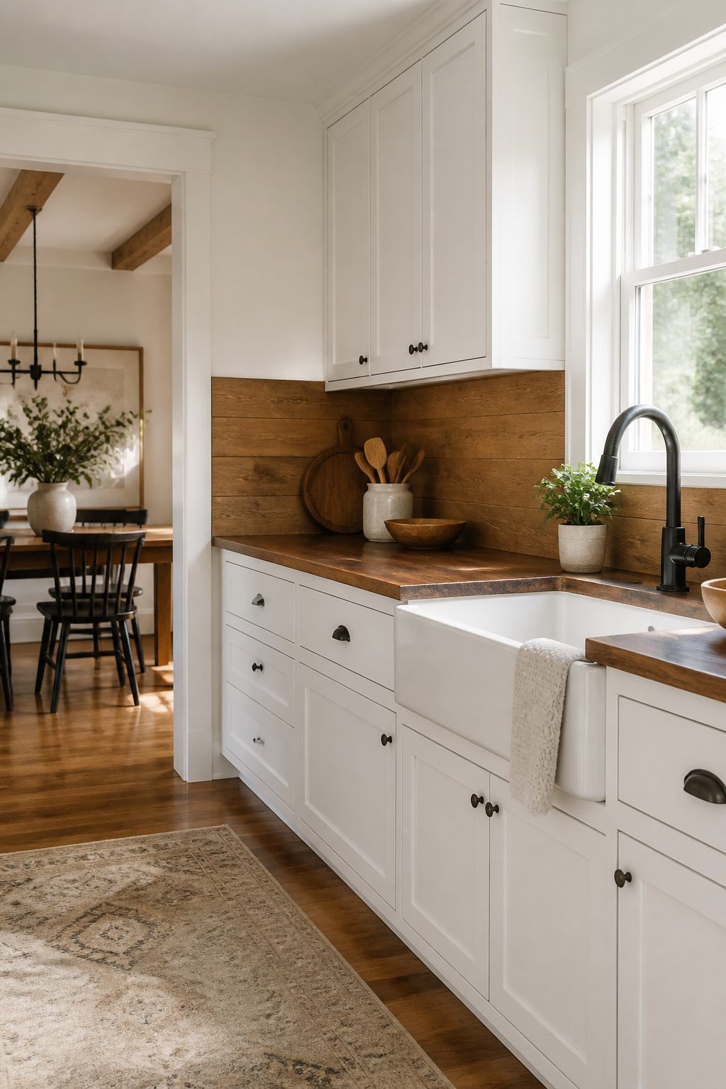
Natural wood is one of the best ways to add warmth to a white kitchen, and a backsplash puts that warmth right at eye level where it counts. Reclaimed wood gives you instant character with its weathered patina and varied tones, while shiplap brings a cleaner, more predictable line that still reads cozy rather than clinical. If the maintenance or fire code realities stop you, wood-look tile has come far enough to fool most eyes and lets you run it all the way behind the range without worry.
The actual maintenance depends on placement. Behind a sink, you will need to wipe splashes promptly; paint helps, but wood is still wood. Behind a cooktop, local fire codes typically require noncombustible materials within a certain zone, which rules out real wood in that exact spot unless your inspector signs off on a specific treatment. Most homeowners solve this by switching to tile or metal just behind the range and keeping the wood everywhere else. I have looked at enough kitchen galleries to spot the seam almost every time, but the tradeoff buys peace of mind and keeps the insurance valid.
16. Full-Height Backsplash
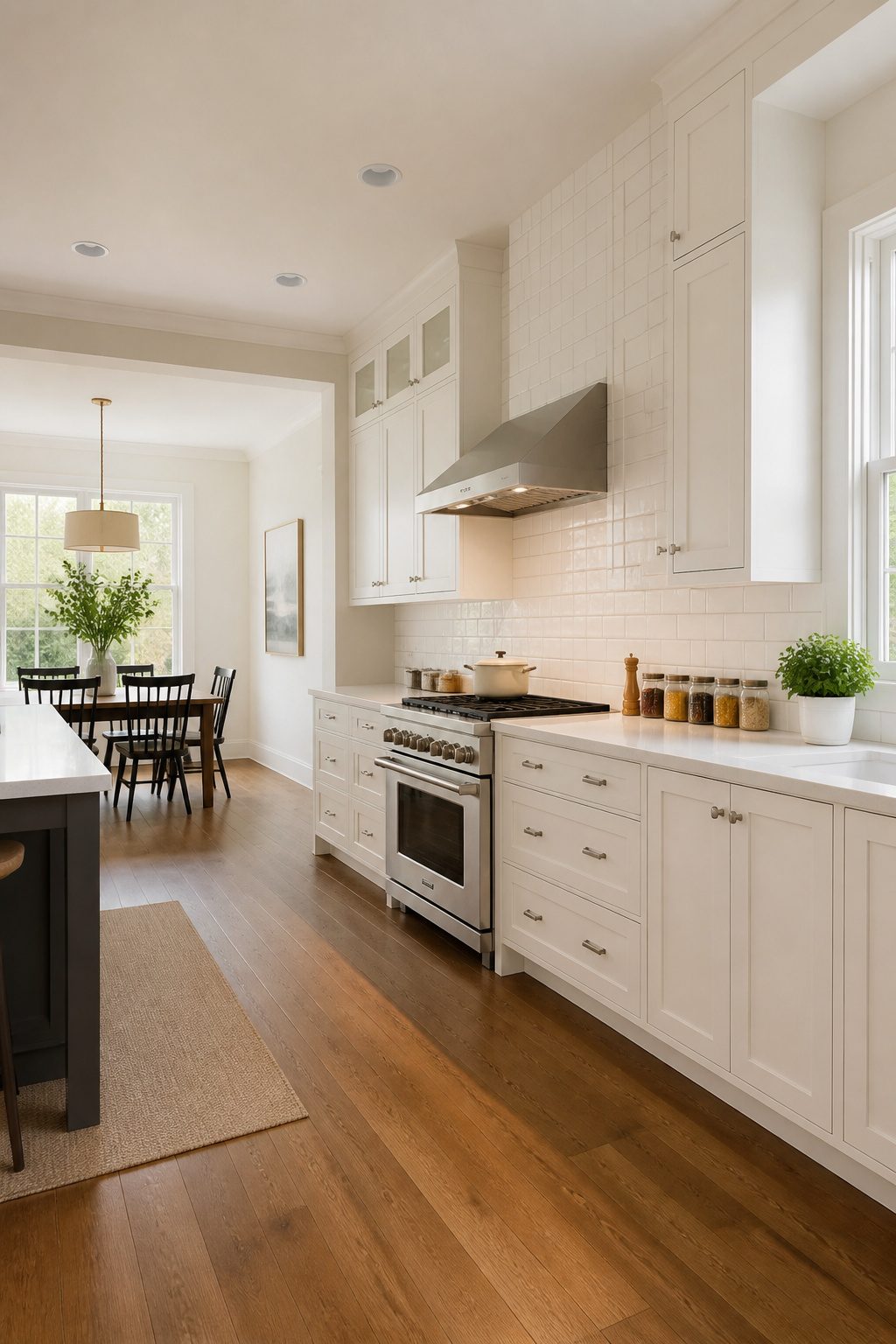
Running tile to the ceiling instead of stopping at the upper cabinets changes the whole feel of a white kitchen. The eye travels upward, the walls read taller, and the space loses that strip-of-wall awkwardness that standard backsplashes leave behind.
This works especially well behind open shelving or a range hood, where the tile becomes a visible surface in its own right rather than a gap-filler between cabinets. Behind open shelves, the backsplash ties the whole wall together instead of stopping short and creating a visual break. Around a range hood, it frames the cooking area and gives patterned or mural tile the room to actually develop its pattern.
The catch is material cost. You’re buying roughly double the square footage of a standard backsplash, plus more cuts around shelves and hoods to plan for. Finalize your layout before you order; herringbone, chevron, or any centered mosaic needs exact measurements around outlets, windows, and the hood position.
With white cabinets, the effect reads designed rather than decorated. The uninterrupted surface feels luxurious without adding ornate detail, and the cabinets become a quiet frame for whatever texture or pattern you choose.
17. Metallic Tile
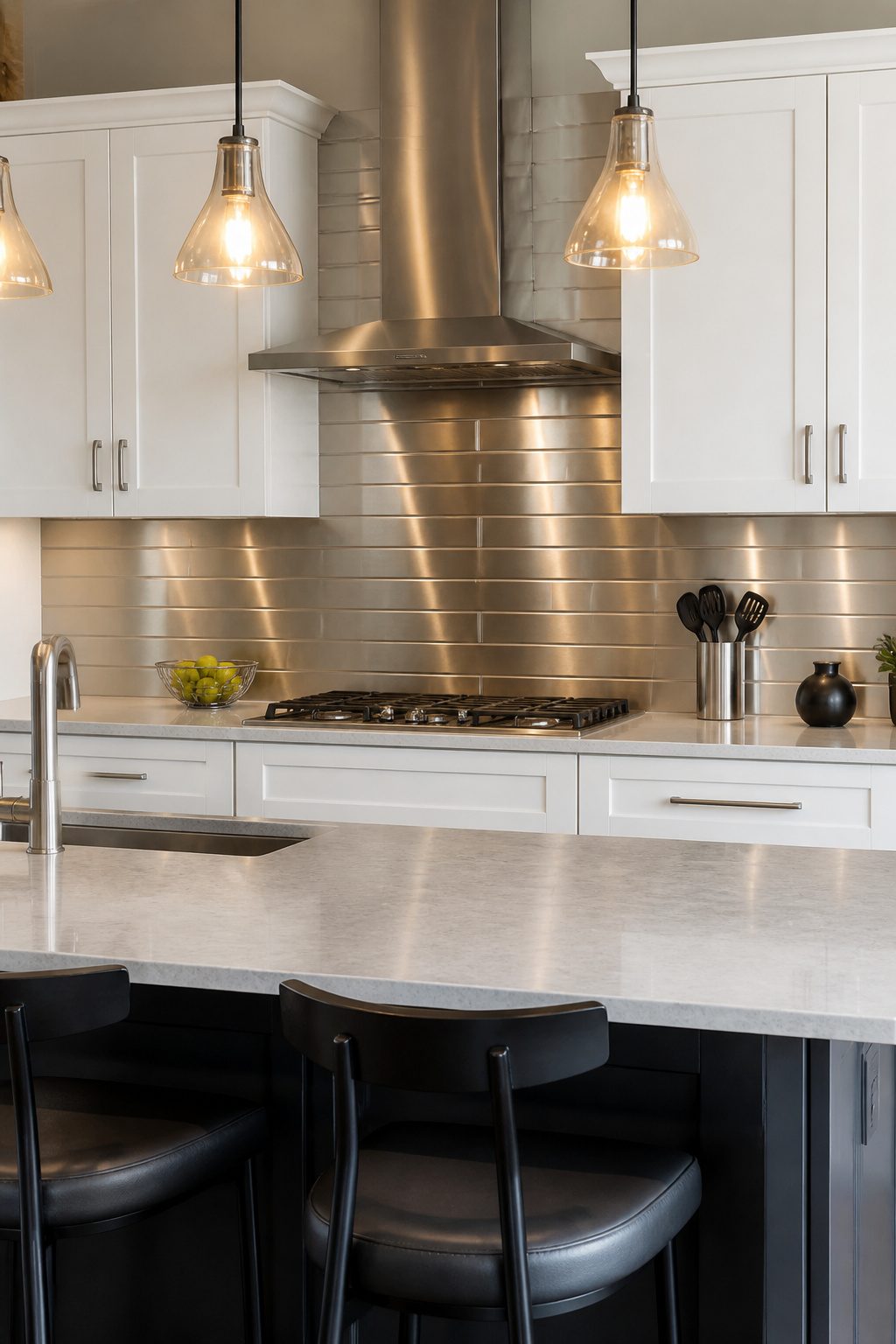
Metal backsplashes hit a sweet spot for white cabinets that can otherwise read a little too quiet. Stainless steel, copper, and bronze tiles all bounce light around the room the same way glossy ceramic does, but the finish feels more deliberate, more designed. The reflection keeps a white kitchen bright without adding another pale surface that disappears into the background.
What sold me on metal for this kind of space is how groutless panels cut the visual clutter to almost nothing. A stainless panel behind the range reads as one continuous plane, not a grid of lines competing with your cabinet doors. That same seamless quality makes cleanup simpler too; there is no grout to stain, no texture trapping grease.
The risk is temperature. Copper and bronze run warm, which keeps the room from feeling like a lab, but silver metal can tip cold fast unless you balance it. Light wood floors, a floating shelf in a natural tone, or even just warm bulbs in your pendants keeps the look livable rather than clinical.
18. Moroccan Tile
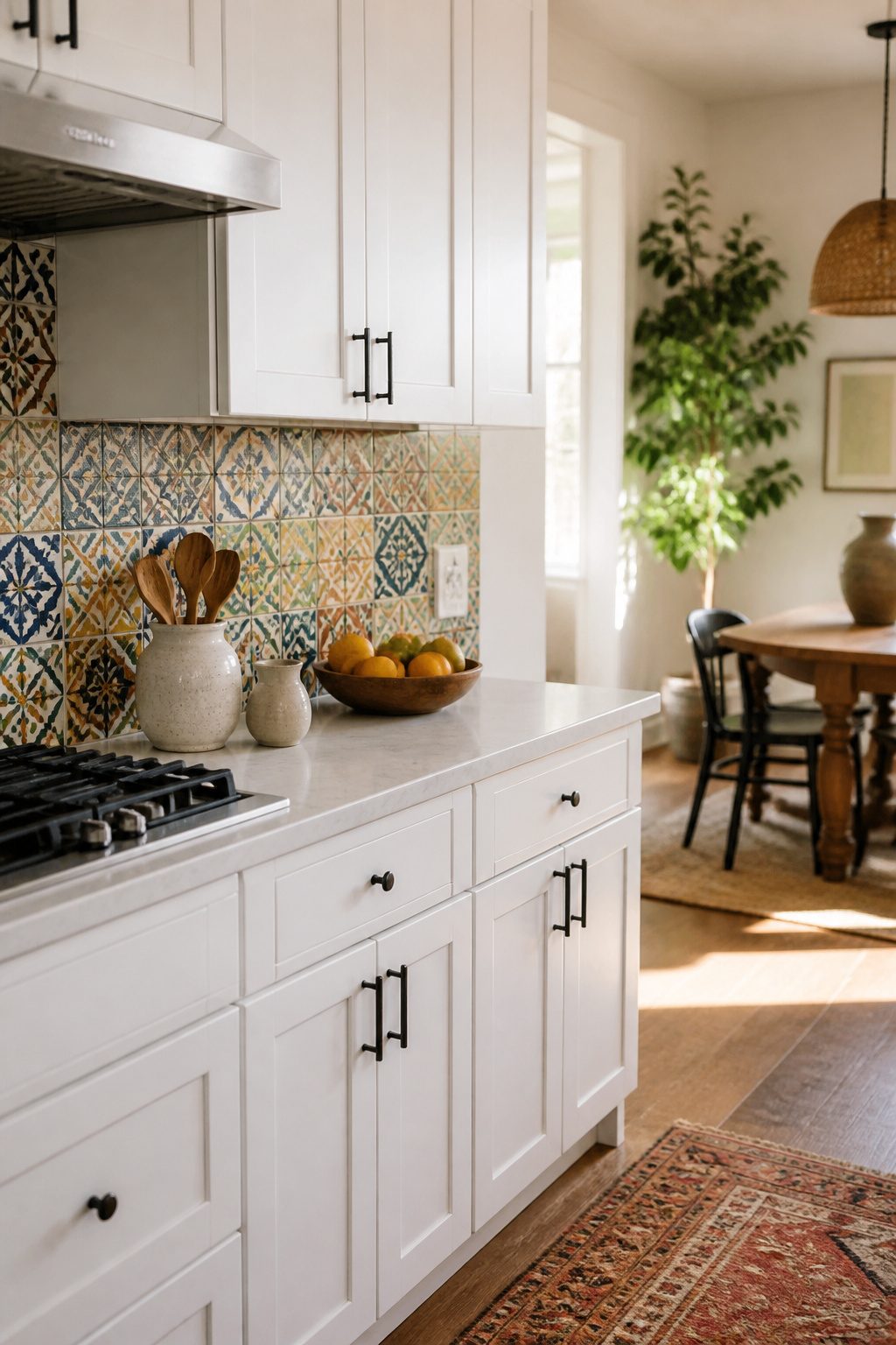
Moroccan cement tile brings intricate geometry and saturated color that white cabinets handle beautifully, since the cabinets step back and let the pattern do the talking. Each tile is hand-pressed, so variation in color and impression is part of the deal, not a flaw to send back. That variation reads as warmth and age, which keeps a busy kitchen from feeling sterile.
These tiles work as a full floor-to-ceiling statement behind the range, or as a single horizontal strip at counter height if the pattern feels like too much commitment. Sealing is non-negotiable: cement is porous, and splatter from tomato sauce or red wine will sink in permanently without a proper sealant applied during installation and refreshed every couple of years. I would not put this behind a sink without checking my own tolerance for maintenance, but behind a cooktop where the visual payoff justifies the upkeep, it is hard to beat.
19. Custom Inset Design
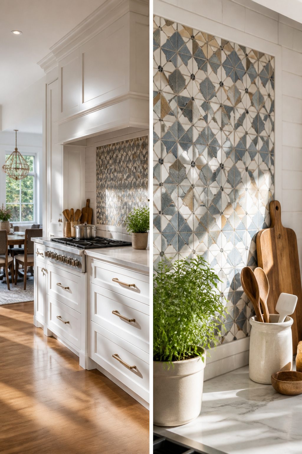
A custom inset behind the range is where a small splurge buys the most drama in an otherwise quiet kitchen. You frame a small area with a simpler field tile, then fill that frame with something bolder: a geometric motif, a curved fan pattern in wooden beige marble, or a multicolored graphic mosaic that reads as wall art from the next room over. The surrounding white cabinets and neutral field tile stay affordable and calm, while the inset does the heavy lifting.
The range wall already draws the eye, so concentrating your budget there makes practical sense. A full backsplash of hand-laid mosaic or natural stone gets expensive fast; an inset might use only eight to twelve square feet. Seal marble before the kitchen goes into daily use, and stick to a cleaner formulated for natural stone afterward. For renters, this is harder to pull off, but a framed panel of peel-and-stick graphic tile can mimic the look without the demo later.
20. Vintage Tin Tile
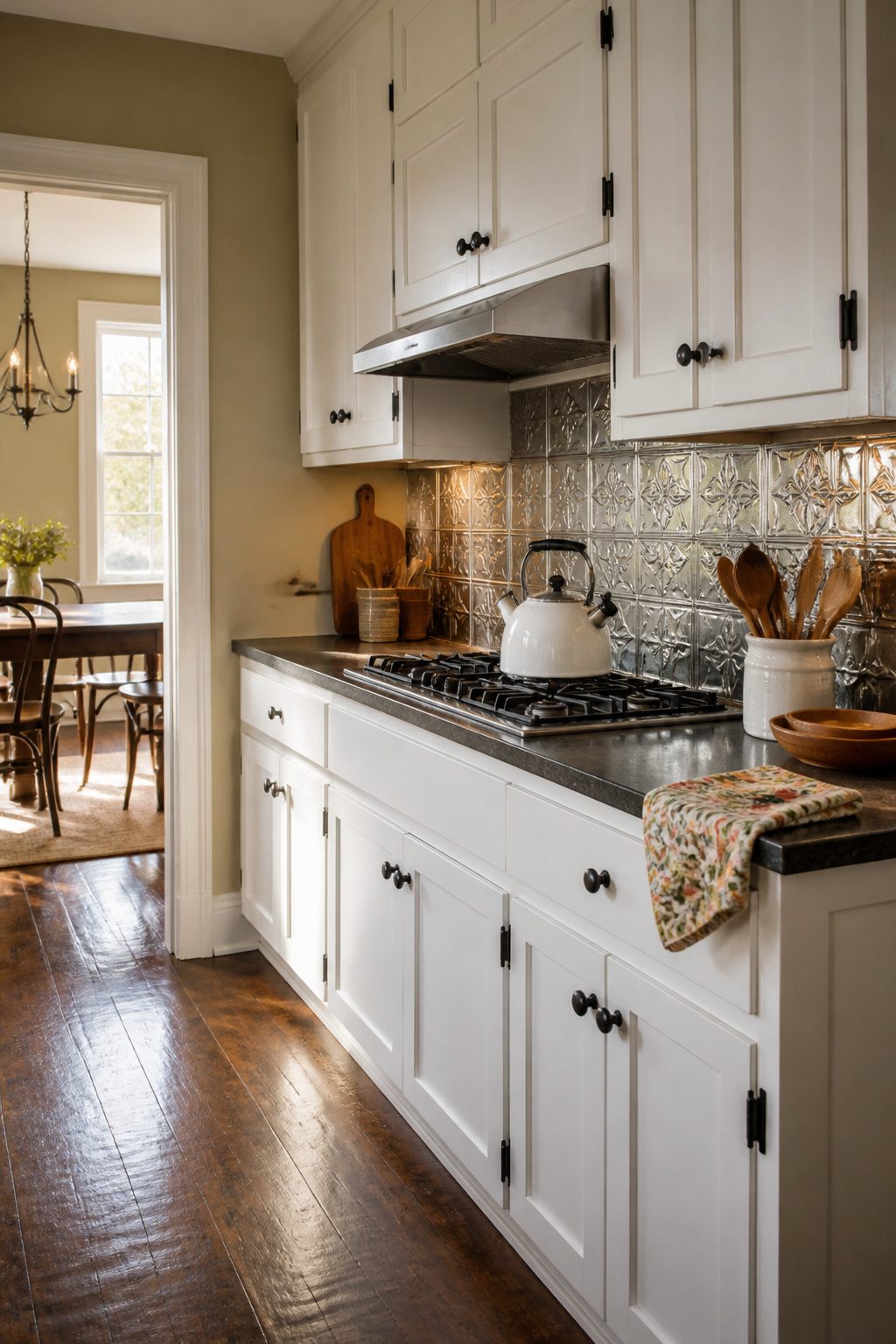
Pressed metal ceiling tiles pulled down and flipped into a backsplash carry a 19th-century workshop look that reads as collected, not decorated. The pattern catches light across its ridges and seams, which keeps a white kitchen from feeling flat without introducing a new color. You will find these in bare steel or aluminum that ages, or in factory-painted whites and soft creams that stay put.
The surface wipes clean with a damp cloth; grease sits on top rather than soaking in, which matters more the closer your cooktop sits to the wall. A matte painted finish hides water spots better than bare metal, though bare metal darkens in a way some people prefer. Installation runs to the same adhesive or screw methods as any thin panel, so a weekend rental project stays within reach.
21. Shell Tile
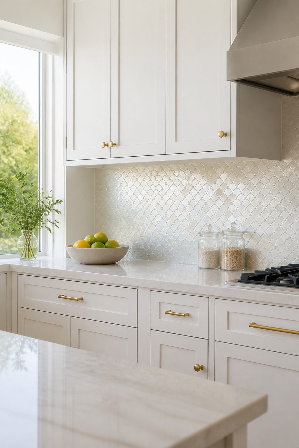
Mother-of-pearl and capiz shell tiles catch light in a way nothing else on this list does. The polished surface shifts between white and silver as the day moves, giving white cabinets a softly luminous backdrop that still reads as restrained. That same iridescence can tilt coastal or glamorous depending on what you pair it with: sandy neutrals and pale aqua read beach house, while black hardware and marble-look countertops turn it toward something more formal.
The tight-joint square pattern feels clean, but the material itself is delicate and the installation takes patience. Grout lines can dull the shimmer, and the sheets are less forgiving of wall imperfections than ceramic. I would not run this behind an entire counter unless you have a pro doing the work. A small band behind the range, or a framed panel over the sink, gives you the effect without the risk or the cost of a full wall.
22. Rustic Slate Tile
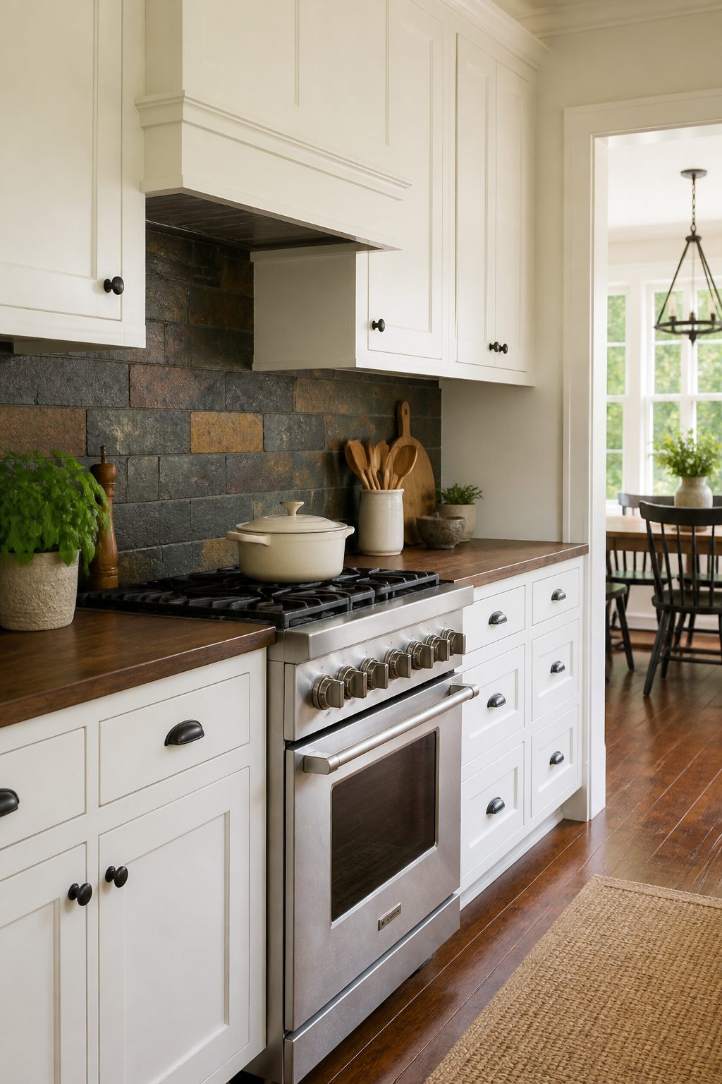
Slate tile brings a rugged, grounded feel that smooth white cabinets can’t achieve on their own. The stone’s uneven surface catches light in patches, and the color shifts from charcoal to rust to moss green depending on the piece. That variation is the point: each tile looks like it came from somewhere specific, not a factory line.
White cabinets read as crisp and uniform, so the contrast with slate’s irregular texture works without needing a bold color statement. The cabinets stay clean; the backsplash does the visual heavy lifting.
Slate splits along natural planes during quarrying, which means thickness varies from tile to tile. Your installer will need to level the surface as they go, not just set and grout. Budget extra labor time for that step.
You’ll also need to seal it. Slate is porous, and cooking grease plus unsealed stone equals stains that do not lift. Reapply sealer yearly, or whenever water stops beading on the surface. Skip this and the rustic charm turns into a maintenance headache fast.
23. Cream Kit Kat Tile
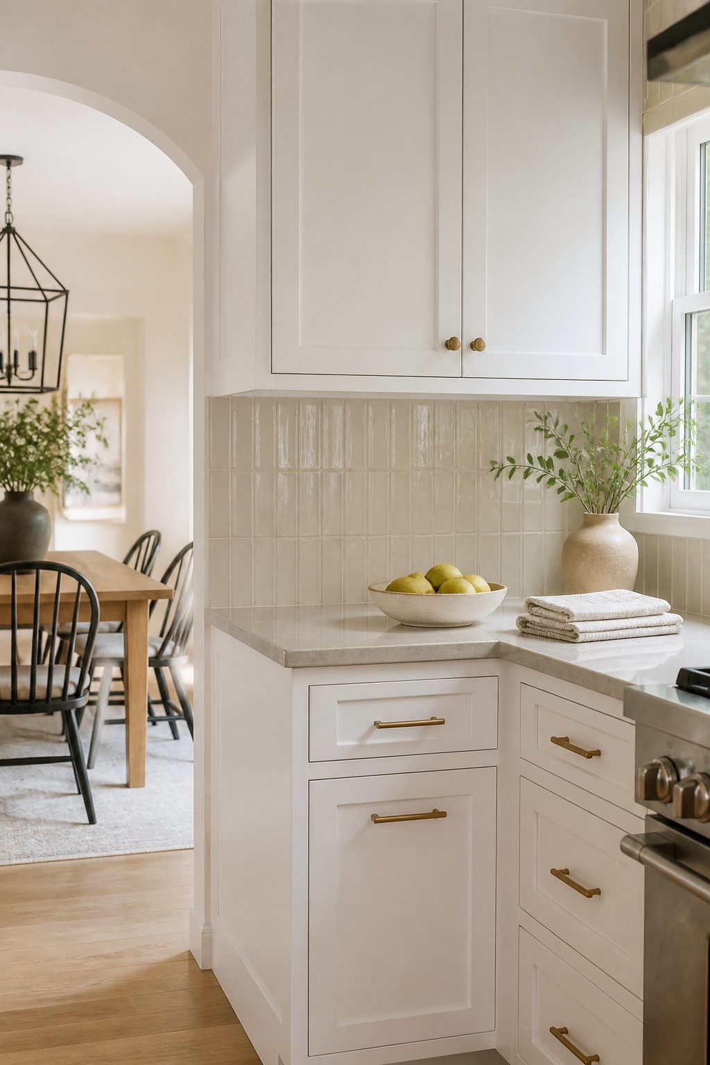
Finger-shaped stacked tiles in warm cream tones carry a Japanese origin that predates the kitchen trend by decades. The format started as toki tiles, narrow rectangles meant to evoke bamboo or wood grain, and the Kit Kat nickname stuck because the proportions feel familiar. Against white cabinets, cream softens the transition where stark white tile would read as another layer of the same bright surface, especially when your countertop or hardware already carries warmth.
Vertical stacking pulls the eye upward around a range hood, which helps in kitchens with standard 8-foot ceilings that can feel compressed. Run the same tile horizontally and a short backsplash between counter and cabinet suddenly feels wider, almost like a deliberate horizontal band rather than a gap to fill. Baldwin Cream Textured Ceramic carries this in a glossy glaze that adds depth without demanding attention.
Grout color matters more here than with larger formats. Because the surface already holds movement from all those narrow pieces, a grout close to the cream tone keeps the wall reading as one textured plane rather than a grid of individual sticks. White grout would break it into stripes; dark grout would turn it busy.
24. Earthy Natural Stone
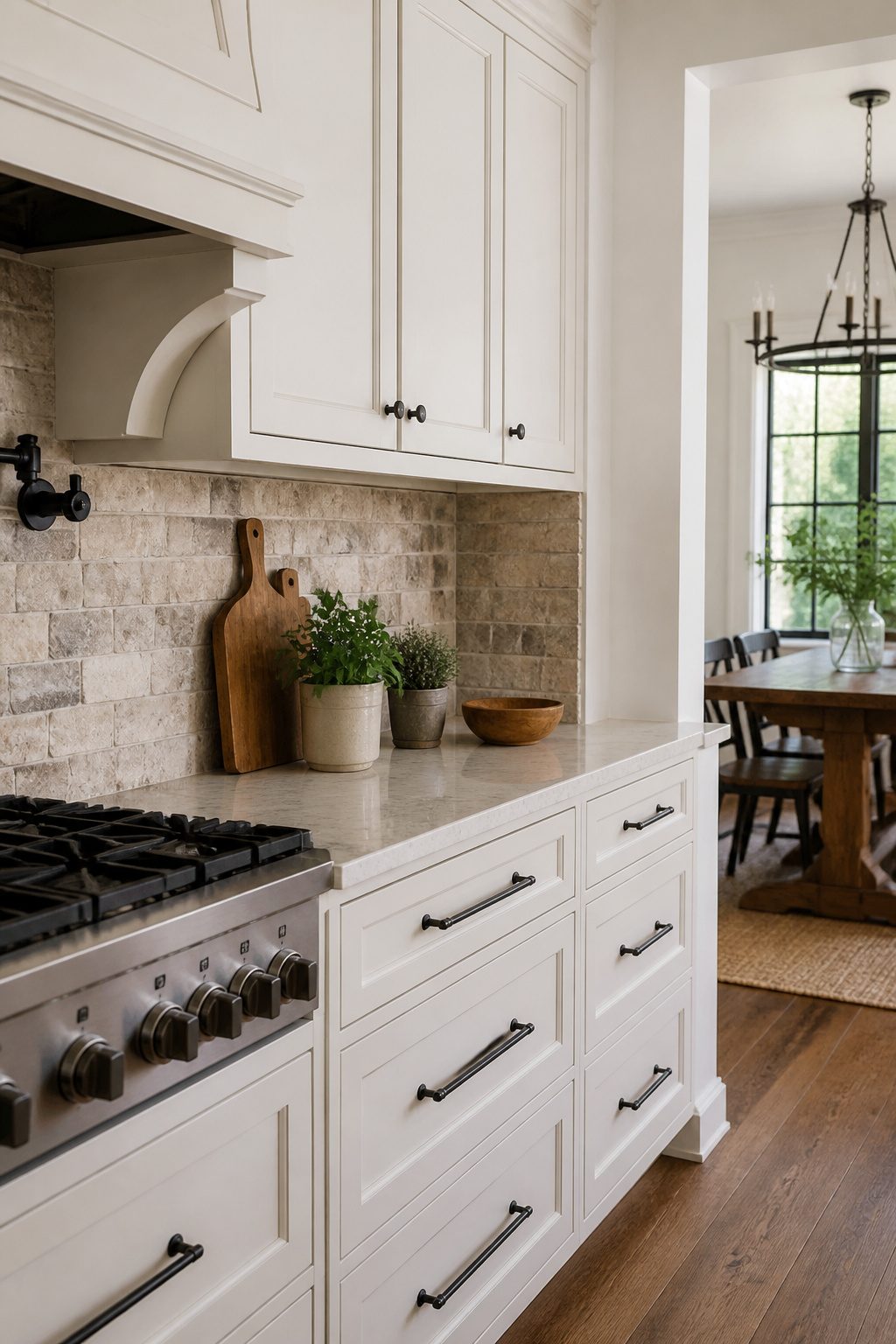
Travertine and limestone bring an organic warmth to white cabinets that manufactured materials rarely match. The soft browns and warm grays in tumbled travertine create a quiet contrast against crisp white cabinetry, adding depth without competing for attention. I have always found that the patina natural stone develops over time is its real advantage: etching, subtle darkening in high-splash zones, and gradual color shifts turn a brand-new backsplash into something that looks settled and intentional.
The variation is worth planning for. No two travertine tiles share identical veining or pitting, so your backsplash will read as layered rather than uniform. That irregularity pairs especially well with farmhouse or rustic kitchens where perfection would feel out of place. Limestone skews slightly cooler and more matte, which works if your white cabinets run toward the stark end of the spectrum rather than cream.
Maintenance is the tradeoff. Natural stone needs sealing, and acidic foods or cleaners will mark it. For a weekend-project budget, factor in both the sealer cost and the hour or two upfront. If you cook heavily and wipe down constantly, the lived-in look arrives fast. If you prefer things pristine, the same patina reads as wear you did not choose.
25. Colorful Ceramic
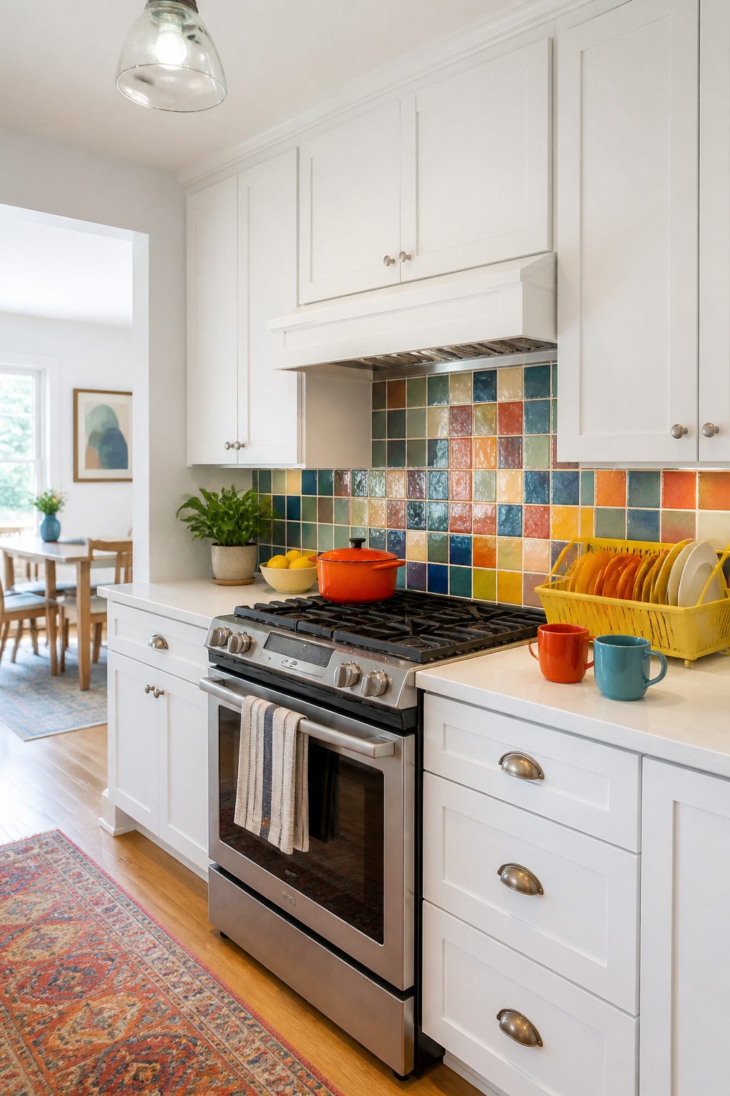
Ceramic tile is the right place for bold color because the glaze sits on the surface where light can catch it, not buried under a glassy porcelain skin. That distinction matters when you want a backsplash that reads as saturated rather than muted. Porcelain is denser and less porous, which makes it tougher for floors, but for a vertical wall that never takes a footfall, ceramic’s slightly softer body holds glaze with more depth and variation.
Hand-glazed tiles in particular carry subtle shifts from one piece to the next, so a solid cobalt or terracotta reads as alive rather than flat. If intricate patterns feel like too much commitment, a regional style like Talavera gives you color through heritage glazes without the busyness of mosaic geometry. The white cabinets become your quiet frame; the tile does the talking.
Budget ceramic runs roughly a third less than porcelain, and the weight is easier on rental walls if you are tiling over existing substrate rather than stripping back to studs. The tradeoff is chipping at cut edges, so plan your layout to hide those along the counter or inside corners.
26. Artistic Hand-Painted Tiles
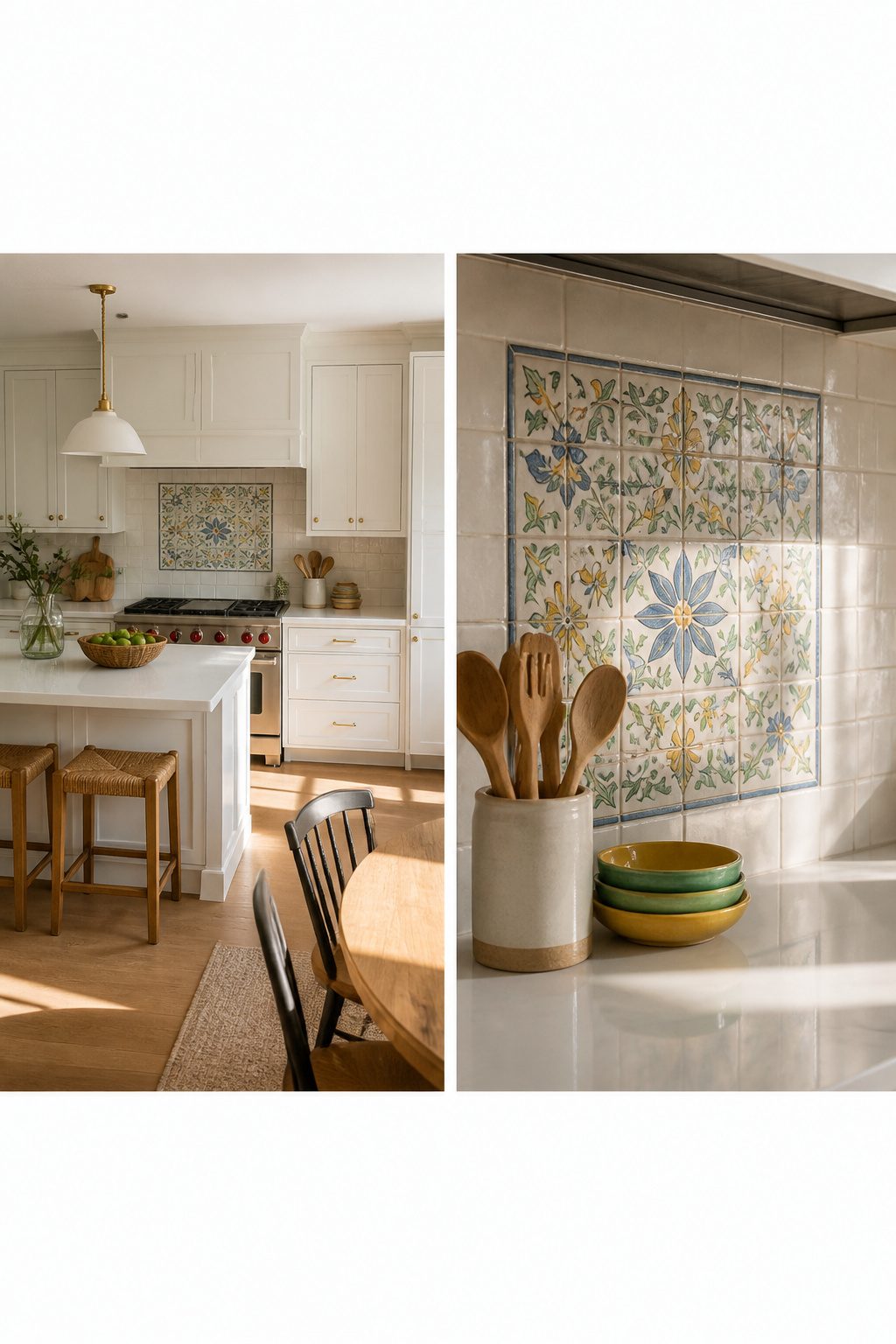
A single hand-painted tile dropped into a run of plain white subway or zellige field tile works like a tiny painting on a gallery wall. The eye finds it, rests there, and the whole backsplash suddenly feels collected rather than installed. Scatter three or five at random intervals and the effect turns into something closer to a jewelry box lid, each tile catching light differently depending on where you stand at the counter.
This is the move for anyone who loves the idea of artisan tile but cannot stomach the price of covering four full feet of wall with it. Hand-painted field tiles run anywhere from $15 to $40 apiece, sometimes more for custom work. One or two statement tiles at $25 each, surrounded by $3 stock tile, puts the money where you will actually see it. The budget stays intact, the white cabinets stay crisp, and the kitchen gets the one moment of deliberate imperfection that keeps the whole thing from reading like a showroom display.
27. Soft Contrast Tile
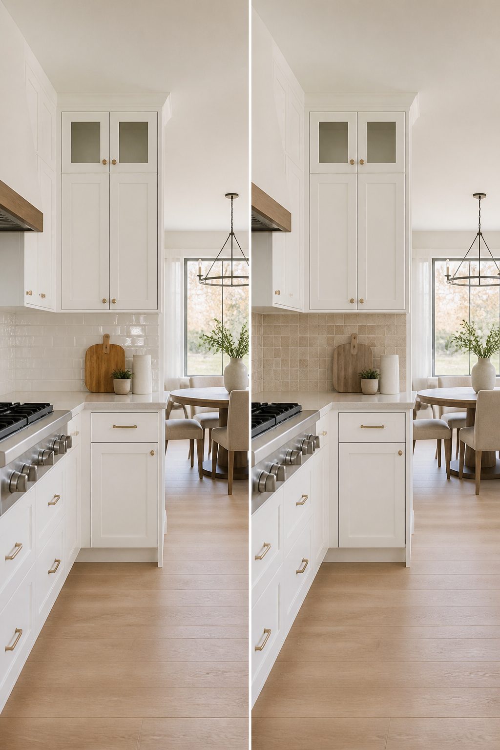
Greige, warm gray, and putty tones sit right where most kitchens need them: not matching the cabinets into oblivion, not punching a hole in the calm with something dark. These colors add depth without turning the backsplash into a statement piece that competes with everything else.
The trick is the undertone. A warm gray with a hint of beige reads as color in the daylight but settles back into neutral once the under-cabinet lights come on. Ceramic tiles in these shades give you that shift for less than stone, and glass can push the same tone lighter without going clinical.
What convinced me, looking through kitchen after kitchen, is how this middle path solves the lighter-or-darker standoff that stalls so many projects. You are not committing to high drama, and you are not defaulting to another layer of white. A putty-toned hexagon tile gives you texture plus that gentle contrast, which feels finished without feeling busy.
Brass hardware pulls the warmth forward; wood accents keep it from going flat. The whole thing stays cohesive because nothing is shouting.
28. High-Gloss Finish
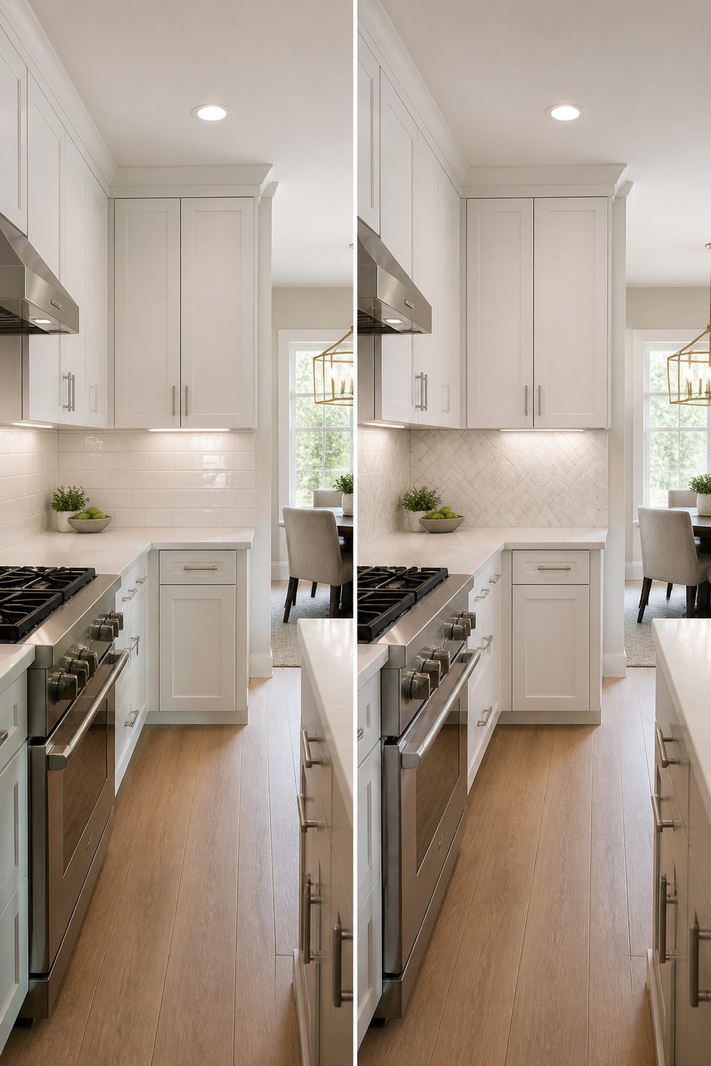
Gloss and matte are less about material and more about how light behaves in your kitchen. A high-gloss finish bounces both natural and artificial light around the room, which makes a small or dim space feel noticeably brighter and more open against white cabinets. That same reflectivity is what puts every fingerprint and cooking splatter on display, so you will wipe it more often even though the surface itself cleans easily. Matte finishes absorb light instead, which hides imperfections and reads as softer and more subdued. The risk is a flat, almost chalky look if the rest of your kitchen runs too quiet. For white cabinets in particular, gloss adds energy while matte adds restraint, and the right call depends on whether your kitchen needs waking up or calming down.
Peel-and-Stick Options
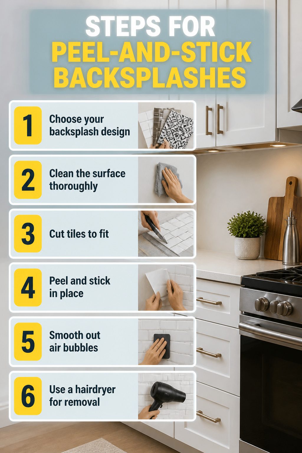
Peel-and-stick backsplashes are the renter’s real answer to what backsplash goes with white cabinets without losing a deposit. Vinyl tile that looks like ceramic, thin metal panels, or gel sheets all sit right on top of existing drywall or old tile, and most handle stove heat fine if you stay a few inches back from the burner grate.
The catch is removal day. Heat from a hairdryer softens the adhesive so the sheet lifts clean; rushing it with a scraper pulls paint or paper backing off with it. Patch any gouges before the walkthrough, and the wall reads as untouched.
Metal panels read especially modern against white flat-panel cabinets, and the groutless surface wipes down faster than real tile. A cheerful pattern in vinyl works too if you want the kitchen to feel less sterile, though bold color behind a stove tends to show grease faster than a neutral.
For the Houzerio reader doing one project a year on a tight weekend, this is the option that actually finishes on Saturday. No wet saw, no mortar cure time, no calling the landlord for forgiveness.
Artisan and Handmade Tiles
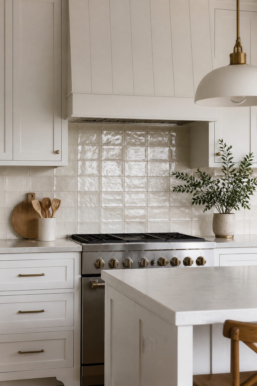
Small-batch tiles carry the slight waviness and color drift that factory lines deliberately erase. That variation is the entire appeal; a wall of handmade tile reads like linen rather than laminate, catching light across ridges that never repeat exactly. With white cabinets, that organic movement matters because all-white kitchens can tip sterile fast. The cabinets give you a quiet canvas, and the tile supplies the warmth without introducing a second color you have to coordinate.
Ordering takes a little planning. Dye lots shift between batches, so order fifteen percent over your square footage and keep it from one run. Return what you do not open, but risking a shortfall is how you end up with a patched-in stripe that reads like a mistake. Handmade glazes pool differently edge to edge; the "imperfections" are the design, and white cabinets are forgiving enough to let that texture be the statement.
What to Know About Grout
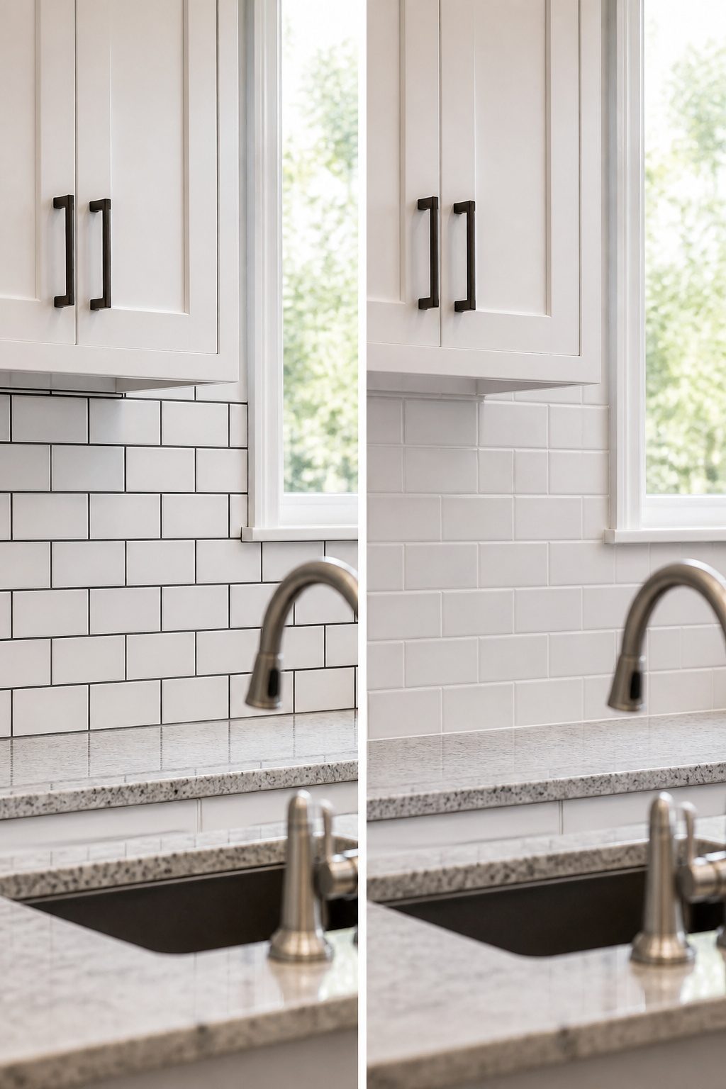
Grout color changes the entire look of any tile you choose, so sampling it against your actual tile and your white cabinets matters more than most people expect. Matching grout softens the joints and lets the tile’s color or texture lead, which works well if you want the backsplash to feel like one quiet surface. Contrasting grout, like charcoal or deep gray against white subway or hex tile, defines every shape and turns even basic layouts into something graphic and intentional. That high-contrast look brings structure without breaking the clean feel of a white kitchen.
Grout width plays its own role: narrower joints keep things sleek and let the tile dominate, while wider spacing makes the grout lines themselves part of the pattern. For stain resistance, especially behind a stove or sink, epoxy grout resists discoloration far better than standard cement-based options. A bright white grout that turns dingy in six months can ruin the whole effect, so the extra upfront effort pays off in a kitchen that actually stays crisp.
Maintenance by Material
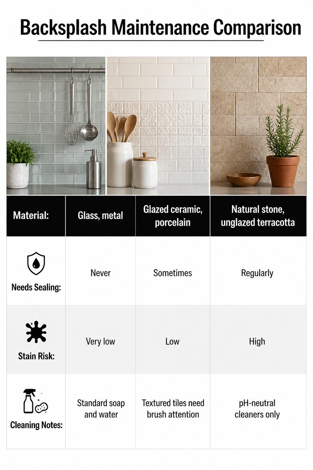
Your backsplash material determines how much of your weekend you’ll spend maintaining it rather than enjoying it. Glass and metal need nothing more than a wipe with soapy water; their surfaces never absorb splatter. Ceramic and porcelain fall into a middle ground where the glazed face cleans easily, though textured patterns can trap grease in their raised details and need a softer brush, not just a cloth.
Natural stone and unglazed terracotta are the ones that demand a schedule. Marble in particular stains from acidic splashes like tomato sauce or lemon juice, and the veining that makes it beautiful won’t protect it. You’ll need to seal it regularly and use cleaners formulated for stone, not whatever spray is under the sink.
| Material | Needs Sealing | Stain Risk | Cleaning Notes |
|---|---|---|---|
| Glass, metal | Never | Very low | Standard soap and water |
| Glazed ceramic, porcelain | Sometimes | Low | Textured tiles need brush attention |
| Natural stone, unglazed terracotta | Regularly | High | pH-neutral cleaners only; seal per supplier guidance |
If you cook daily, factor sealing time into your decision the same way you factor cost. A weekend of cooking with untended stone behind the range can leave marks that no weekend project fixes. Ask your tile supplier specifically how often their stone product needs resealing; the answer varies by finish and porosity, and "natural stone" is too broad a category to trust general rules.
Frequently Asked Questions
What backsplash color looks best with white cabinets?
Soft neutrals, bold colors, and metallic finishes all work well. White subway tile stays the most popular for a reason; it reads classic and the slight tonal shift between glossy tile and matte cabinet paint keeps the white-on-white look from going flat. If you want more personality, deep emerald, electric blue, or even a black backsplash creates sharp contrast that makes white cabinets read crisper.
Should the backsplash be lighter or darker than the cabinets?
Darker backsplashes ground the room; lighter ones recede. With white cabinets, going darker adds depth the space would not otherwise have. A matte black subway tile or even a bold colored inset behind the range gives the kitchen weight without overwhelming it. Lighter options like soft pastels or glass tile keep things airy and open, which works well in smaller kitchens.
What is the most popular backsplash for white kitchens?
White subway tile remains the top choice decade after decade. The 2-by-8 or 3-by-6 rectangles in a running bond pattern give clean lines that read as classic rather than basic, and the slight difference between glossy tile and matte cabinet paint prevents the all-white palette from going flat. It is cheap, easy to install yourself, and forgiving if your walls are not perfectly square.
Can you use natural stone as a backsplash with white cabinets?
Yes, marble and other natural stones are elegant choices that play off the brightness of white cabinets. Carrara marble with its soft gray veining reads intentional rather than accidental against white cabinetry, while Calacatta Gold steps up the warmth with bolder veins that pick up brass hardware. The tradeoff is maintenance: marble needs sealing every six to twelve months and is susceptible to staining from acidic substances.
What backsplash adds warmth to a white kitchen?
Natural materials like wood and warm-toned tiles add the most warmth at eye level where it counts. Reclaimed wood or wood-look tile behind white cabinets brings instant character, while hand-formed zellige or textured ceramic lets shadow do the work that a second color would. Warm-toned terrazzo or soft pastel tiles in eucalyptus or sage also keep the room from feeling sterile without introducing high contrast.