
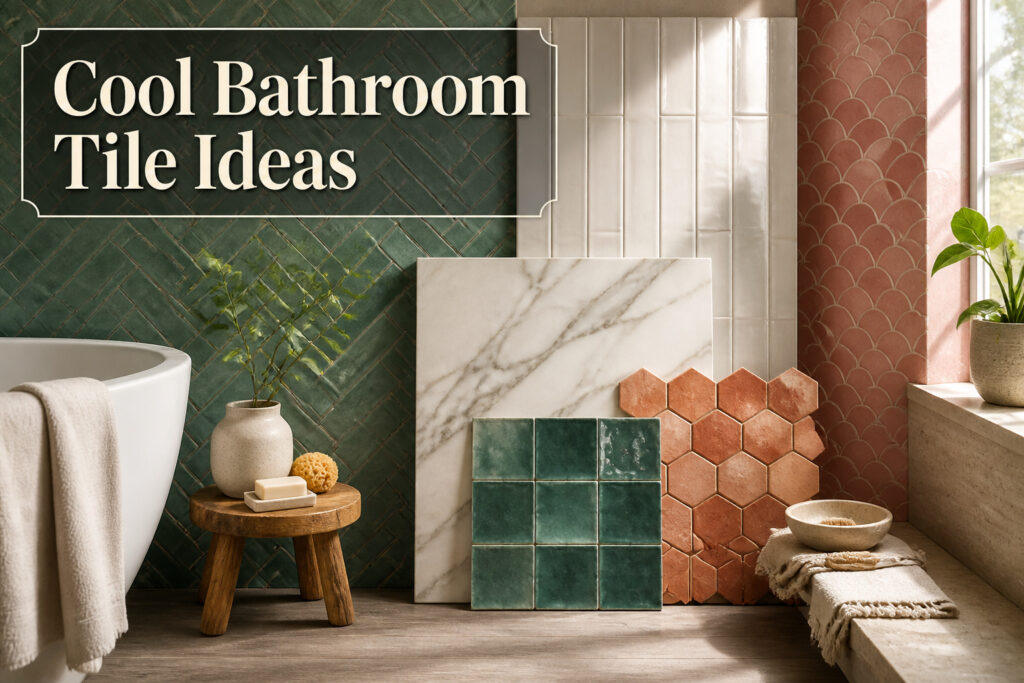

The difference between a bathroom you tolerate and one you actually want to spend time in usually comes down to one surface.
Tile choices range from hand-shaped Moroccan zellige at roughly three to five times the cost of basic subway to a free layout shift, like stacking standard subway tiles vertically instead of in a running bond, that costs nothing extra but changes the whole feel of the room.
What matters most is matching the material to how much maintenance you will actually do: natural marble and travertine need yearly sealing, while stone-look porcelain gives the same warmth without the calendar.
1. Zellige Tiles
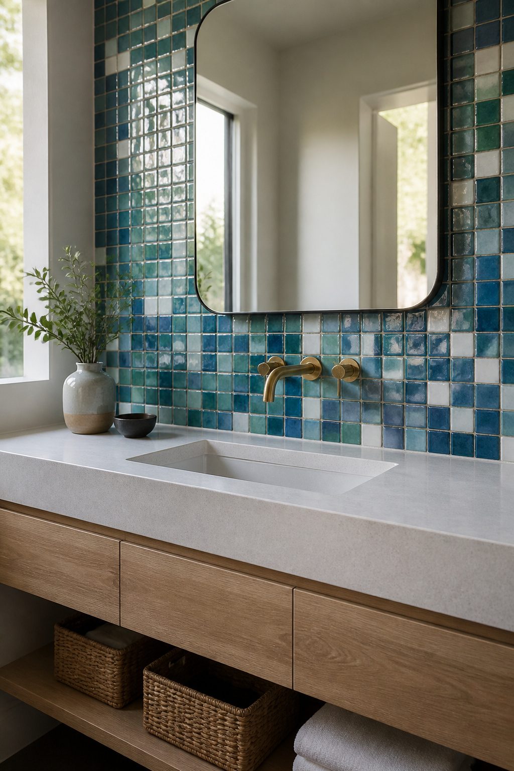
Zellige tiles come from Morocco, where artisans have shaped and glazed clay by hand for centuries.
Each piece carries slight variations in color, thickness, and surface, so a finished wall never looks factory-made. That handmade quality is exactly what makes them one of the cool bathroom tile ideas that keep surfacing in design conversations.
The gloss catches light differently from tile to tile, which gives even a neutral palette depth you do not get from machine-made finishes.
They work best on a feature wall, a shower surround, or a vanity backsplash where the variation reads as texture rather than mess.
A whole bathroom clad in zellige can feel busy, so I would limit it to one surface and keep the rest simple.
The organic nature of zellige tile continues to be a popular choice with designers and homeowners alike.
That popularity means you will find more color options now than five years ago, but the price reflects the labor.
Expect to pay artisan-tile rates, roughly three to five times what basic subway tile costs, and order extra for cuts and the occasional cracked piece in shipping.
For a weekend project on a tight budget, a zellige accent strip or a small niche is a smarter play than a full wall.

PREMIUM PEEL AND STICK TILES MADE IN NORTH AMERICA: Buy local from the market leader in self-adhesive wall tiles. At Smart Tiles, we offer a large selection of easy-to-install, high-quality backsplash tile designs. This 5-pack of tile sheets covers 2.75 sq ft.
PREMIUM PEEL AND STICK TILES MADE IN NORTH AMERICA : Buy local from the market leader in self-adhesive wall tiles. At Smart Tiles, we offer a large selection of easy to install, high quality backsplash tile designs. Each pack of 5 tiles covers 2.77 Sq. Ft.
2. Neat Stacks
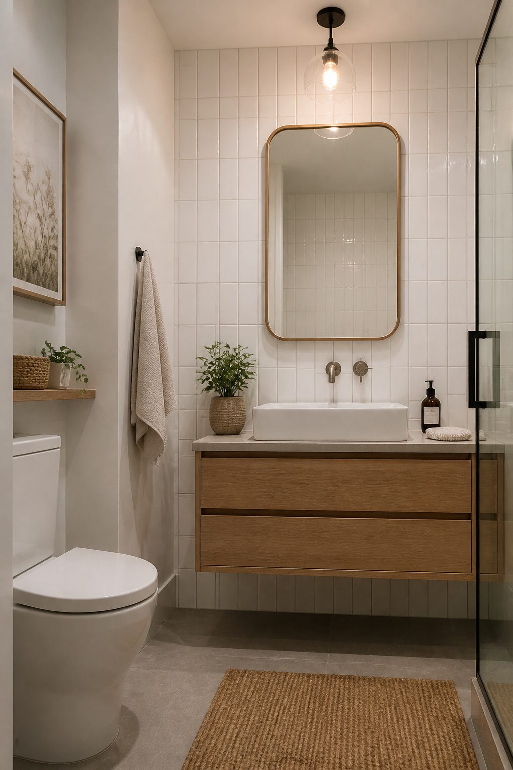
Vertically stacked subway tiles line up edge to edge instead of the usual brick pattern where each row offsets by half a tile. That small shift changes everything.
The eye travels straight up, and a small bathroom suddenly feels taller and more organized. I noticed this first in a friend’s narrow guest bath; the stacked layout turned what could have felt cramped into something almost serene.
The brick pattern, sometimes called running bond, breaks the wall into horizontal bands. It is classic, but it can emphasize low ceilings in tight spaces.
The vertical stack does the opposite, drawing the sightline upward. Best part?
Your tile installer does not charge extra for this. Same tiles, same cuts, same grout, just a different starting point on the wall.
If you are already redoing a backsplash or shower surround, ask for the stack before the first piece goes up. It takes a moment to specify and costs you nothing.

Suitable for all indoor and outdoor walls and floor


Ideal as a Moroccan souvenir or for showcasing pride in Moroccan roots. This design highlights the timeless elegance of Moroccan craftsmanship, making it a meaningful present for travelers, expats, or anyone who loves Morocco
3. Raised-Pattern Wood Looks
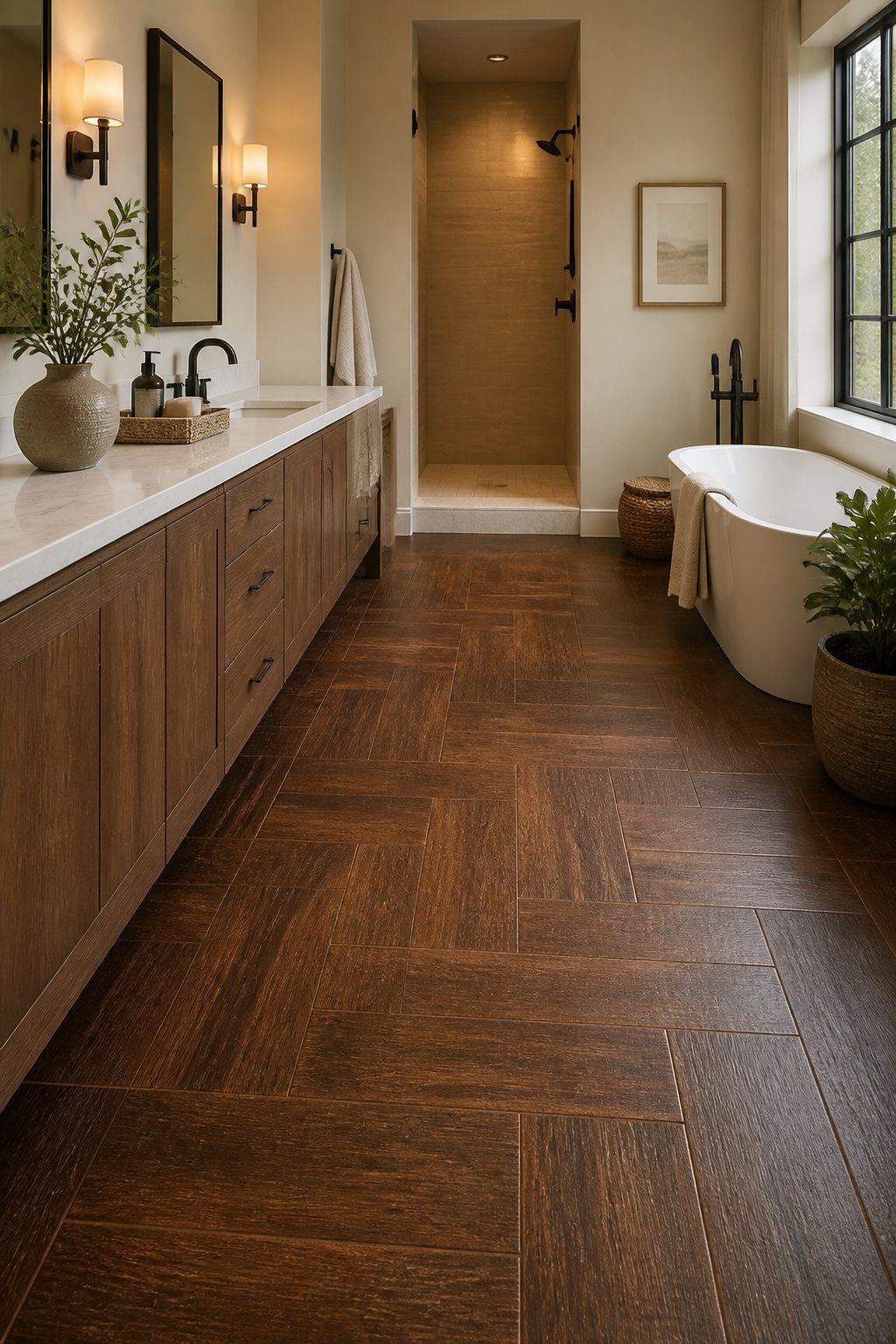
Raised-pattern wood-look tiles give you the grain and knots you want without the swelling, warping, or rot that real wood risks in a bathroom.
Porcelain versions absorb less than half a percent of water, so they handle splashes and steam without fuss. That density also means they hold up to daily traffic without the soft spots or refinishing that actual planks eventually need.
You can run them underfoot where the texture adds subtle grip, or climb the wall behind a vanity for warmth that paint or plain ceramic cannot match.
The raised relief reads as genuine timber from a few feet away, especially in a matte finish that skips the plastic shine older prints carried.
A few sources still push luxury vinyl plank for wet rooms, but porcelain fired at high heat keeps its shape and color longer in my view.
For a weekend project on a tight budget, vinyl works; for a floor you will not revisit in five years, the porcelain wood-look tile wins.

Box Math: 10 pieces cover 1.25 sq ft — 8 tiles per square foot.

【Peel and Stick】Diflart peel and stick glass tiles are self-adhesive design, no grout, no mess, easy to install.

【Peel and Stick】Diflart peel and stick glass tiles are self-adhesive design, no grout, no mess; Simply peel off the backing and apply to any clean and flat surface; A budget-friendly solution that saves time and labor for makeovers
4. All-Over Marble
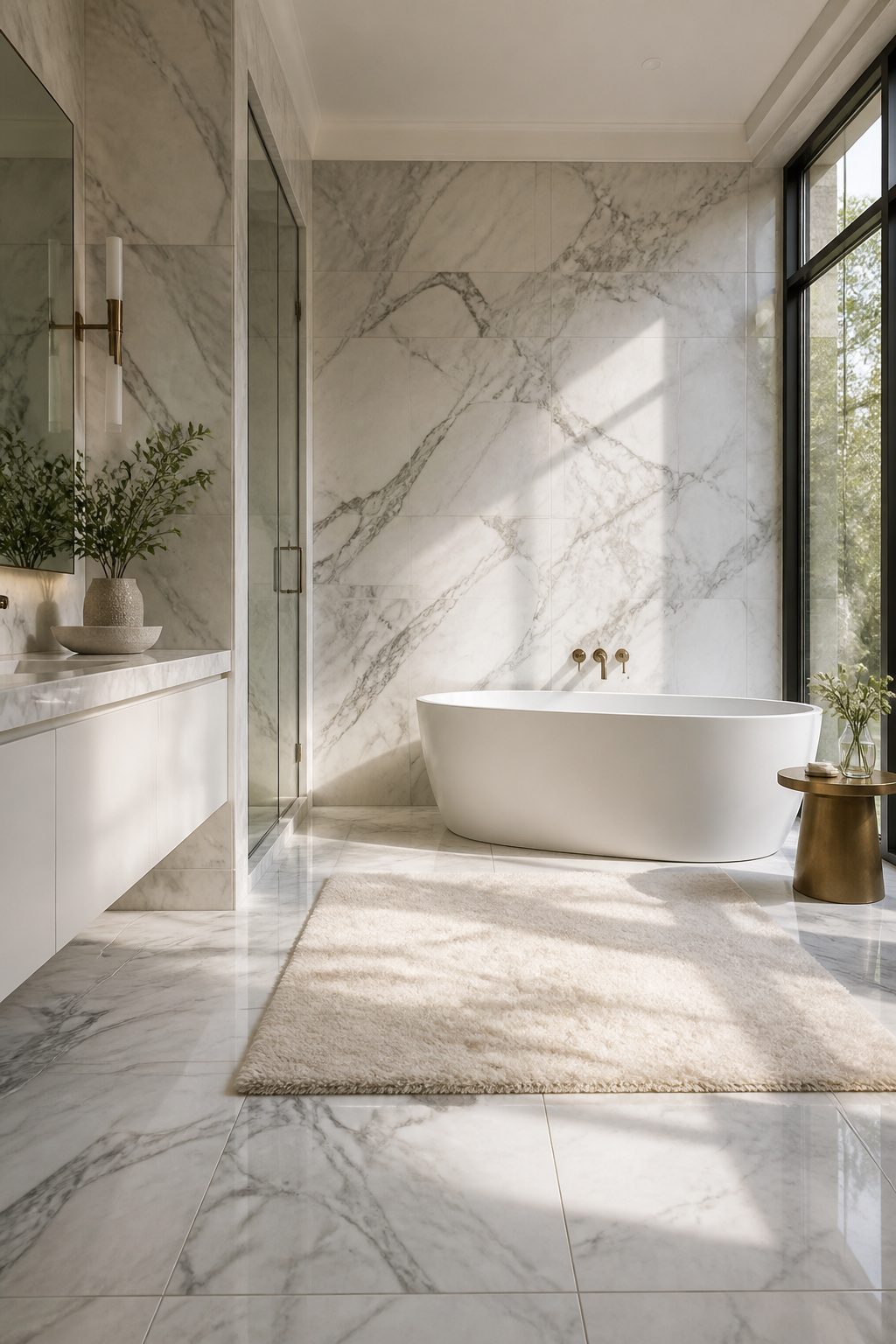
Nothing says luxury quite like marble running from floor to ceiling in a single collection. Each piece carries natural veining that no factory can duplicate, so the result feels custom and quietly expensive.
The catch is upkeep.
Natural marble is more porous than glazed porcelain or ceramic, which means it needs resealing yearly to prevent stains and etching from everyday cleaners and splashes. Skip that step and the creamy surface starts looking tired fast.
For tighter budgets, marble-look porcelain tile offers the same expressive veining with far less fuss. Many styles are nearly indistinguishable from real stone, and you will even find colors nature never produced, like blue, emerald and gold.
The maintenance difference alone makes it worth considering if you are doing the work yourself and do not want another annual chore on the list.

Easy DIY, Just Peel & stick, cut with tin snip, utility knives or hand saws, saving large amount on labor

Upgraded Thicker Build: 2–3 times thicker than regular peel and stick tiles, resistant to tearing and bending for easier installation.

✿ 1.4 Times Coverage Area: 10 sheets thickened self-adhesive tiles, 12" X 12" each (The small piece is 3.3" X 1.8"), which covers 40% more area than 10"x10" tile
5. Curved Tile
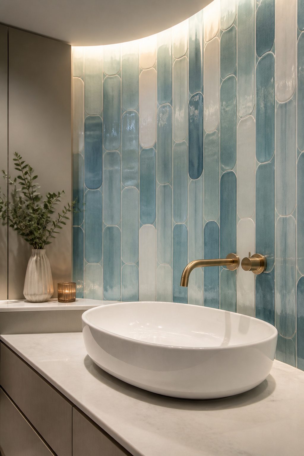
Curved tiles soften a bathroom in a way square ones simply can’t.
The rounded edges break up all those hard lines from vanities, tubs, and shower enclosures, so the room feels less like a grid and more like a place to actually relax.
Penny rounds and scalloped shapes work almost anywhere — backsplashes, shower features, accent walls, even floors if you’re okay with a little extra grout maintenance.
I’ve seen them read retro in one space and quietly modern in another, depending on the colorway and what you pair them with.
Cream or white keeps things calm; a blue or grey can nod to something more coastal without shouting.
Installation takes a bit more patience than standard subway tile. The curves mean more cuts at edges and corners, and you’ll want a setter who’s worked with them before.
The result is worth the slower pace, though. A bathroom with curved tile just feels like someone thought about how you’d feel in it, not just how it would photograph.

Versatile Cleaning Tool:Our pumice stone is suitable for cleaning toilets, bbq grill, pools, bath tubs and ceramic surfaces, powerfully cleans away limescale stain, hard water rings, rust

【Versatile Cleaning Tool】:Our pumice stone is suitable for cleaning toilets, bbq grill, pools, bath tubs and ceramic surfaces, powerfully cleans away limescale stain, hard water rings, rust

6. Japandi Style
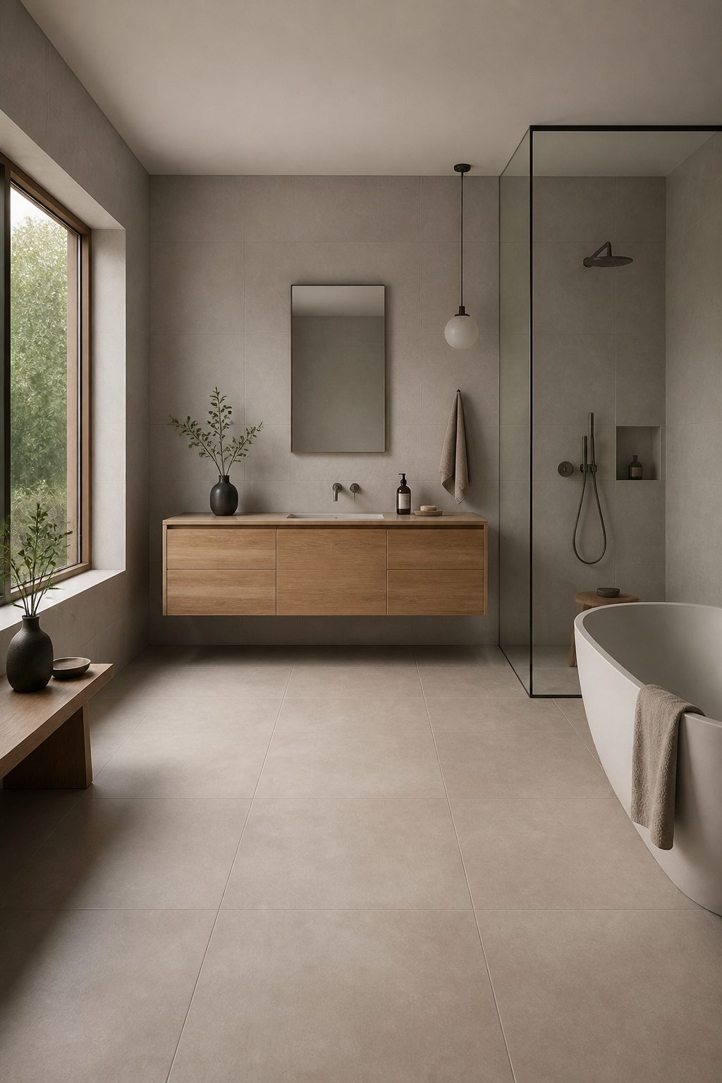
Japandi pulls from two places that both know how to do small spaces well.
Japanese design strips away the extra; Scandinavian hygge adds the warmth back in. The result is a bathroom that feels like a quiet room, not a closet you tolerate.
The palette stays in one lane: beige, sand, taupe, and soft grey.
These aren’t boring choices; they’re what let your eye rest. A sandy-beige tile on the floor with soft grey on the wall gives you enough contrast to see the shape of the room without breaking the calm.
The restraint is the point. Busy patterns fight for attention in a space you want to disappear into.
Natural materials carry the feeling. Think stone-look porcelain, light wood vanities, linen textures.
The Tile Shop’s Hawkdale Willow tile does this with a leafy motif that reads as nature, not decoration. It is minimalism with a pulse.
For a renter’s weekend project, this is forgiving.
Neutral tile covers old layouts that do not match. You are not fighting the room; you are letting it exhale.

𝗧𝗶𝗹𝗲 𝗠𝗮𝘁𝗲𝗿𝗶𝗮𝗹 𝗮𝗻𝗱 𝗙𝗶𝗻𝗶𝘀𝗵: Blue subway ceramic tile with a glossy finish that reflects light and brightens the room. Each piece is kiln-fired ceramic with a glazed face, so the surface is sealed against everyday splashes and wipes clean. Ceramic wall tile is lighter and easier to cut than porcelain, which makes it a practical choice for backsplashes and wall projects.

PREMIUM PEEL AND STICK TILES MADE IN NORTH AMERICA: Buy local from the market leader in self-adhesive wall tiles. At Smart Tiles, we offer a large selection of easy-to-install, high-quality backsplash tile designs. This 5-pack of tile sheets covers 2.75 sq ft.

GENUINE HANDCRAFTED ARTISTRY: Each 10x10 cm tile is hand-molded, kiln-fired, and hand-chiseled by skilled artisans in Morocco using traditional techniques passed down for generations. No two tiles are exactly alike, providing a truly one-of-a-kind luxury aesthetic for your home.
7. Artistic Patterns
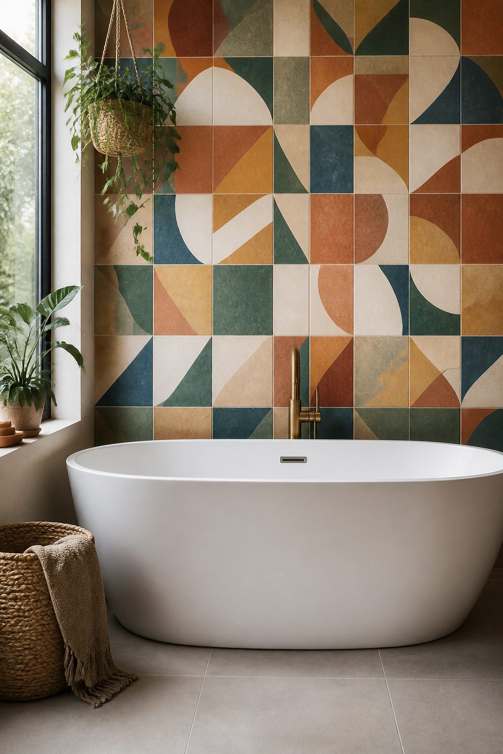
Artistic tile patterns let you treat your bathroom like a gallery wall, but the trick is knowing where to stop. A floor-to-ceiling encaustic print in a five-by-eight powder room will have you reaching for sunglasses with your morning coffee.
I learned that the hard way watching a friend tile her entire guest bath in Moroccan motif; by week two she was already pricing out replacements.
Feature walls and shower niches are the safest bets for bold pattern. The shower niche especially, because it is already a framed rectangle; the eye expects something special there, and the surrounding field tile acts as breathing room.
One solid wall behind a freestanding tub works too, if you have the layout for it.
Mosaic and patterned tiles come in ceramic, porcelain, or cement, so you can match the material to your wet-zone needs.
Cement wants sealing, but it holds those hand-painted-looking designs that ceramic sometimes flattens out. For the rest of the bathroom, large neutral tiles keep the budget sane and the pattern from swallowing the space.
You are not building a museum. You are building a bathroom you can still stand in six months from now.

Authentic Handmade Look – Uneven edges and surface variations replicate the charm of traditional Zellige craftsmanship.

HANDCRAFTED ZELLIGE TILES: Traditional Moroccan clay tiles made by skilled artisans, featuring a rich caramel-colored glossy glaze.

Premium Quality Ceramic – High-quality ceramic construction with a durable matte glaze and subtle shimmering effect, delivering long-lasting beauty and refined texture for interior wall applications.
8. Color Drenching
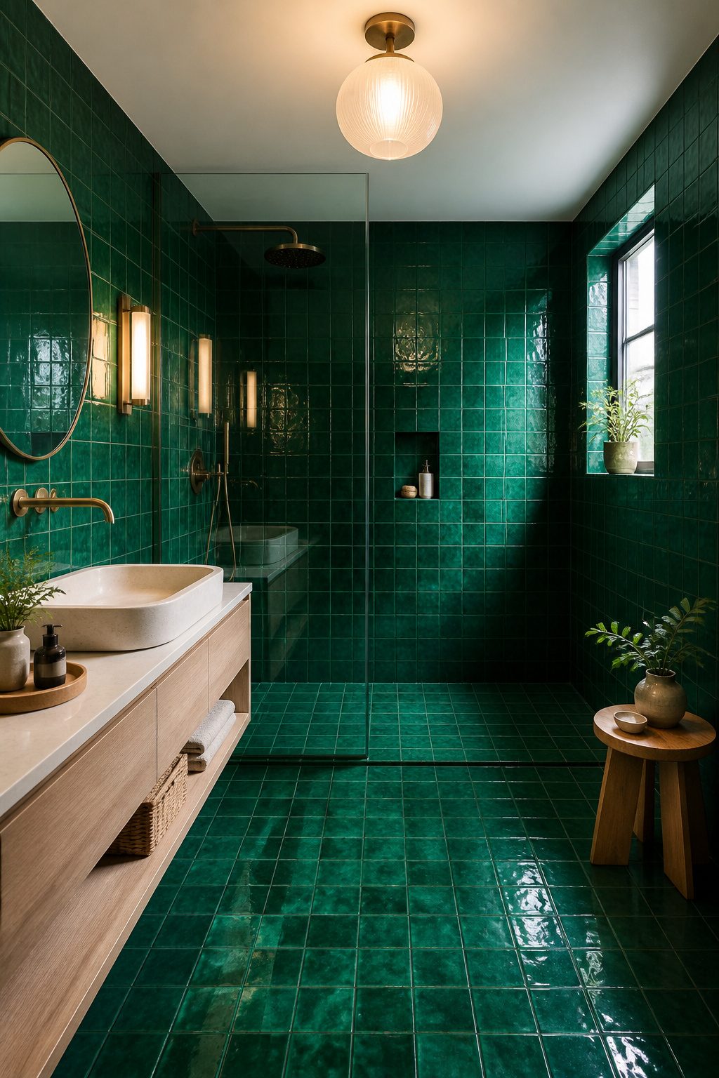
Color drenching hits different with tile than with paint. Paint sits flat, but tile gives the same saturated color texture and shadow lines, so the room feels layered instead of flat.
The Alison Victoria Gem tile does this in emerald, carrying one tone from wall to floor to shower seat without a single break.
The bathroom is the one room where this trend actually makes sense long-term.
Steam, splashes, and daily wear punish paint, but glazed tile shrugs it off. For a weekend project on a few hundred dollars, you are buying durability alongside the look.
Grout matching extends the effect. When the grout lines share the same tone as the tile, the surface reads as one continuous plane rather than a grid of squares.
Whisper Grey grout against Ashford Carrara marble works the same way, softening the edges so the eye travels across the whole wall. That tonal blend is what separates a bold choice from a loud one.

𝐏𝐫𝐞𝐦𝐢𝐮𝐦 𝐌𝐚𝐭𝐞𝐫𝐢𝐚𝐥𝐬:Made of PVC composite laminate, anti-scratch, high impact, color fadeless, more durable and stronger than other plastic self-adhesive tiles. Brushed surface finishing with realistic look, high waterproof and stain-resistant performance, protect the walls from splash and iol.

Timeless Subway Style – Classic white ceramic subway tile with an elongated 4-1/4" x 16" size for a sleek, modern twist on a traditional design.
MODERN WALL DECOR: These sleek 2.58 x 8 in. ceramic subway tiles create a modern finish in bathrooms, kitchens, and more. Each pack covers 5.38 sq. ft., making it easy to calculate material needs.
9. Neutral Patterns
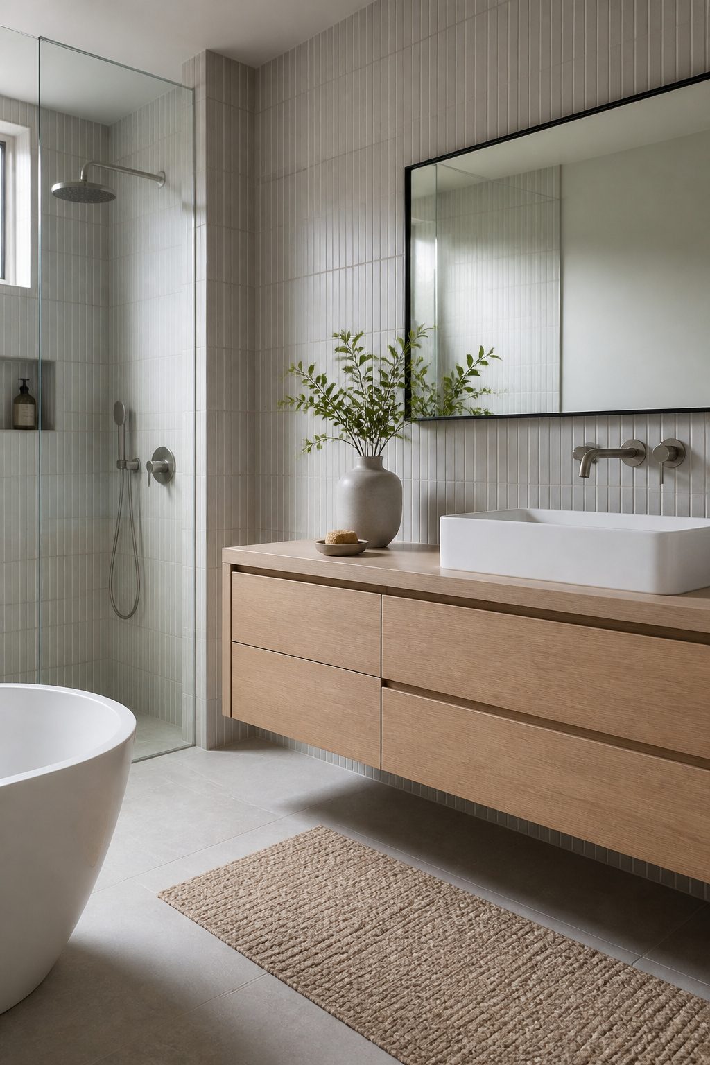
Neutral patterns in neutral colors are the safest bet for a bathroom you will not want to redo in five years.
A quiet grid, a soft diamond, or a pinstripe in white and barely-there gray adds just enough movement to keep the room from feeling flat without shouting for attention.
These are the patterns that read as texture first and pattern second, which means they do not fight with your towels or your mirror frame.
The real payoff comes when you are ready to sell or when you simply change your mind.
A bathroom tiled in a loud trend dates itself fast. A bathroom with restrained pattern in a neutral palette stays calm and looks intentional long after the install day.
That matters for renters who want their deposit back and for first-home owners who might list the place sooner than they planned.
Concrete tile with a matte finish works especially well here. Unlike glossy ceramic, it catches light softly, and a vertical pinstripe can stretch the walls upward in a room with high ceilings.
If you prefer something warmer, natural stone with a muted diamond motif gives you the same quiet interest with an organic feel.
Either way, you are building a backdrop, not a statement piece. That is exactly what indecisive decorators need: a choice that keeps working even when everything around it changes.

𝐏𝐫𝐞𝐦𝐢𝐮𝐦 𝐌𝐚𝐭𝐞𝐫𝐢𝐚𝐥𝐬:Made of PVC composite laminate, anti-scratch, high impact, color fadeless, more durable and stronger than other plastic self-adhesive tiles. Glossy/Poished surface finishing with realistic ceramic look, high waterproof and stain-resistant performance, protect the walls from splash and iol.

Easy to install: These wall tiles are simple to install—just peel and stick, no extra adhesive required.

100 sheets solid PVC tiles, 2.95"x5.9"x0.12" each, cover 12.11 square feet. This simple subway pattern is easier to install and plans the layout freely to your imagination.
10. Boho Chic
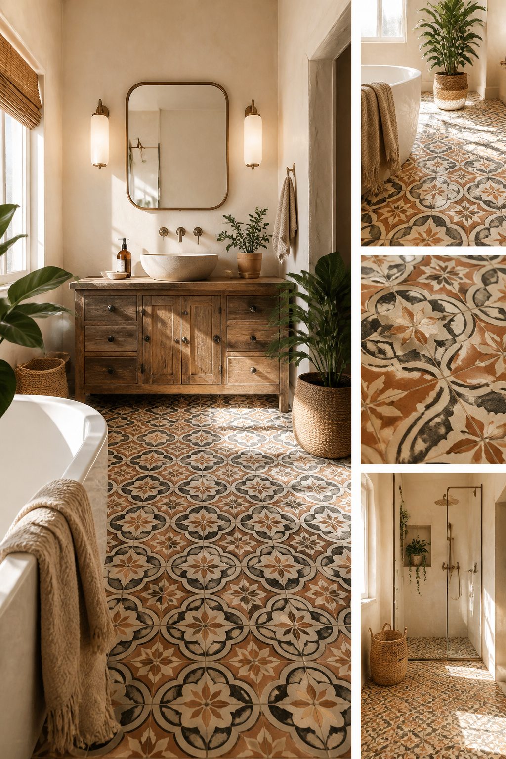
Encaustic tiles are the classic starting point for a boho bathroom. These patterned tiles date back centuries, with artisans pressing colored clay into designs that run all the way through rather than sitting on top.
That depth means the pattern stays visible even as the surface wears, which is why old Mediterranean floors still look good after decades of foot traffic.
Modern versions swap cement for porcelain or ceramic, so you get the same interlocking circles and Moorish florals with better water resistance and less sealing.
I have seen the Brielle 8×8 in Nouveau Stone paired with brass fixtures and a white vanity, and the brown-and-cream geometry holds its own without fighting the room.
The trick to mixing patterns is keeping one element constant.
Pick a color thread and repeat it, or alternate a busy floor with plain walls. Handmade-look tiles like Marrakesh Blue in a checkerboard layout work because the two tones talk to each other instead of competing.
One bold surface per room is usually enough. Two can work if they share a palette; three turns into visual noise fast.

Equipped with extended grip handle to keep your hands away from dirty water and grimy messes during cleaning. The handle fits naturally in your palm to bring a steady, comfortable cleaning experience without uncomfortable bending or direct contact with stains.

Clean surfaces quickly and easily-porcelain, hard water stains, pool tiles, flush toilets, barbecue grills, steel and stone.

2-PACK PUMIE SCOURING STICKS, POWERFUL, CHEMICAL-FREE CLEANING SOLUTION – Eliminate tough stains and stubborn buildup with this 3-pack of Pumie Scouring Sticks. Perfect for removing hard water deposits, rust, and grime from toilet bowls, porcelain sinks, bathtubs, and tile surfaces. These heavy-duty pumice sticks clean deeply without harsh chemicals or scratching surfaces, making them ideal for both residential and commercial cleaning jobs. Whether you’re maintaining a spotless bathroom or tackling janitorial cleaning tasks, these pumice stones deliver professional results where traditional cleaners fall short.
11. Grid-Patterned Subway Tile
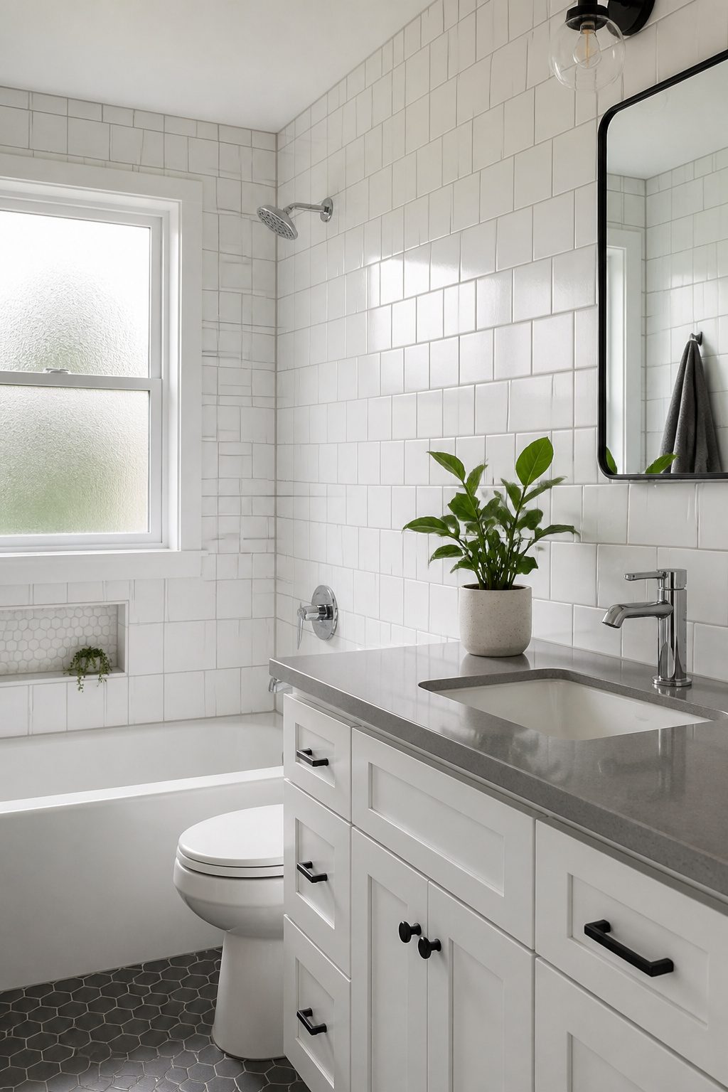
The classic subway tile most of us picture is set in a running bond, where each row shifts by half a tile so the joints never line up.
A grid pattern stacks the tiles dead even, corners meeting corners in straight vertical and horizontal lines. That small change reads as much more current.
The running bond has been the default for a century because it hides slight size differences in handmade tile.
Modern manufacturing is tighter, so the grid works without looking sloppy. Visually, it pulls the eye straight across the wall rather than staggering it, which feels calmer and a little more architectural.
Best part: if you already have subway tile in a running bond, you do not need new material. The tiles come down and go back up the same day in the new layout.
Grout lines shift from brick-style to a clean lattice, and the whole bathroom feels like someone thought about it on purpose. It is the kind of update that costs nothing but reads like a renovation.
12. Travertine
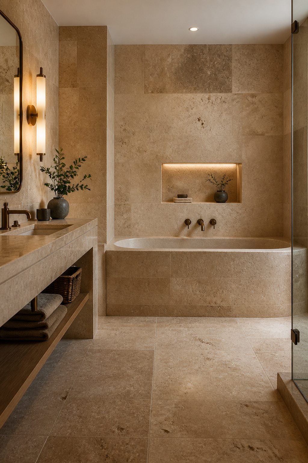
Travertine is having a moment again, and I get why.
Each tile carries its own veining and pitting, so no two pieces match. That individuality is what makes a bathroom feel personal rather than catalog-ordered.
The catch is the upkeep. Travertine is porous, meaning it will drink up water and stains unless you seal it on schedule.
Plan on resealing every year or so in a bathroom that sees daily steam and splashes. Skip that step and the surface dulls fast.
If you love the look but not the maintenance, stone-look porcelain gives you the same warm, earthy palette without the sealing calendar.
It is harder to tell apart from the real thing these days, and it handles wet feet with less worry.
For a bathroom that already leans warm, with brass fixtures or creamy walls, travertine fits right in. The natural browns and soft greys pull the room toward that spa-calm feeling without trying too hard.
13. Mix Colors, Textures, and Shapes
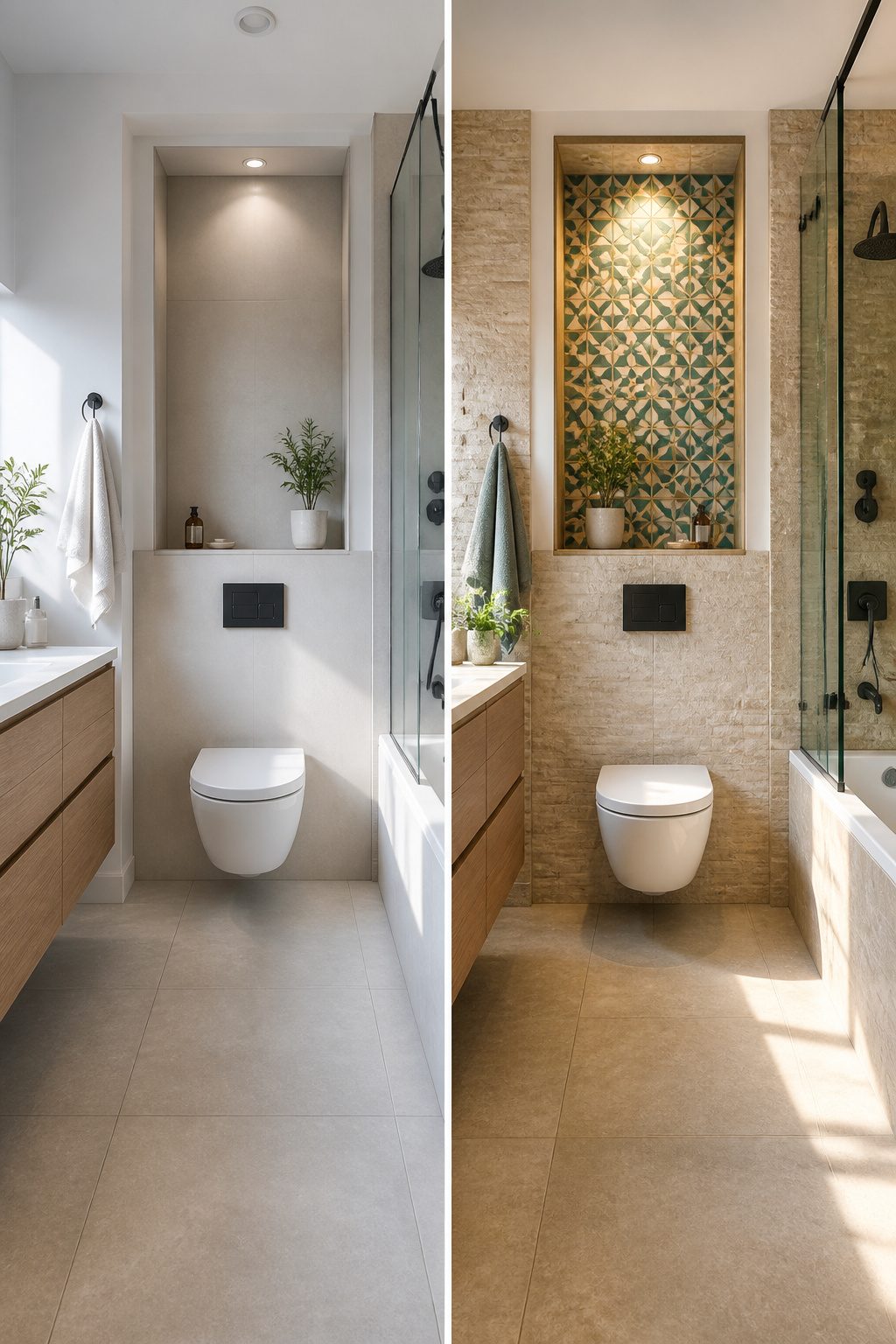
Mixing tiles is where a bathroom stops looking like a showroom and starts feeling like yours. The trick is giving your eye enough to notice without making it work too hard.
Pair smooth with rough, matte with glossy, or large with small.
A matte ceramic next to a glossy finish catches light differently, so the wall has life even in a single color. Rough stone beside sleek porcelain does the same thing with texture instead of sheen.
The safe formula that keeps it from turning chaotic: limit yourself to three elements total.
That might mean two tile types plus your paint, or shape plus texture plus color. Once you hit four, the room starts to feel like a sample board.
I like to start with one anchor tile, usually the one that covers the most area, then build around it.
Large neutral tiles on the floor give you freedom to play with a patterned niche or a textured accent wall. The niche is low risk because it is small, but it still reads as intentional design rather than leftover tile.
If you are nervous about commitment, keep your wild card to one spot: the shower wall behind the fixtures, the floor of a powder room, the face of a single step.
You get the visual interest without the overwhelm of living inside a pattern you might tire of in a year.
14. Accentuate with Trim
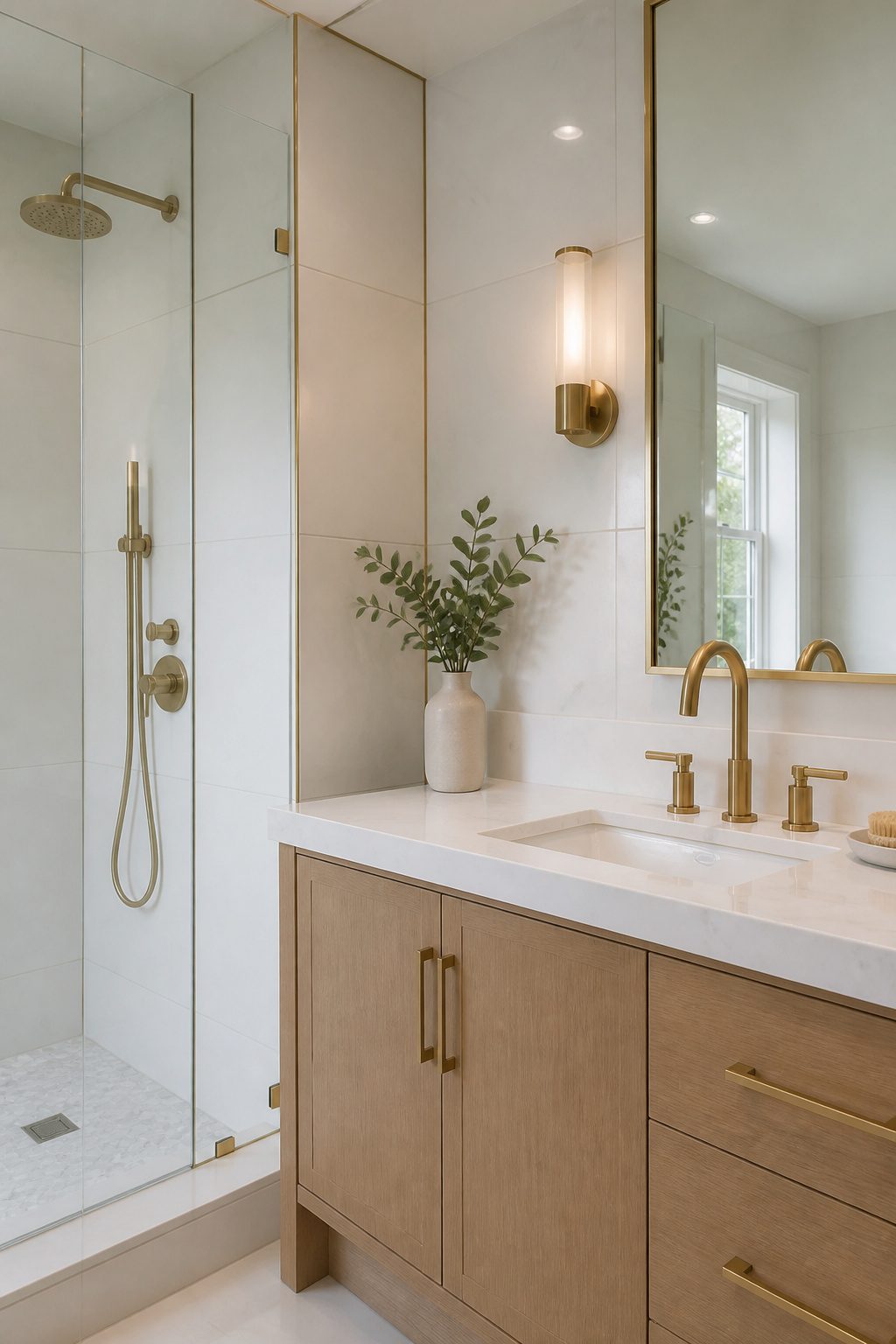
Trim pieces are the small details that make a tile job look finished instead of obviously DIY.
They are the narrow strips that cap the raw edge of a field tile where it meets a wall corner, a window frame, or the floor.
Without them, you see the rough cut side of the tile, and no amount of careful grouting hides that.
Schluter strips are thin metal profiles that sit under the edge of the tile and provide a clean, modern line. They work especially well with large-format or rectified tiles that do not have their own finished edge.
Bullnose tiles, on the other hand, have one rounded edge built in. They are the traditional choice for wrapping a corner or topping a wainscot, and many subway tile lines include matching bullnose pieces.
I have learned to order trim at the same time as the field tile, not as an afterthought.
Running short on a matching bullnose or discovering your tile line has no coordinating trim is the kind of mistake that turns a weekend project into a multi-week wait for a small box of special-order pieces.
Black trim against white subway tile, or a brass Schluter strip against matte gray porcelain, can also act as a deliberate accent rather than just a practical finish.
15. Coastal Chic
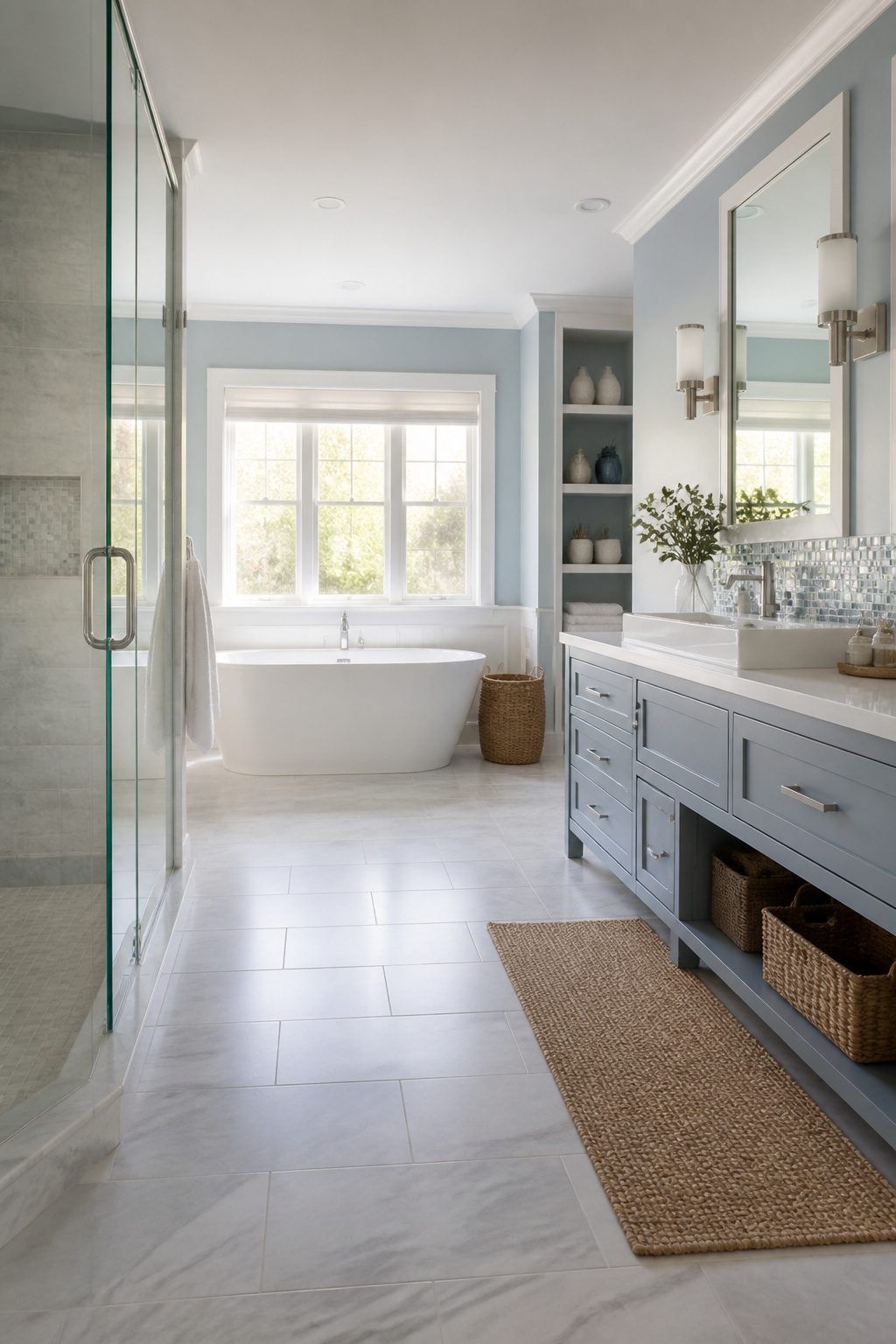
Cool blues, crisp whites, and sandy hues set the palette for a bathroom that feels beachy without going overboard.
The trick is keeping it calm enough that you don’t walk in and feel like you’re on a carousel at a boardwalk.
Glass tiles earn their place here for the way they catch light, almost like water shifting on a wall.
A basketweave mosaic with subtle color shifts, watery blues and greens running into grays and cream, does the heavy lifting without any anchors or rope prints. That reflectivity is what sells the coastal vibe, not literal seashells.
Materials matter too.
Carrara marble in a herringbone floor pattern reads spa-like and coastal at once, warm and cool at the same time. Pair it with a glossy glass backsplash and the room feels pulled together rather than themed to death.
Skip the nautical patterns entirely if you want this to last past next summer.
Sandy neutrals and oceanic tones do the work; red stripes and anchor motifs turn it costume-y fast. Rose-colored glass tiles stacked vertically can even act as a neutral, softening the space without screaming beach house.
The line between relaxed and tacky is thinner than you’d think, and staying on the right side mostly means letting the materials speak instead of the motifs.
16. Geometric Floral Patterns
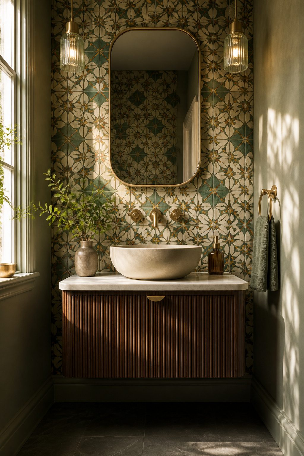
Geometric floral tiles take the soft look of traditional botanical prints and give them a graphic edge. Instead of realistic petals and leaves, you get stylized shapes arranged in repeating patterns that feel more modern and a lot less fussy.
This hybrid style works especially well in a powder room, where the small footprint lets you take a risk without committing to a whole bathroom’s worth of pattern.
The tile itself carries the design, so you do not need much else on the walls.
Porcelain and ceramic versions now replicate the look of old cement tiles while handling moisture better and needing less upkeep.
I have seen them paired with brass fixtures and a simple white vanity, and the combination lands right in the middle of heritage charm and clean contemporary lines.
If you want nature inside but prefer something more structured than a literal garden on your wall, this is the move.
17. Wood-Look Flooring
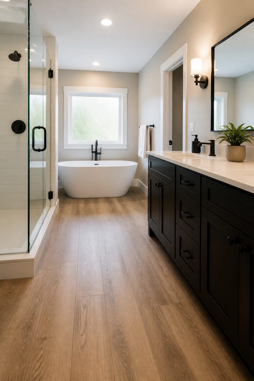
Porcelain planks that mimic wood grain have gotten so convincing that guests will tap them to check. The water absorption rate stays below 0.5%, which is why these work where real hardwood warps and swells.
I have seen them run from narrow strips that look like old farmhouse oak to wider boards that read more modern, and the plank size you pick changes the whole feel of the room.
The grout line is where the illusion lives or dies.
A thin joint, color-matched tight to the tile, lets the planks read as one continuous floor. Go too wide or too light with the grout and the eye catches every break.
Real wood in a bathroom is a maintenance headache I would not wish on anyone.
Porcelain gives the warmth without the worry, and the textured or matte finishes available now keep it from getting slick under wet feet. For a weekend project on a real budget, this is the swap that pays off every morning.
18. Midcentury Modern
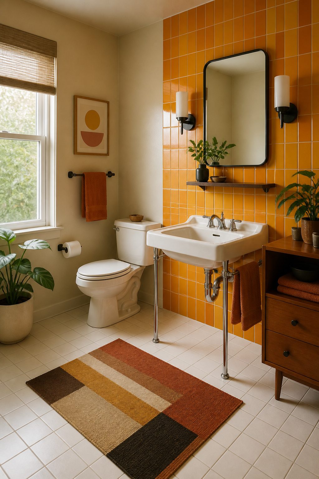
Midcentury bathroom tile pulls from the same clean lines and optimism you see in vintage furniture, but scaled for wet walls. The palette leans warm: mustard, avocado, burnt orange, and soft turquoise against white or natural clay backgrounds.
These aren’t the colors you’d pick for a spa retreat, but they carry a specific cheerfulness that reads as intentional rather than dated when the layout stays disciplined.
Starburst and atomic motifs show up most often in accent strips or a single feature wall, not across the whole room.
A small repeating starburst in black and cream can anchor a shower niche without shouting. The trick is keeping the rest of the field plain so the pattern has room to breathe.
Geometric layouts matter more here than in other styles. Stacked squares or offset rectangles in uniform sizes keep the look sharp.
I would skip the running bond subway pattern for this one; the staggered edge fights the era’s preference for visual order. Instead, a grid of 4-inch squares or a vertical stack of larger rectangles feels right.
For a weekend project on a few hundred dollars, focus on one bold move: a starburst border at eye level, or a single wall in period color with the rest in warm white. The restraint is what sells it.
19. Large-Format Tiles
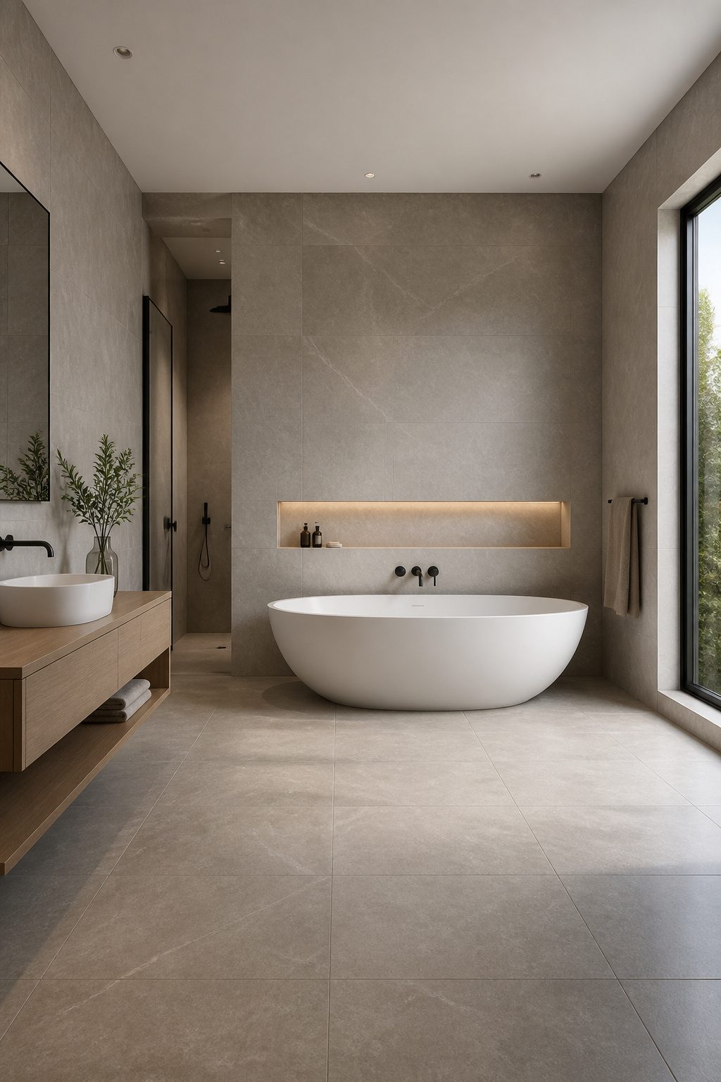
Large-format tiles are as big as 48 inches by 48 inches, and they do one thing smaller tiles can’t: they almost erase the grid of grout lines that usually breaks up a bathroom wall.
I came around to these after seeing how a single sheet of stone-look porcelain changed a cramped guest bath from busy to calm.
The payoff is real maintenance, not just looks.
Grout is porous. It stains.
It collects mildew in a steamy room. Cut the grout by two-thirds and you’re cutting the scrubbing by two-thirds too.
The face of the tile stays smooth, and the surface reads as one continuous plane. That visual continuity also tricks the eye into seeing more square footage than you actually own.
Here’s where I’d pump the brakes if you’re doing the work yourself. A 48-inch tile is heavy, awkward, and unforgiving.
Walls have to be flat; any bow in the studs telegraphs straight through. Thinset coverage has to be near-perfect; you can’t press and wiggle the way you would with a subway tile.
If your walls are older plaster or you’ve got lumpy drywall, the prep time before you set the first tile can eat your whole weekend.
For a first-timer, I’d split the difference with a 24-by-48 instead. Same cleaner look, half the wrestling match, and you still get that seamless feel the search results keep promising.
20. Unexpected Checkerboard
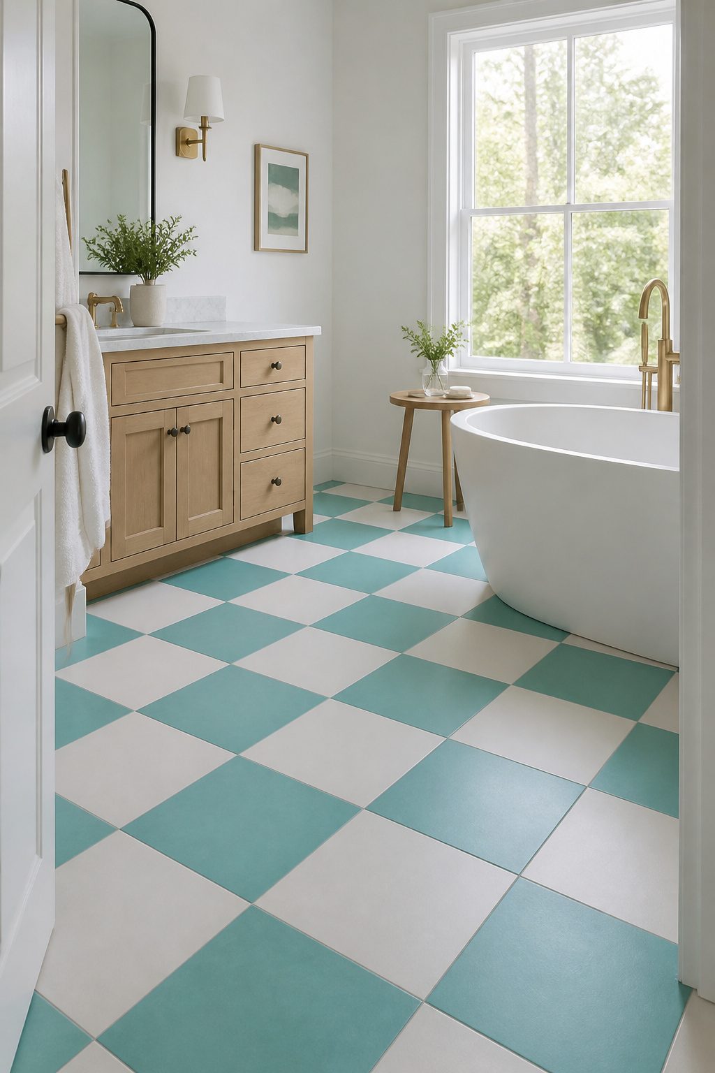
Checkerboard tile is back, but it does not look like your grandma’s floor anymore. The classic black-and-white pairing has loosened up into updated color combinations like turquoise and white, or warm wood tones against crisp Arctic White.
Scale shifts the whole mood: tiny two-inch squares feel handmade and busy, while larger blocks read calmer and more modern.
Stone checkerboard raises the refinement even higher, swapping ceramic gloss for matte limestone or travertine that soaks up bathroom light rather than bouncing it back.
I would use stone on a floor where you want quiet luxury, and save the brighter color mixes for a shower niche or a powder room wall where the risk stays small.
21. Ornate Patterned Floor Tile
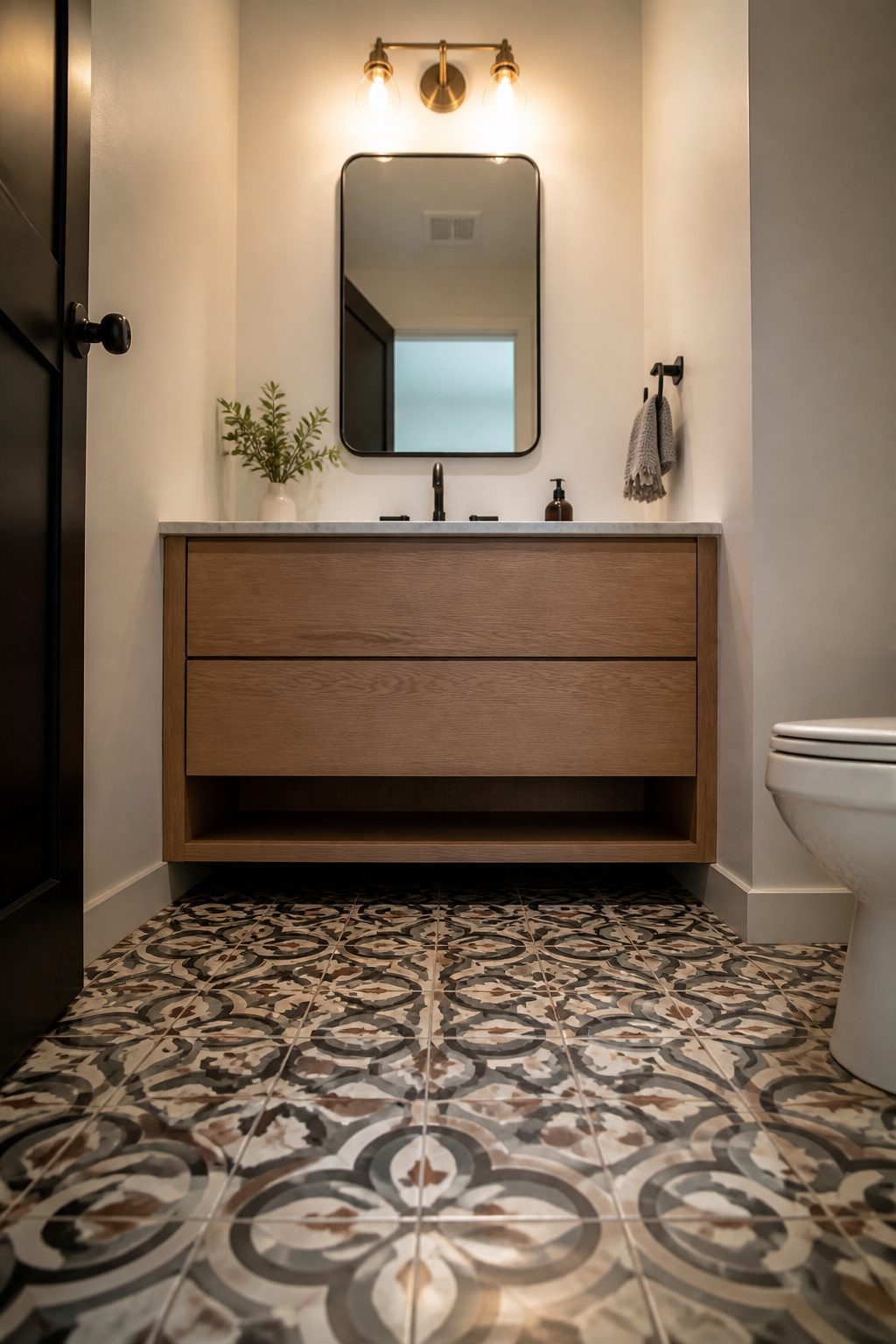
Ornate patterned floor tile is where I put my money when a bathroom needs personality but the budget does not stretch to custom everything.
Intricate designs, the kind with interlocking circles or floral geometry, add visual interest that plain tile simply cannot match.
The trick is pairing a busy floor with calm walls: white subway tile, a simple vanity, nothing competing for attention. Let the floor be the one bold move.
Small floors make the ideal canvas. A powder room or a compact guest bath has just enough square footage to commit to a striking pattern without the cost spiraling.
You get the impact, and you are not buying enough tile to drain the weekend fund. Modern porcelain versions replicate the look of old cement tile, and they handle moisture better too, so the beauty lasts past the first year.
This is one of those upgrades that pays off in spaces guests actually see.
A powder room is half the square footage of a master bath but gets judged just as hard. The patterned floor does the design work so the rest of the room can stay simple and cheap.
22. Customized Patterns
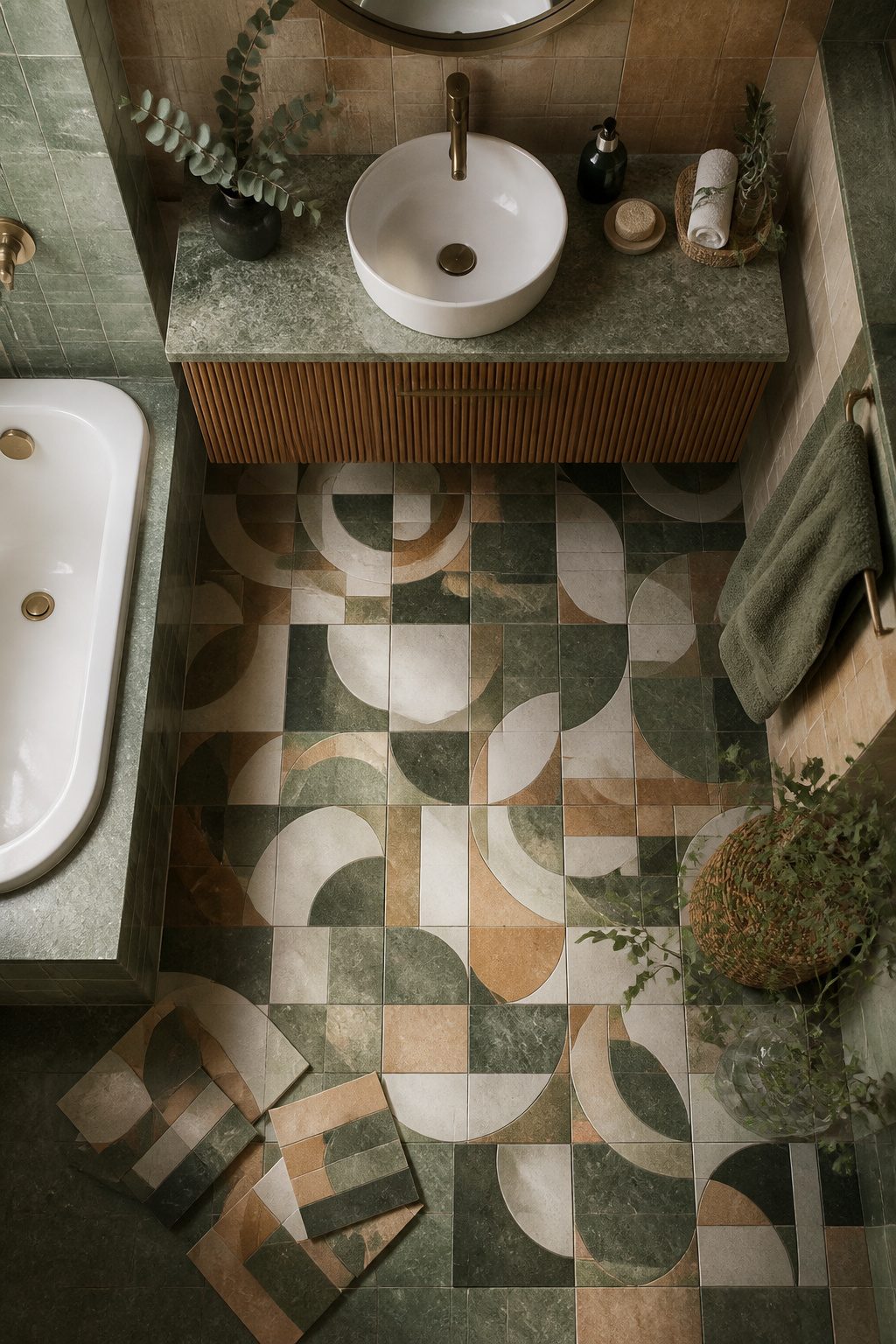
A custom pattern does not have to mean custom money. Start with graph paper and a pencil.
One square equals one tile. Move the pieces around until the rhythm feels right, then tape actual tiles to a scrap board to see how the light hits the joints.
Penny rounds and hexagons are forgiving shapes for this. They come in uniform sizes and enough colors to build something you will not see in a neighbor’s bathroom.
Herringbone and chevron work too, but they demand more precision. The cuts multiply fast, and a wall that looked lively on paper can look busy once it is half done.
A dry layout on the floor saves the project.
Lay the full field before you mix any thinset. You will spot the awkward seam or the spot where a color lands wrong.
Complex cuts around valves or niches are where I would call a pro for a day. You are still doing the pattern yourself.
You are just buying a clean edge where a rented saw would chip the glaze. That split keeps the budget in weekend territory and the result in custom territory.
23. Picket-Shaped Tile
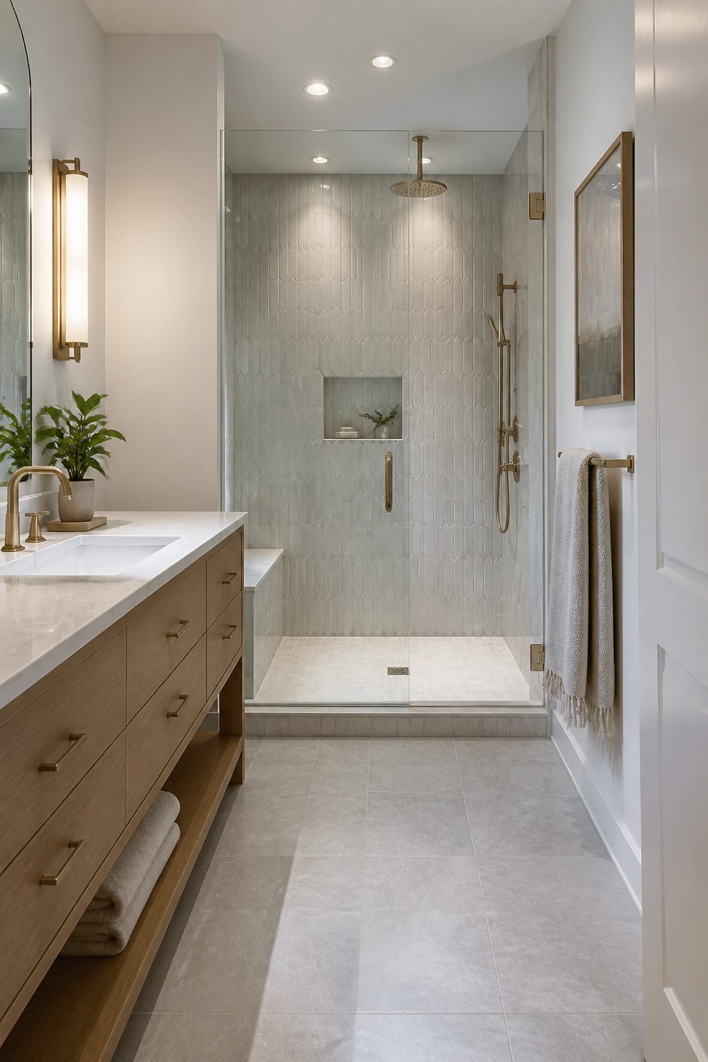
Picket-shaped tiles stretch a regular hexagon into something longer and leaner, like a fence picket cut from six-sided stock.
The shape keeps the gentle angles of a standard hex but drops the squat, honeycomb feel that can read busy on a large wall.
I like them run vertically on a shower surround because the eye travels with the point, and a narrow bathroom suddenly has somewhere to go.
Flip them horizontal and the same tile widens a short wall, which works behind a vanity where you want the room to feel grounded.
The offset stagger, not a stacked grid, is what makes the movement happen; the points catch light differently as you walk past.
Installation takes more cuts than subway tile because the edges are not straight, so budget extra tile for waste and do not assume your contractor’s standard 10 percent will cover it.
The shape also demands a tighter grout line, since wide joints break the clean lines that make the tile worth choosing in the first place.
24. Ultra-Luxe Marble-Look Tile
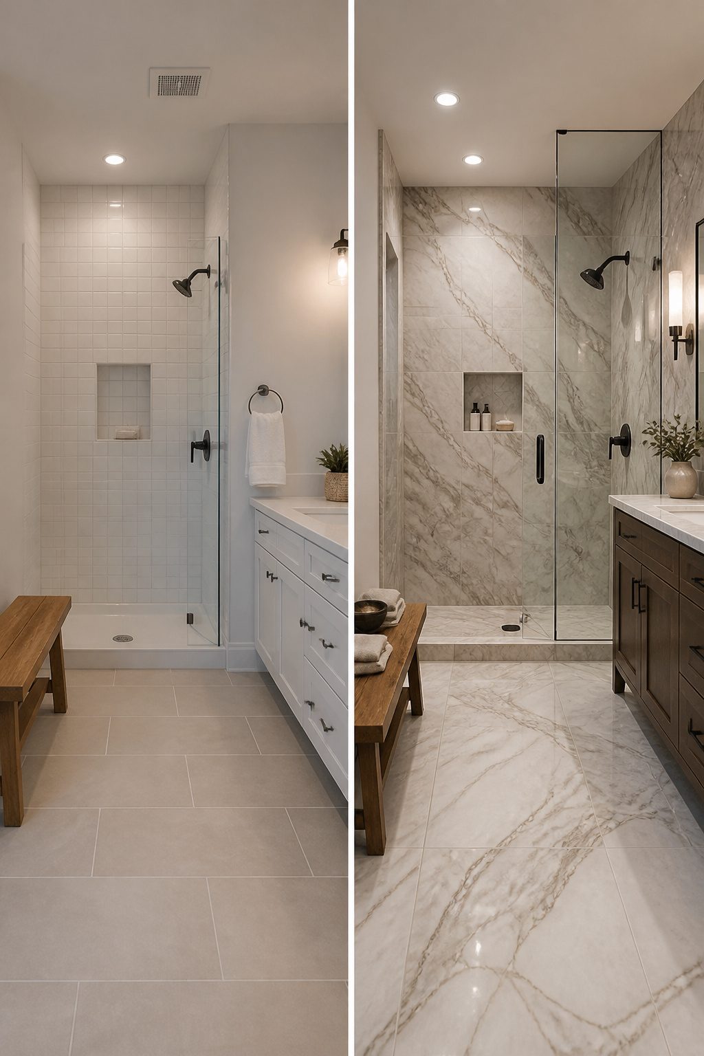
The printing on marble-look porcelain has gotten good enough that I have to look twice to tell the difference.
Veining now moves across the tile the way real stone does, with variation from piece to piece instead of that repeating pattern that used to give it away.
Some lines even carry colors you would not find in nature, blue and emerald and gold, if you want the luxury feel without the museum-quiet upkeep.
Real marble needs resealing every year and still stains or etches the moment something acidic sits too long.
Porcelain solves that outright. The surface is already sealed, non-porous, and indifferent to lemon juice or hair dye.
Price is the quieter win. Natural Carrara runs several times what the porcelain version costs per square foot, and that gap widens when you factor in the sealing products and the professional labor to keep it presentable.
For a weekend project with a few hundred dollars, this is the look that reads expensive but lives easy. The tile is durable enough for floors and walls both, and the maintenance is basically mop and go.
I would still check slip ratings before buying for a shower floor, wet porcelain is still porcelain, but that is a quick filter when you order samples.
25. Stone Checkerboard
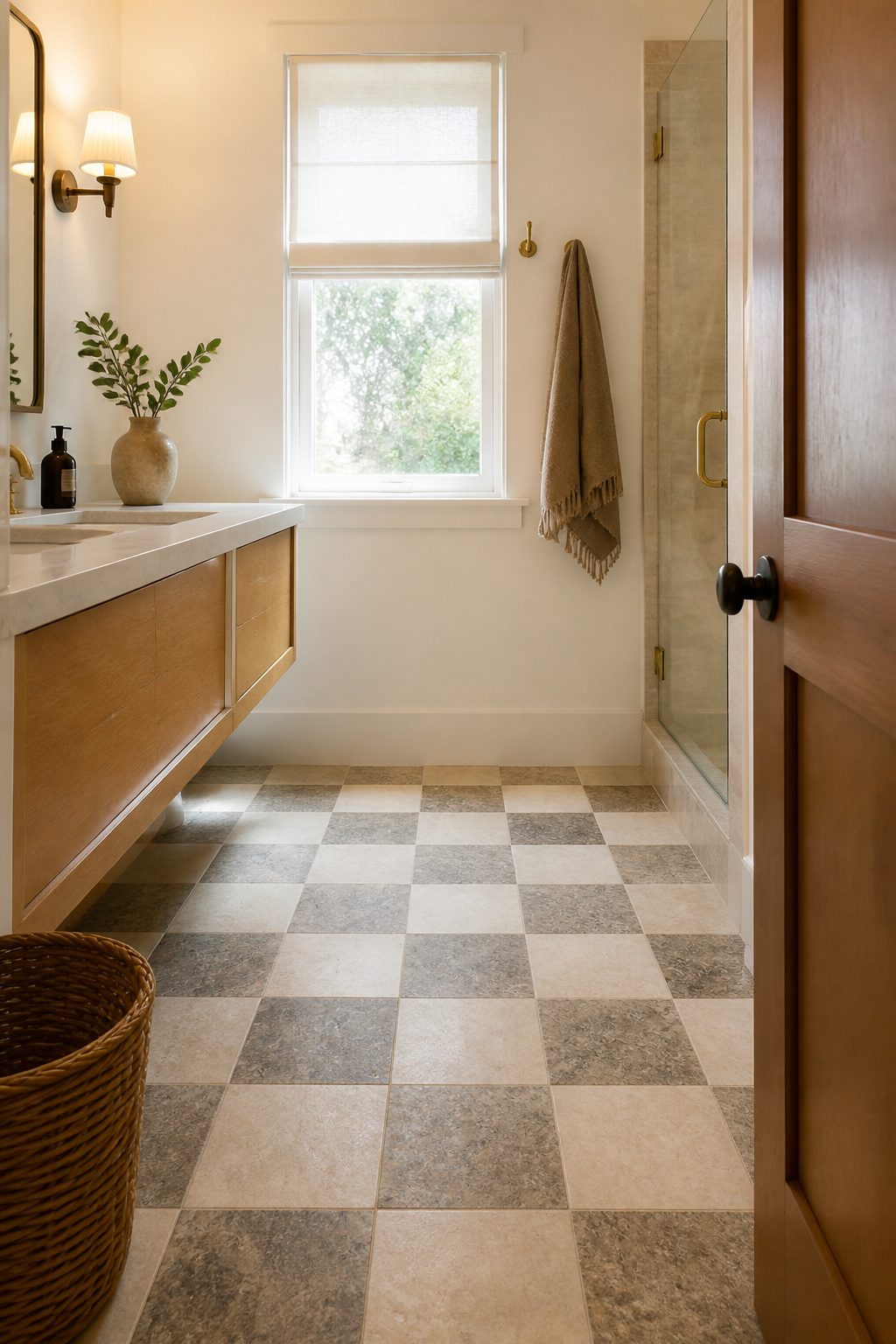
A checkerboard floor reads as busy fast. Stone quiets it down.
Travertine and limestone do the heavy lifting here. Both stones carry natural tonal variation, so the light and dark squares feel related rather than opposed.
One tile might read oatmeal, another sand, a third something closer to wet clay. That range keeps the pattern from flattening into a diner floor.
The tradeoff is maintenance. Stone absorbs water and stains unless you seal it, and you will need to reseal it regularly.
It also runs cooler underfoot, which matters on winter mornings. I would budget for underfloor heating or at least a slip-resistant finish if this is the route you choose.
For a weekend project with a few hundred dollars, stone checkerboard is probably out. But if you are tiling a small powder room or a shower floor you will look at daily, the warmth pays for the care.
26. Marble Mosaic
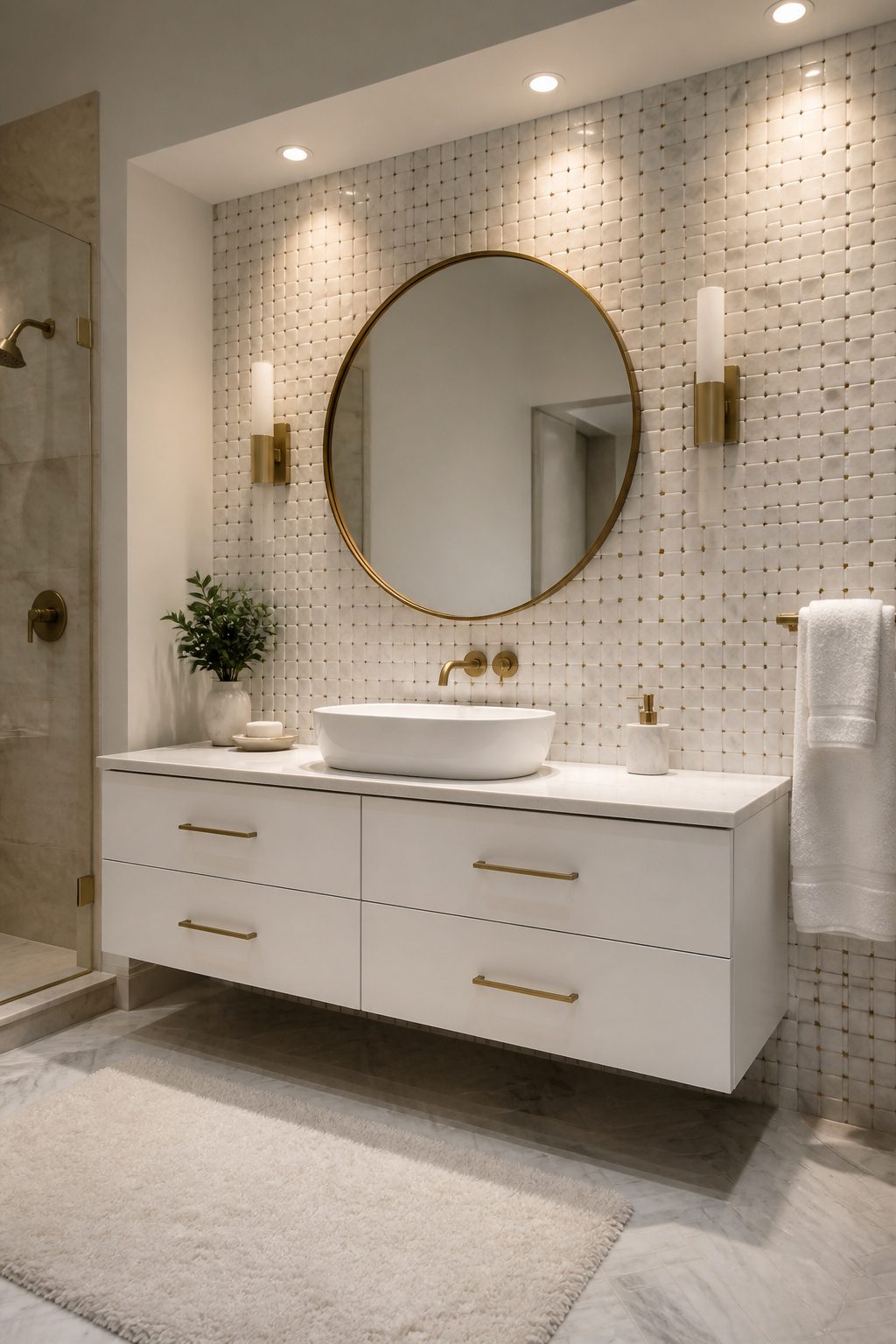
Marble mosaic tile carries a quiet kind of energy.
The small pieces catch light differently across each curve and angle, so a wall or floor never reads as flat. That movement is what makes these patterns feel elegant rather than busy.
You will find two ways to buy them. Sheet-mounted mosaic comes pre-arranged on mesh, which speeds up installation and keeps the pattern straight even on curved shower walls.
Individual tiles give more control but take longer to set and cost more in labor. For a weekend project, the mesh-backed sheets are the practical choice.
Basketweave is the pattern I keep coming back to.
The tiles are cut and laid to look woven, like a flat basket, and the illusion works in both ceramic and marble. The classic version reads as traditional without feeling dated, which is hard to pull off in a bathroom.
Where they really earn their place is the shower floor.
All those grout lines add grip underfoot, and honed marble in particular gives you traction without looking industrial. A marble mosaic shower floor feels like a small luxury that still respects the budget most of us are actually working with.
27. Match the Grout
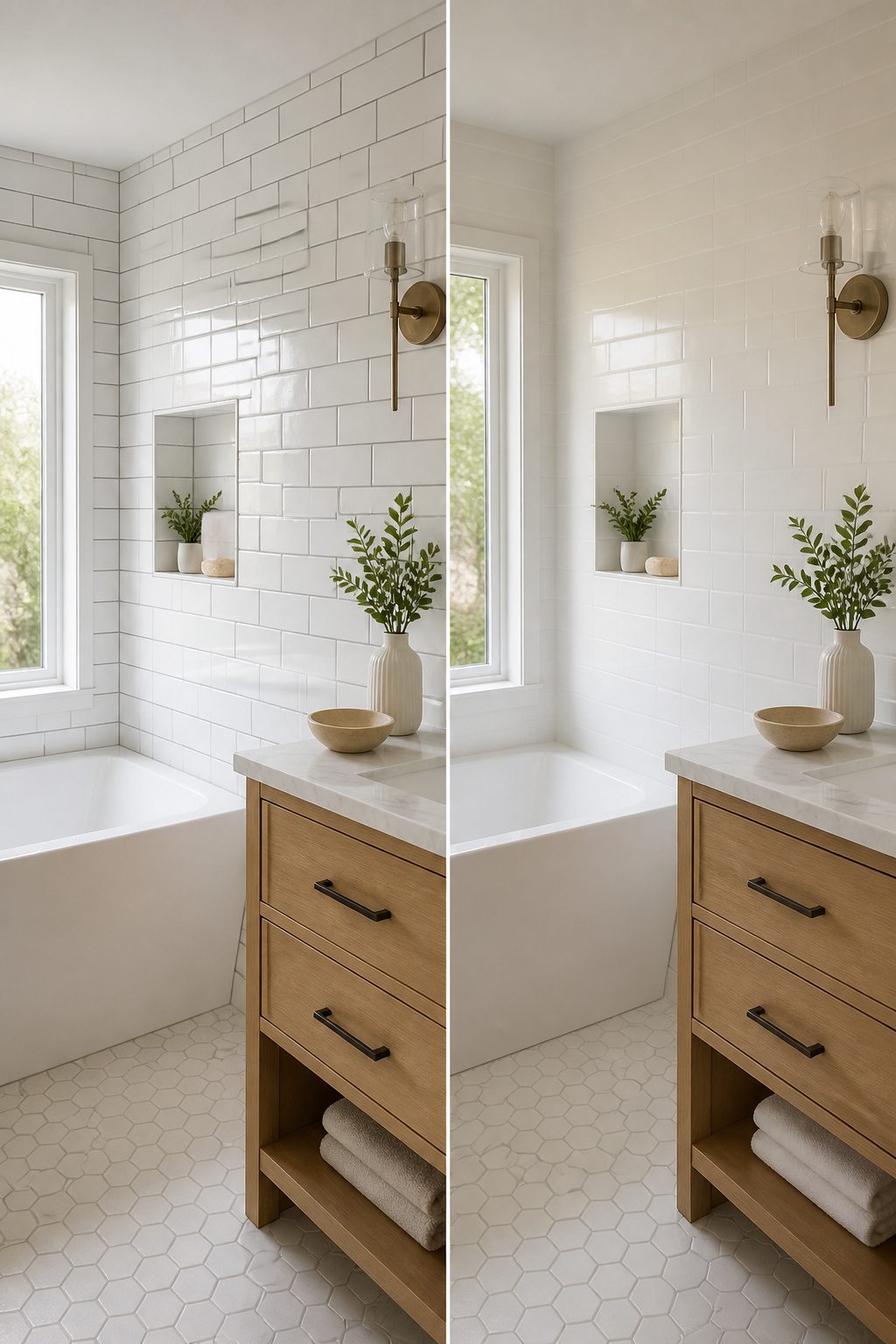
Grout color is the quiet decision that changes everything about your tile. Match it to the tile itself and the pattern stretches out like wallpaper, the edges softening until the room feels bigger and calmer.
That soft grey grout against Ashford Carrara marble does exactly this, the lines barely there so the surface reads as one continuous field.
Contrasting grout turns the same tile into a grid. Dark lines against white subway tile, or the reverse, draw your eye straight to every rectangle and make the geometry the whole point.
It is bolder, more deliberate, and in a small shower it can actually make the walls feel closer in.
For wet areas, epoxy grout is worth the extra step.
It shrugs off moisture and staining better than standard cement grout, which matters in a bathroom that sees real daily use. The choice comes down to what you want the room to do: recede quietly, or show its bones.
28. Herringbone Subway Pattern
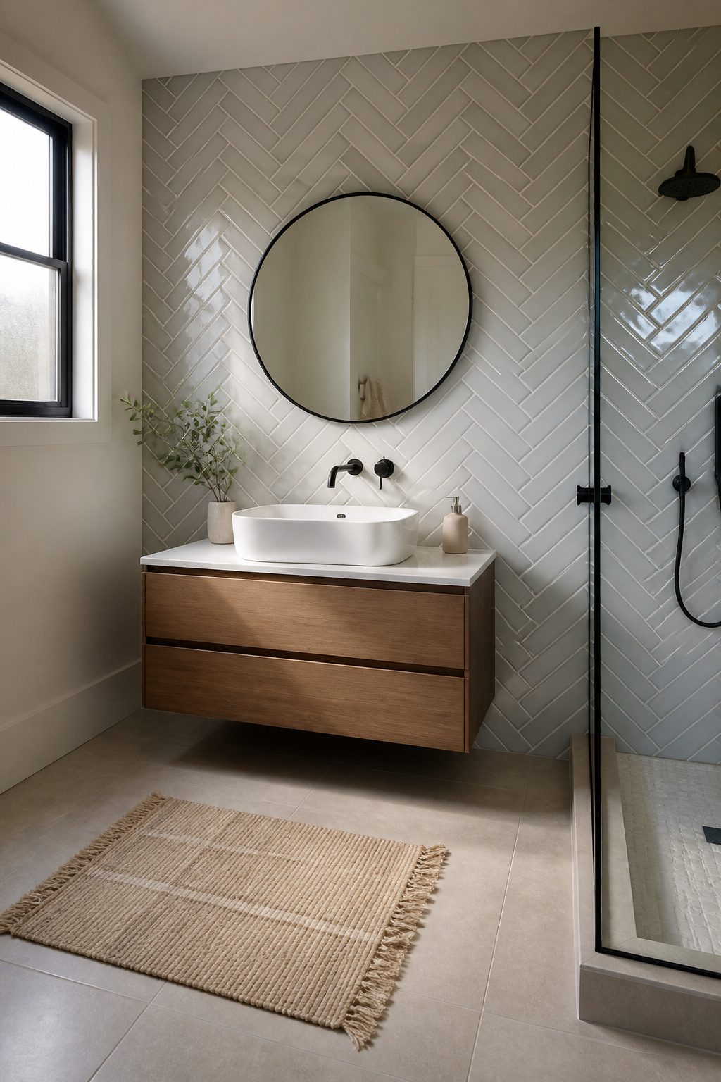
Subway tile in a herringbone layout takes a basic material and makes it feel intentional without asking for a bigger budget.
The zigzag pattern draws your eye diagonally across the wall, which gives even a small bathroom more energy than standard horizontal stacking ever could.
The catch is waste. Because every rectangular tile gets cut at an angle to fit the V, you will order roughly 15 to 20 percent more tile than your square footage suggests.
That extra box or two matters when you are working with a weekend timeline and a few hundred dollars.
This pattern works best as a feature wall behind a vanity or tub, not wrapped around an entire room.
A whole bathroom of herringbone starts to feel busy fast, and the cuts multiply into real time and money. One wall keeps the impact sharp and the project manageable.
29. Handmade-Look Tile
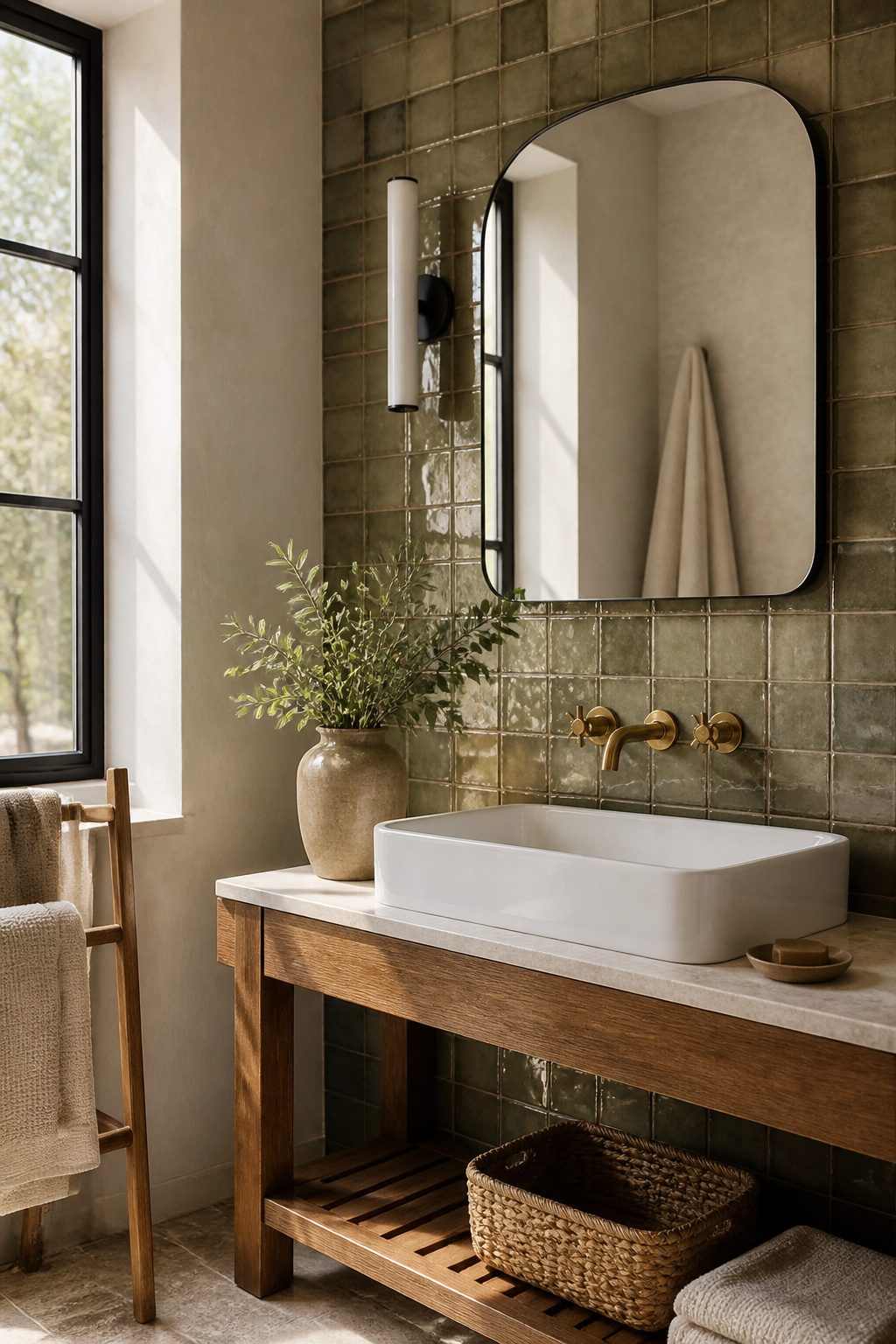
Machine-made tile that mimics the hand of a real artisan gives you warmth without the staggering price of true handmade work.
Slight shifts in tone, surface, and size create that imperfect character people want, but the batch stays consistent enough to tile a whole bathroom without surprises.
I have seen the same handmade-look wall tile read as rustic farmhouse in one space and quietly modern in another, depending on what you pair it with.
The savings matter here: true Zellige or studio tile can run four to six times more per square foot, and for a rental or first home, that gap is hard to justify.
Handmade-look tile bridges the look and the budget by printing or pressing those irregularities onto durable porcelain or ceramic instead.
If you love the idea of terracotta warmth or a glazed surface that catches light unevenly, this is the practical path.
30. Glass Tile
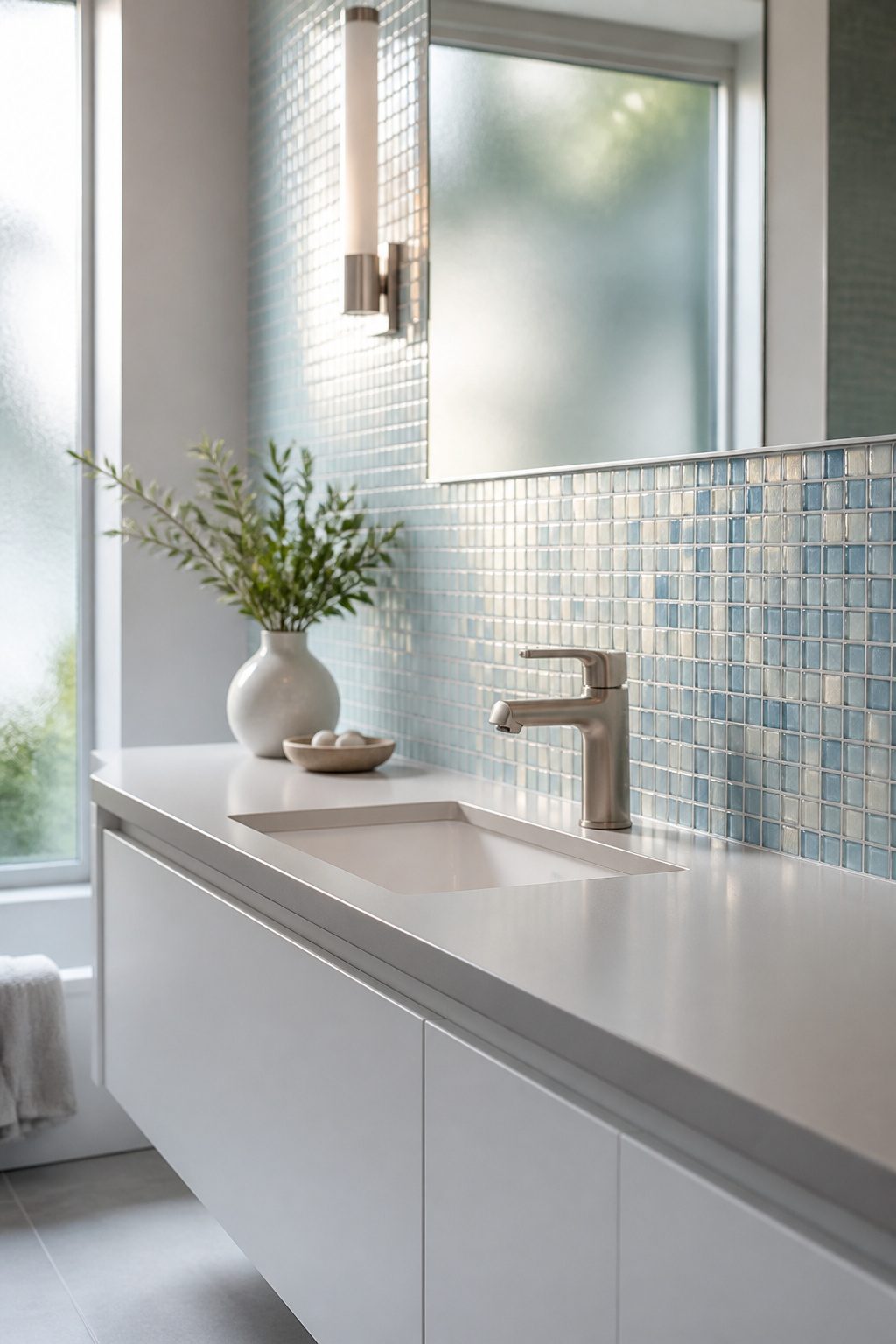
Glass tile catches light and bounces it around a room like almost nothing else.
The translucent finishes feel almost lit from within, which is why a small strip of them behind a vanity or inside a shower niche can wake up a whole wall without demanding attention.
I have seen full glass walls, and they read more ice rink than spa. The tile is simply too reflective, too busy, for large surfaces.
Installation asks more patience than ceramic.
The tiles are thinner, the adhesive shows through if you are sloppy, and the cuts chip if you rush. Most weekend tilers hit a rhythm after a row or two, but the first hour is slow.
Recycled glass options now come with up to 45% post-consumer content, and their non-porous surface shrugs off mold without sealing. That is a real maintenance win in a wet room.
The Astrid 3×6 in Alabaster pairs warm white with faint golden veining; it is the kind of quiet accent that works with matte black fixtures or wood tones without fighting them.
Glass belongs on a single wall at most, or better yet a niche or border. Use it where the light hits, let it glow, and keep the rest of the room in something calmer.
31. English Country Cottage
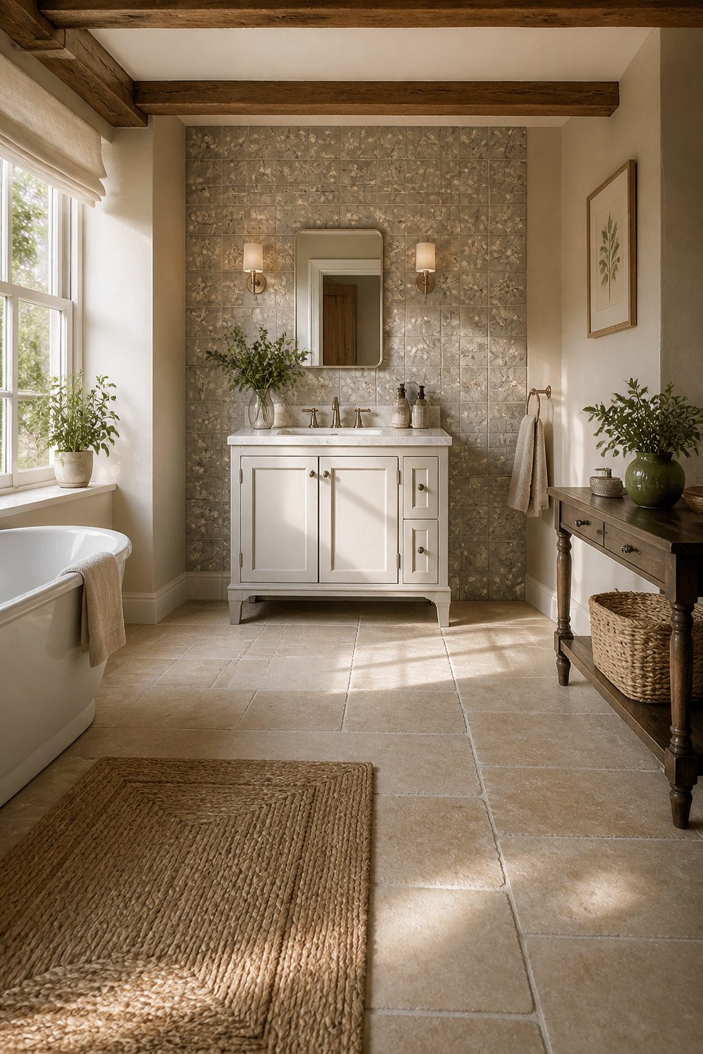
English country cottage tile walks a line between charm and dated.
The Morris & Co. St. James Farringdon Grey pattern, pulled from a historic William Morris wallpaper print, shows how to do it right: soft grey grounds the floral motif so it reads as texture rather than fuss.
I would keep this look to a small bathroom where you want personality without clutter. A powder room or a narrow guest bath works because the pattern gets one focused wall, maybe the floor, and the rest stays quiet.
Too much floral in a large space and you are living in your grandmother’s living room. The trick is treating the tile as the star and keeping fixtures plain and pale.
White wood paneling alongside helps, the way it does in cottage builds where floral floor tiles sit underfoot like a rug you never have to clean.
That pairing keeps the room from feeling precious. If you are renting, this is a harder sell than simpler patterns, but a weekend of peel-and-stick on a single accent wall could test the waters before you commit.
32. Switch Directions
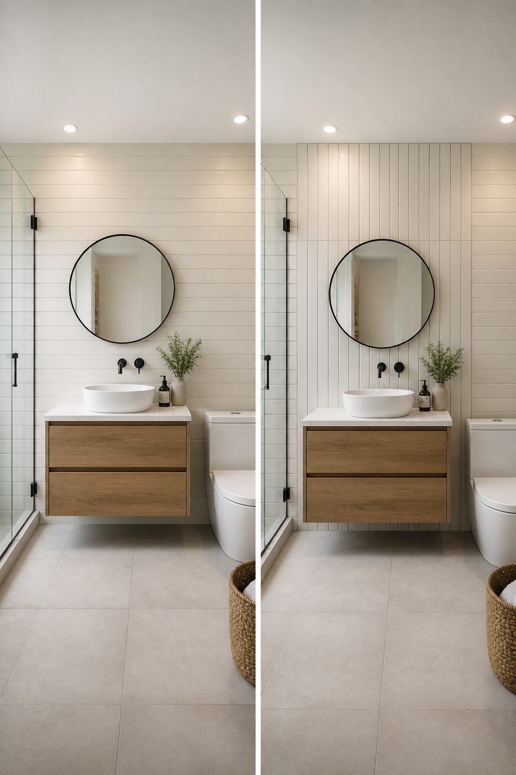
The direction your tile runs changes everything about a room’s feel, and it costs exactly zero dollars to switch.
Horizontal subway tile is the default.
It wraps the wall like a belt, widening the space and keeping your eye moving side to side. Flip a band of those same tiles vertical, though, and you create a quiet interruption that reads as deliberate design.
I like running a double stack of vertical tile against a horizontal field to mark a transition: behind the vanity, inside a shower niche, or wherever you want the eye to land without adding a second material.
The glossier finish catches light differently too, so the vertical band almost flickers when you move through the room.
A full wall of vertical stacks does something else entirely. It draws the eye up and makes a standard eight-foot ceiling feel like it has somewhere to go.
Designer Cortney Bishop used vertical glass tile throughout a large bathroom to get that waterfall effect, keeping the grout neutral so the direction itself did the work. One tile, one direction, no extra pieces needed.
The only catch is deciding where the switch happens. A mid-wall horizontal band of vertical tile can look like a mistake if the spacing feels arbitrary.
I would rather see it anchor a fixed feature: the mirror’s edge, the top of a wainscot, the line where tile meets paint. Give the eye a reason, and the direction change reads as smart instead of confused.
33. Block in Black and White
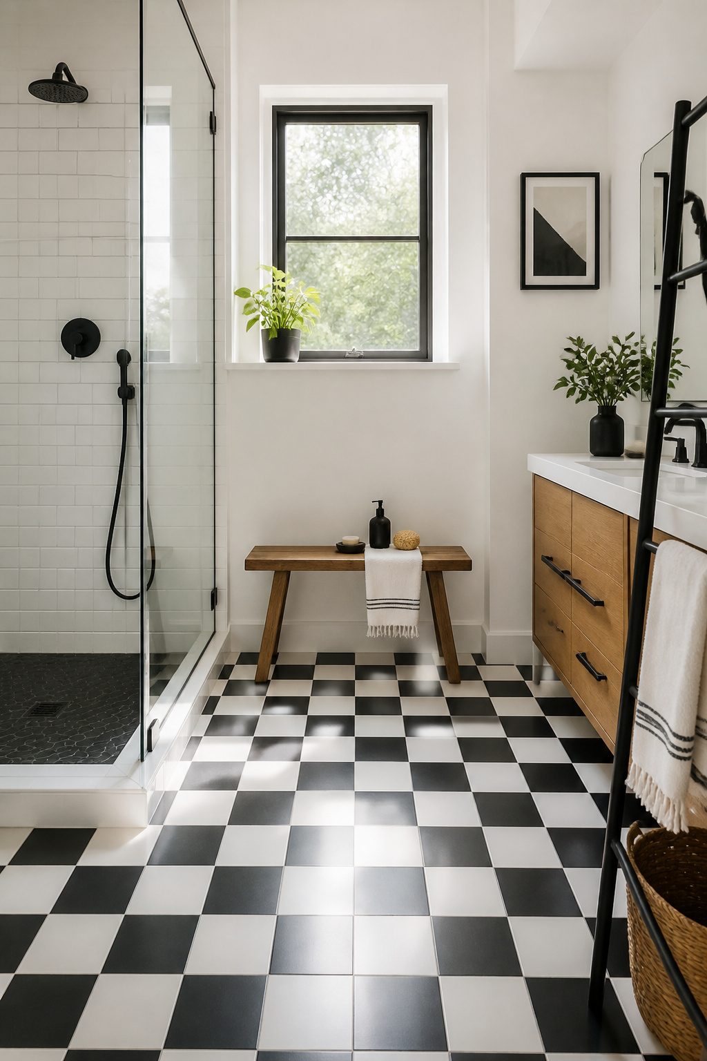
Black and white tile hits harder than any other combo in a bathroom. The contrast draws your eye straight to the floor or the wall, and it does not ask permission.
I have seen it read as hotel-luxe in one house and as a vintage diner in the next, and the difference is almost always the warmth you wrap around it.
The palette itself is not going anywhere.
It has survived every trend cycle of the last century, and it will survive the next. But bare black and white can flatten a small bathroom into something that feels like a photo, not a room.
Natural wood or brass is what keeps it human. A walnut vanity, a brass sconce, even a teak shower bench breaks the graphic line and gives your eye a place to rest.
Without that, the space can feel like a set you are supposed to look at rather than live in.
If you are tiling on a weekend budget, this is where to spend it.
The materials are simple, the install is straightforward, and the result looks deliberate. Just do not forget the warm note somewhere in arm’s reach.
34. Pair Stone-Look Tile with Natural Stone
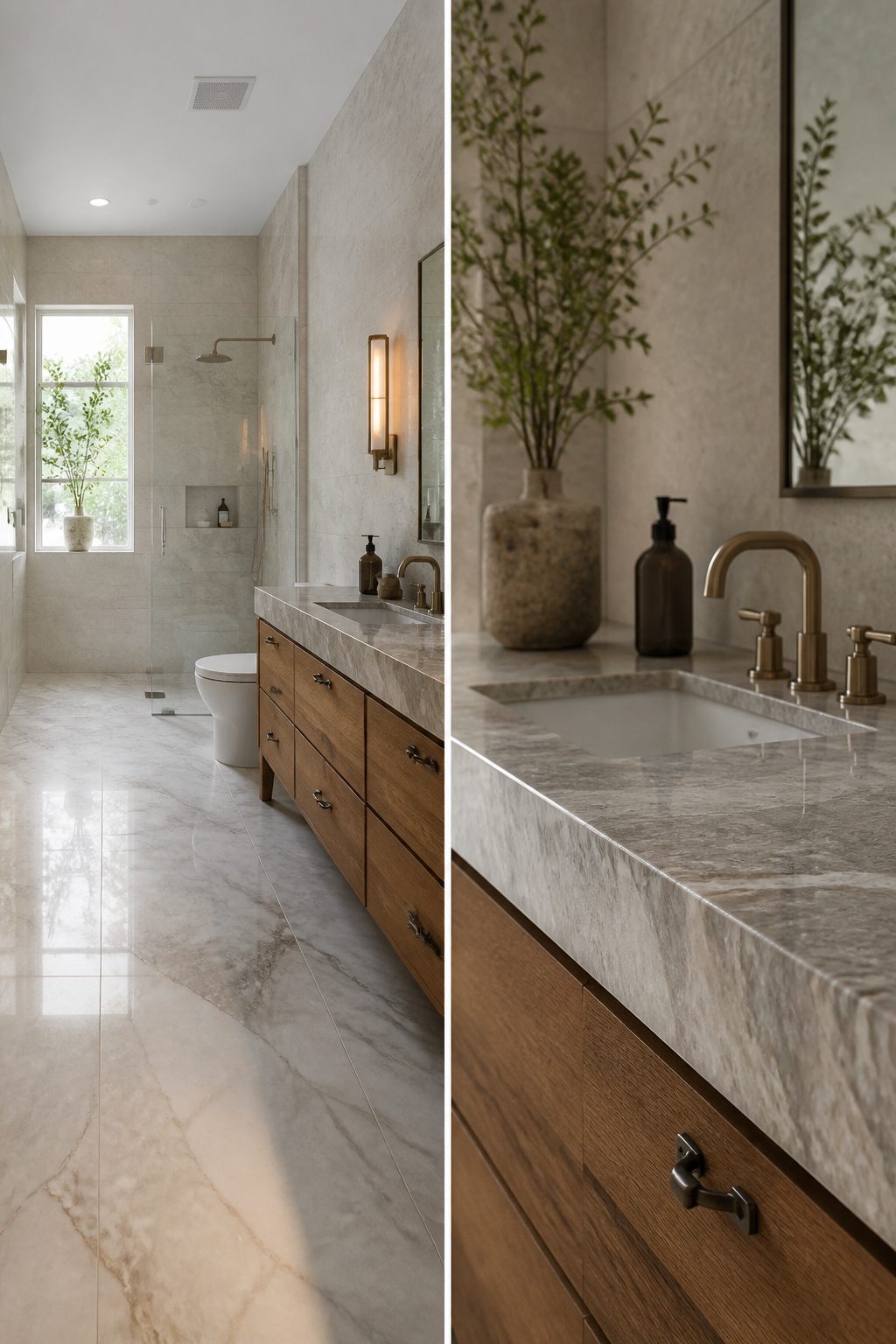
Real stone on every surface drains a budget fast. The trick is knowing where the eye actually lands.
I like to put natural stone where you touch it and study it up close: a vanity top in travertine or marble, a shower niche, a small accent wall behind the mirror.
Those spots get the real thing with its cool weight and true veining.
Then I run stone-look porcelain across the floor and the remaining walls. Modern porcelain copies the expressive veining and organic details convincingly, and it shrugs off water and acidic cleaners that etch real marble.
The mix reads as one quiet material palette. Up close, the vanity feels luxurious.
From the doorway, the floor carries the same mood for a fraction of the cost. Save the real stone for surfaces at arm’s length and let the stone-look tile do the heavy lifting everywhere else.
35. Fluted Tile
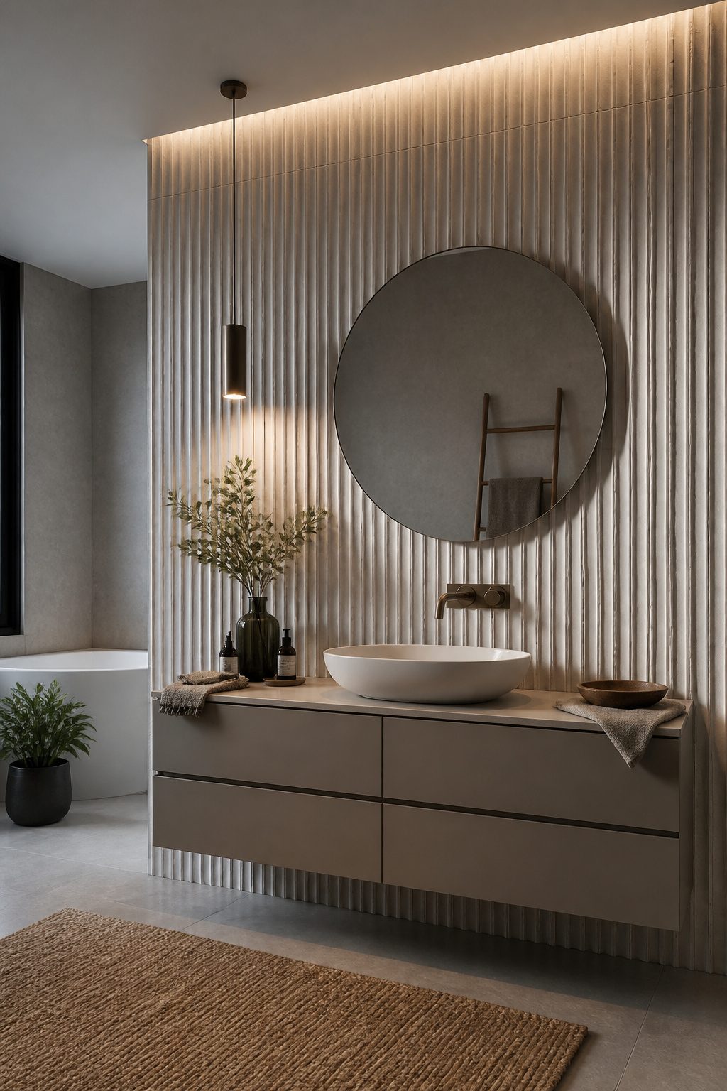
Fluted tile gives a bathroom wall something your fingers want to trace.
The rounded, raised ribs catch light at different angles through the day, so the surface never quite looks the same. Morning sun makes soft shadows; a candle near it at night turns the ridges into a flickering pattern.
I have seen this work best where you want one wall to do the heavy lifting.
A fluted shower wall becomes the feature moment without needing any other pattern in the room. The texture reads as design, not decoration.
The same idea holds for a vanity backsplash. The ribbed surface sits at eye level where you actually notice it, and it pairs fine with flat tile everywhere else.
The catch is installation. Those ridges need to line up, and uneven grout lines destroy the whole effect.
If your walls are not plumb, this tile will announce it. Budget for a careful setter, or choose a smaller fluted area you can really control.
36. Metallic-Look Tile
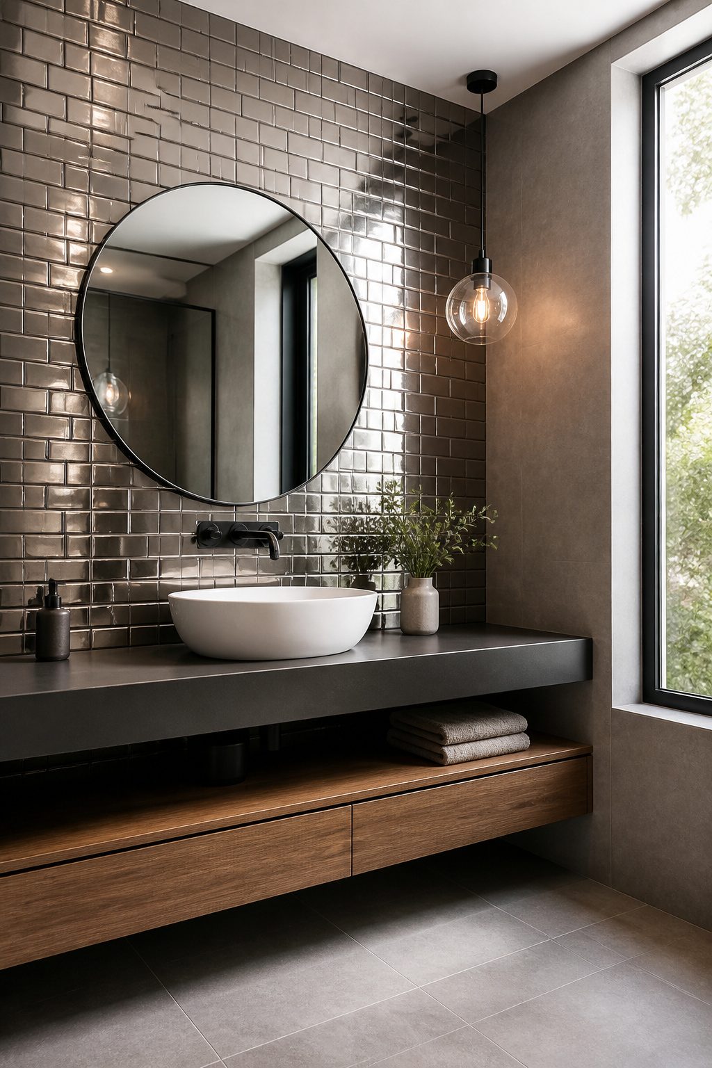
Metallic-look tile gives a bathroom that industrial edge without the headache of actual metal.
Porcelain tiles with metallic finishes use oxides in the glaze to mimic copper, bronze, or oxidized steel, and because the base is porcelain, they stay waterproof and scratch-resistant while real metal would corrode.
The range runs from a soft shimmer you barely notice to tiles that read as straight-up metal. I would keep the obvious ones small: a shower niche, a vanity backsplash, or a single feature strip.
The reflective surface bounces light around nicely, but too much of it and your bathroom starts feeling like a spaceship from five years ago.
Satin finishes are easier to live with than high gloss.
The Estelle 12×12 in white with diagonal silver striping is a good example of how to do this quietly. The raised texture on something like the Enredo Steel Dark Brown adds interest without screaming for attention.
Mixing these with matte surfaces elsewhere keeps the room from going flat, but the metallic tile itself should stay the accent, not the main event.
Tile Materials Compared
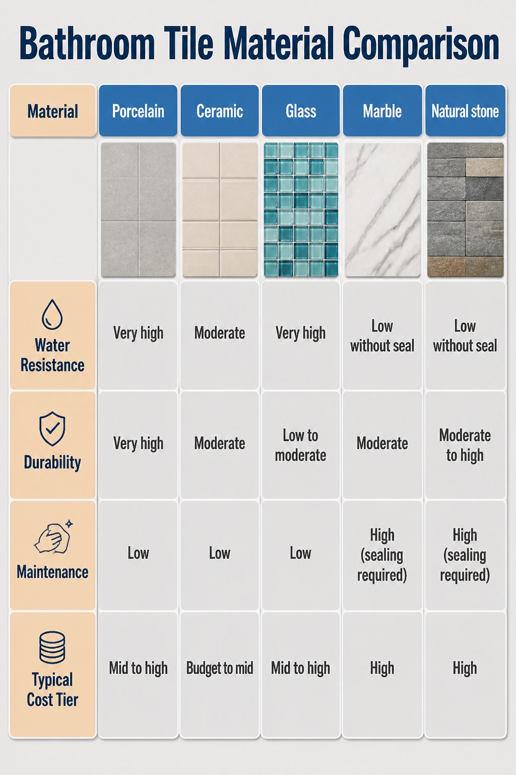
Porcelain and ceramic both start as clay, but porcelain gets fired hotter and pressed harder.
That density matters in a bathroom. Porcelain absorbs less than 0.5% water, which is why it is the most popular choice for shower floors and walls.
Ceramic is softer, easier to cut, and costs less, but it is more porous and better suited to walls or powder rooms where puddles are rare.
Glass tile is non-porous and wipes clean, yet it chips more easily underfoot and usually costs more than either clay option.
Natural stone and marble bring warmth and veining no factory can quite copy. Marble, especially, holds heat well and pairs beautifully with radiant floors.
The catch: both stone types need sealing with penetrating protectants to stop stains and etching. Honed marble trades some shine for better grip under wet feet.
| Material | Water Resistance | Durability | Maintenance | Typical Cost Tier |
|---|---|---|---|---|
| Porcelain | Very high | Very high | Low | Mid to high |
| Ceramic | Moderate | Moderate | Low | Budget to mid |
| Glass | Very high | Low to moderate | Low | Mid to high |
| Marble | Low without seal | Moderate | High (sealing required) | High |
| Natural stone | Low without seal | Moderate to high | High (sealing required) | High |
For a rental or first home on a weekend budget, porcelain usually wins. It handles the wettest spots without the sealing ritual stone demands, and the price spread over ceramic is often narrow enough to justify.
Layout Patterns That Change Everything
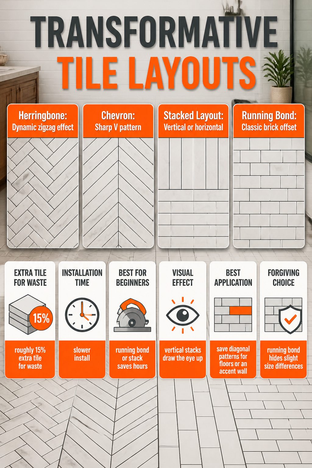
The same subway tile can read completely different depending on how you lay it. A herringbone pattern, that zigzag where each rectangular piece meets at a right angle, pulls the eye diagonally and adds movement to even a small wall.
Chevron looks similar but the tiles are cut at an angle to form a true V, which feels sharper and more modern. Both need more cuts, so expect roughly 15% extra tile for waste and a slower install.
Stacked layouts, either horizontal or vertical, are the friendliest for a weekend project.
Vertical stacks draw the eye up and make ceilings feel taller. A grid pattern, alternating horizontal and vertical rows, gives a woven look that works with petite 2-by-6 tiles especially.
Running bond, the classic brick offset, hides slight size differences in handmade or natural tiles.
It is forgiving on walls that are not perfectly flat. For a first-timer with a rented wet saw, this or a simple stack will save hours over herringbone.
Save the diagonal patterns for a floor where you want the drama, or for a single accent wall where the extra cuts and waste stay manageable.
Color Schemes That Work
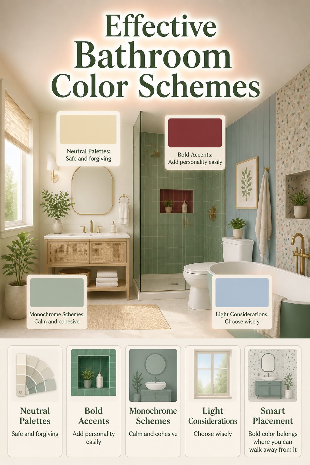
Neutral palettes read as safe because they are.
Soft whites, warm grays, and sandy taupes bounce light around a small bathroom and forgive the odd water spot. I have seen a windowless powder room feel almost sunny with pale tile and a decent bulb.
Bold colors work best where you will not face them at 6 a.m. for the next decade. A deep burgundy or vivid emerald in a shower niche or a guest bath adds personality without the weight of a full commitment.
Guest bathrooms and kids’ baths are the spots to try something whimsical, since you are in and out rather than living inside the color.
Monochrome schemes, one color carried across walls and floor, create the calm of a single mood.
Color drenching takes this further: saturating the whole space in one hue, bright or muted, for a cohesive statement that still soothes rather than shouts. It is one approach among several, not the only way forward.
The real choice comes down to how long you will live with it and what your light gives you. A north-facing bath with one small window can handle a moodier tone because it already feels cozy.
A bright, white-tiled master bath with morning sun might let you add color through a patterned accent wall or a terrazzo feature without closing the space in.
Small bathroom, limited light: go lighter. Bold color belongs where you can walk away from it.
What Lasts in a Wet Room
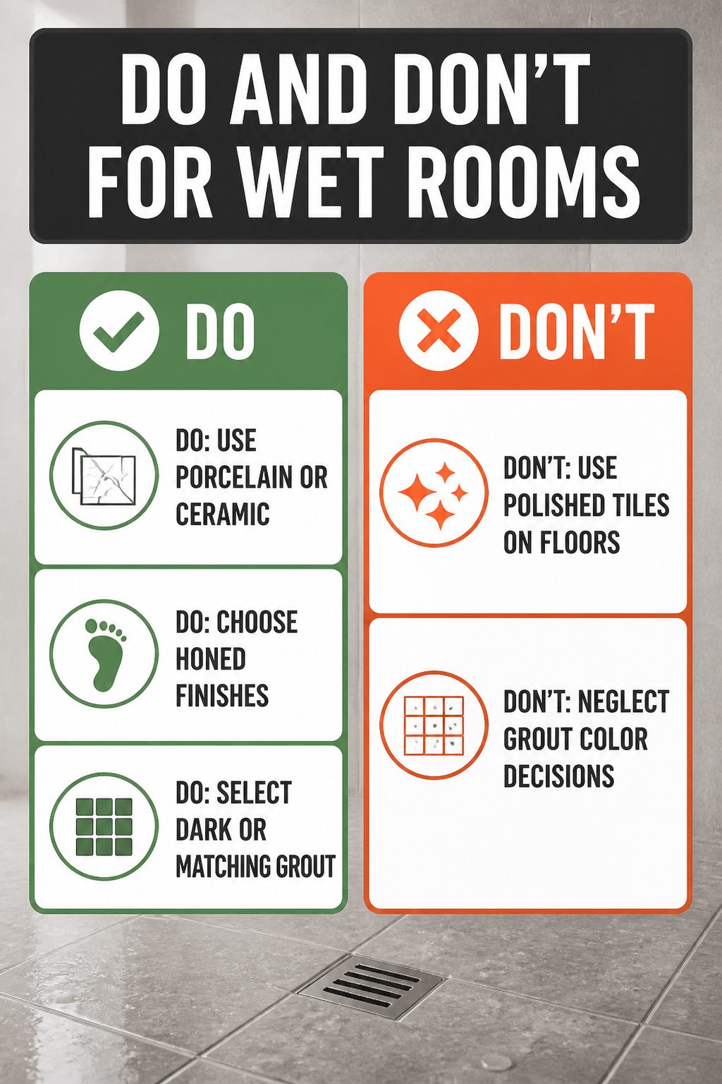
Porcelain and ceramic are the workhorses here because they handle water so much better than almost anything else. Porcelain is fired at higher temperatures, so it ends up denser and absorbs less than half a percent of water.
Ceramic is softer and easier to cut, which matters if you’re installing it yourself, but it is more porous and better suited to walls than floors.
Finish is where safety actually happens. Honed tiles have a matte, satin surface that gives your feet something to grip.
Polished tiles are dangerously slippery when wet, so they belong on walls, not floors. Matte or textured finishes add traction without looking industrial.
Grout color is the last decision people think about and the first one they regret.
White grout looks clean for about a week, then every speck of mildew shows. Darker grout or a color that matches the tile hides the daily reality of a shower much better.
Frequently Asked Questions
What is the most popular tile for showers?
Porcelain is the most popular choice for shower tiles because it stands up to daily steam and splashes with minimal upkeep.
The article highlights porcelain wood-look planks and large-format stone-look porcelain as particularly durable options that also look current. Unlike natural stone, porcelain does not need yearly sealing, and its water absorption stays below half a percent.
What tile finish is best for shower walls?
Honed tiles with a matte or satin-like finish are recommended for shower walls because they provide grip under wet feet.
Polished surfaces look more glamorous on walls but can be dangerously slippery on floors. The article also notes that grout choice matters: color-matched grout extends a color-drenched look, while dark grout against white subway tile reads more modern.
How do I create a focal point with tiles?
Bold patterns or vibrant colors on a feature wall or shower niche create the strongest focal point without overwhelming the room.
The article recommends keeping the surrounding tile neutral so the pattern has room to breathe. One bold surface per room is usually enough; two can work if they share a palette, but three turns into visual noise fast.