


You can land the right curtain color for any wall in about a weekend and under two hundred dollars in fabric, but most people skip the step that actually decides it: testing the swatch in their own light at 9 a.m., 4 p.m., and on an overcast day. That same warm gray can turn greenish by afternoon, and a velvet panel can pool near-black at dusk while the linen sample stays honest to its dye. The cost of skipping this is a color that looked perfect in the store and never quite works on your window.
1. White Walls
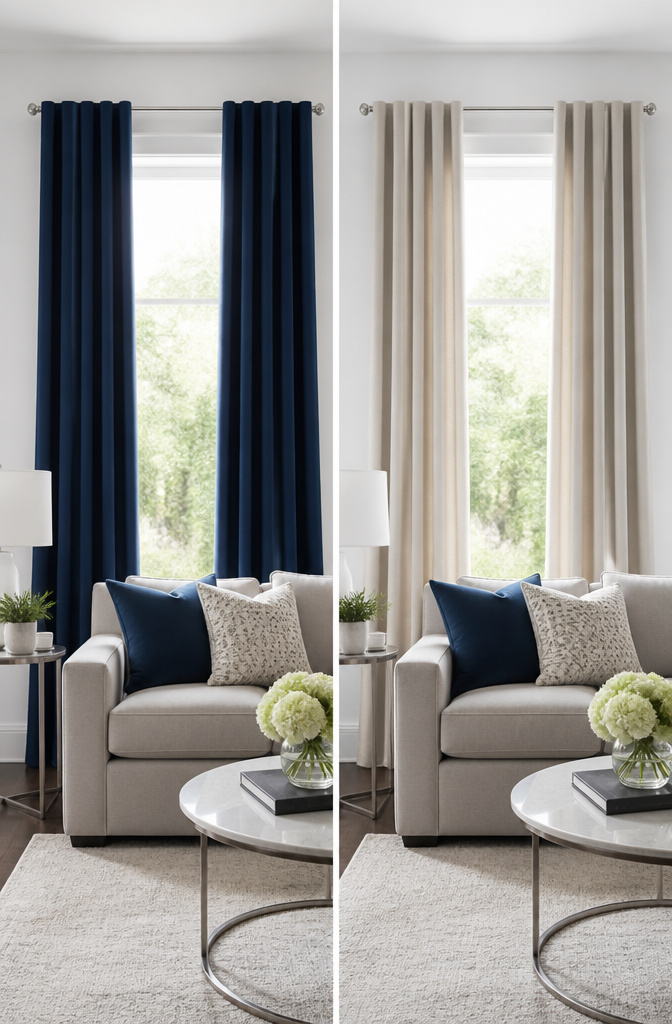
White walls are where most of us start, and they honestly give you the most freedom when you are figuring out what color curtains to hang. Light grey keeps things quiet and layered without feeling busy, while navy, charcoal, or black start to carve out real depth in a room that can otherwise read flat.
The contrast is the point. A darker curtain against a white wall pulls your eye up and gives the window some weight, but it will not close in the space the way saturated color on saturated color can. Navy reads classic; charcoal softens the edge a little; black is the boldest of the three, though in a casual space it can feel theatrical if you do not have other dark anchors in the room.
Where this fits the bigger picture, the 60-30-10 rule is a useful gut check. About sixty percent of your room stays neutral, thirty percent is your secondary tone, and ten percent is your accent. White walls handle the sixty. Your curtains at that thirty percent mark in light grey or navy give you that secondary layer without competing for attention, and you still have room left for a pillow or a frame to pop.
2. Beige Walls
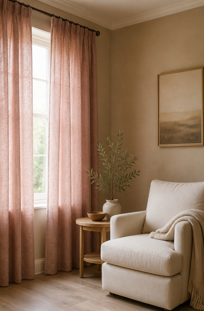
Beige walls already carry their own warmth, so your curtains should deepen that feeling instead of fighting it. Rust, dusty rose, and olive green are the earthy tones that get this right, picking up the underlying pigment in the paint rather than competing for attention.
Muted versions matter here. A saturated fire-engine red would startle the room, but a dusty rose keeps things in the same quiet register as the walls. The same goes for olive over a brighter grass green, or rust over straight orange. These colors layer in without announcing themselves separately.
Warm neutrals like cream or taupe also work, though they risk going so quiet the room turns flat. If you want that calm, keep the texture interesting, a faux linen or a soft weave, so there is still something for the eye to register even when the palette stays close.
The thing to skip is anything cold or sharp. Beige reads as a warm neutral, and pairing it with a cool blue-gray or a stark white can make the walls look suddenly dirty by comparison, a clash nobody pinned on the board before they installed the rod.
I would pick one of those three earth tones, rust in a south-facing room where the light already leans golden, olive in a space that wants to feel a little more grounded, dusty rose where you want softness without going full blush. All three survive a year or two of trend shifts, which matters when you are working with a rental timeline and a weekend to hang them.
3. Yellow Walls
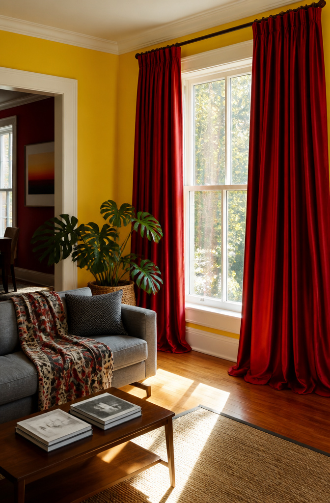
Yellow walls carry a lot of energy, and in my experience that energy needs somewhere to land. Deep reds, browns, or aubergine curtains give it that landing place. The pairing isn’t about matching warmth; it’s about adding weight so the room doesn’t feel like it’s buzzing.
These darker, saturated tones work best when the room already gets good natural light. Sunlight keeps the balance from tipping too somber, and the curtains read as grounding rather than heavy. In a dim space they’d start to feel like an enclosure, but with windows they turn the wall into something intentional.
I’ve seen sunset yellow paired with a true aubergine and the effect was less fruity than you’d expect; it read almost neutral, like a mature version of the color wheel. Brown does something similar but quieter, and deep red leans into the heat without competing. If your yellow is buttery rather than electric, any of the three will settle it down.
4. Grey Walls
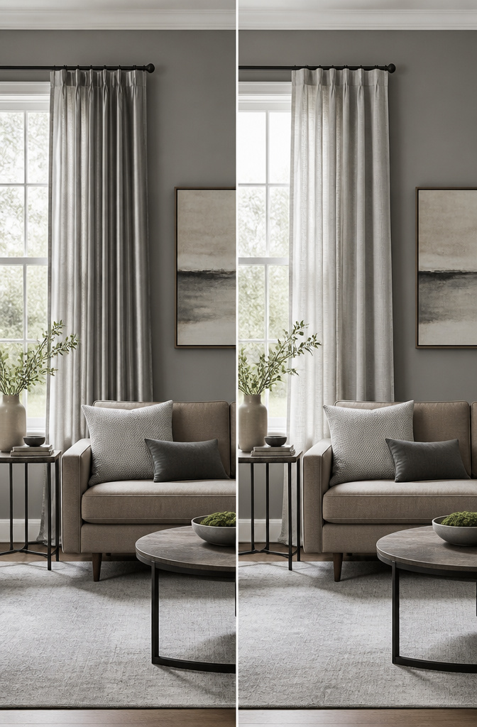
Grey walls read modern until they read flat. The fix is either tonal variation or sharp contrast: silver, black, or a darker grey than what’s on the wall. A silver curtain picks up the wall’s coolness without copying it exactly. Black goes the other direction and grounds the room hard. Same-value grey risks looking like a mistake, so step two shades lighter or deeper at minimum.
Grey’s neutrality can feel cold fast, which is why fabric texture matters more here than with warmer neutrals. A linen weave or a nubby cotton adds warmth that the color itself isn’t supplying. I’ve learned to touch samples in afternoon light before I decide; the swatch that looked soft at 10 a.m. can turn institutional by 4 p.m. if it’s too smooth and too cool.
5. Blue Walls
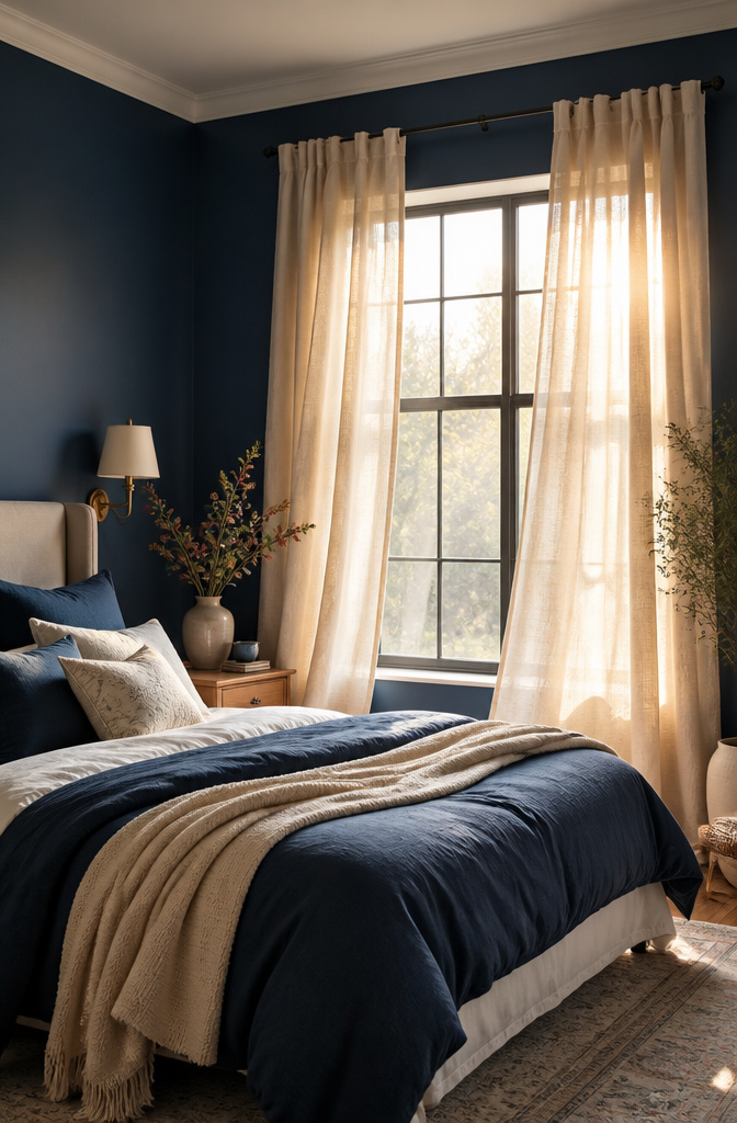
Blue walls already carry a lot of atmosphere, so the curtain choice is really about dialing that up or balancing it out. Matching blue to blue keeps everything calm and unbroken, which I find works best in a bedroom where you want the walls to feel like they keep going.
If the room starts feeling too cool or flat, beige curtains add softness without fighting the wall color. For something more energetic, mustard or a soft orange wakes the space up in the way a throw pillow never quite manages on its own. I’ve seen mustard read as almost gold in afternoon light, which is worth testing with a swatch before you commit.
White or off-white keeps things airy, especially when the blue is deep and you need the window to feel like a break in the wall. On the flip side, navy or charcoal curtains against a lighter blue wall add real depth. That contrast works best when the rest of the room has enough warm wood or metal to keep it from going cold. Lighter blues pair naturally with neutrals, while deeper navy walls can take something bolder without the room feeling overdone.
6. Cream Walls
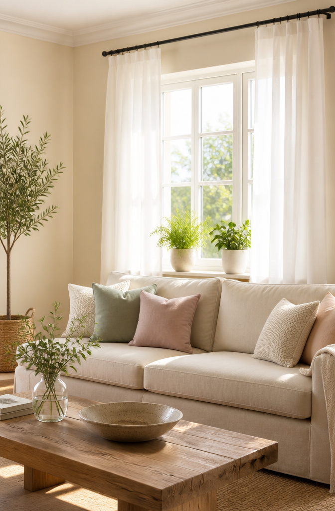
Cream walls are already doing the work of softening a room, so the safest play is to keep that energy going. White or off-white curtains will keep the space bright and airy without introducing weight, and they let the walls themselves stay the story rather than competing with it.
This is one of the lower-risk combinations you can choose. The wall color and the curtain color sit close enough on the spectrum that you don’t have to overthink transitions between windows. I’ve seen setups where even a slightly too-bold curtain turned a calm cream room into something busier than the person living there wanted. If you do want some distinction, pale gray or a soft pastel keeps the mood light without the heaviness that dark curtains, like navy or burgundy, will bring in. Save those for when you actually want the windows to feel like a separate zone.
Texture matters here too. A lightweight linen reads casual against cream, while something like velvet starts to feel formal fast. In a room where you’re already working with soft tones, I tend to think the simpler fabric wins.
7. Green Walls
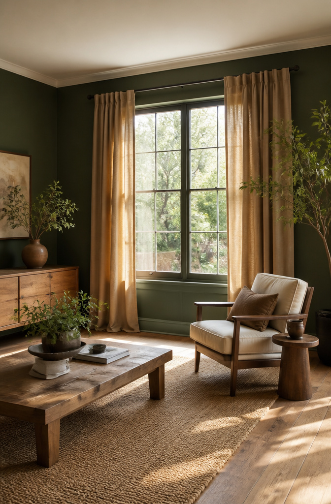
Green walls pull the outside in, and tan or brown curtains keep that thread going instead of snapping it. Earthy neutrals sit with green the way dirt sits under grass, natural and unforced.
I have watched a small bedroom with deep emerald paint go from cozy to cramped in a single curtain swap. The homeowner chose a darker olive drape, tone-on-tone, and the room folded inward on itself. Deeper greens can do that in tight quarters, so a lighter hand with the fabric usually wins.
For renters who want the cocoon without the claustrophobia, a warm brown at a mid-weight grounds the room while still letting the wall breathe.
8. Red and Terracotta Walls
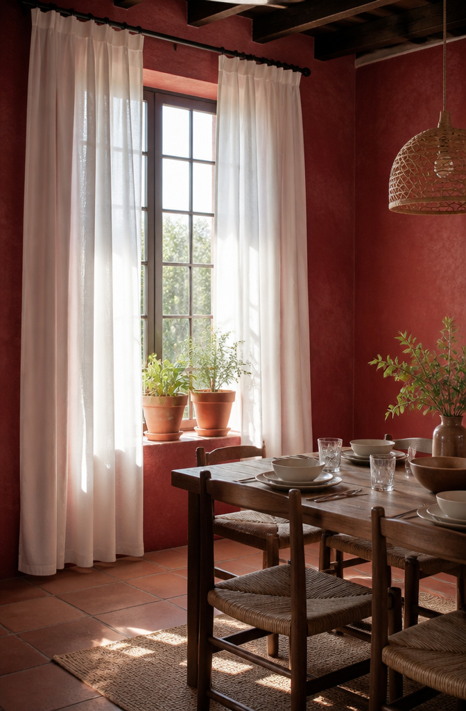
White curtains are the safest move with red walls. They bring the temperature down without fighting the wall, and they let the paint be the statement while the windows stay quiet.
Golden tones do something different with terracotta. They pick up the warmth that’s already there without pushing the intensity higher, so the room feels coherent rather than loud. It is a lean-in choice, but a gentle one.
Deep brown curtains, like chocolate, settle right against warm undertones. They add weight and make the space feel enclosed in a good way, though I’d only use them in a room that gets strong daylight. In a dim corner they can turn heavy fast.
9. Neutral Walls
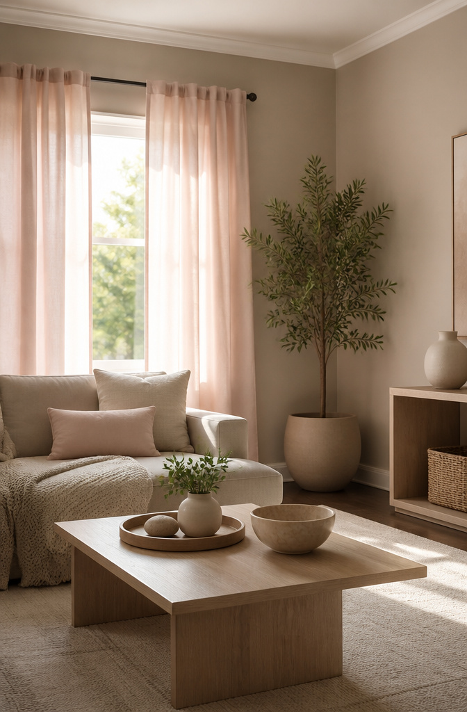
A neutral wall gives you the widest runway for curtains that either whisper or shout, and that freedom is exactly what makes the choice harder. Soft blush or sage can turn a greige room into something gentle, while deep olive or rust turns the same wall into a frame for drama. True neutrals like warm white or greige stay flexible because they refuse to pick sides on temperature, so the curtain color does the actual talking.
For me, this is where the room’s job matters more than any trend chart. My bedroom walls are a soft warm white, and I chose oatmeal curtains that disappear at noon but look intentional by lamplight. My living room wears the same white, yet I went with charcoal panels there because that space needs weight to feel finished after dark. Pastels read as calm in a space where you unwind; bold hues wake up a room where you actually do things. Match the color to the function, not the wall.
10. Dark Walls

Dark walls absorb light instead of bouncing it back into the room, so your curtain choice is really a decision about whether you want to fight that or work with it. Lighter curtains will brighten the space and push back against the gloom, especially in a small room that already feels cramped. I have seen a charcoal bedroom turn almost cheerful with oatmeal linen that still let some daylight filter through.
If you prefer the moody vibe, dark curtains can absolutely work on dark walls, but texture is what keeps it from going flat. A matte velvet against eggshell paint reads as one muddy surface; the same velvet with a soft sheen, or a slubby weave that catches the light differently, creates depth without needing contrast in color. Think camel chenille against deep navy, or a dark olive with a subtle rib.
The fabric matters here more than anywhere else. Even pulled open, curtains reflect tinted light back into the room, so a dark fabric with a sheen will throw a little glow around, while matte dark fabric just swallows it. For renters who cannot repaint, this is the lever you actually have: switch the curtain texture and you switch the light quality entirely.
How Light Changes Everything
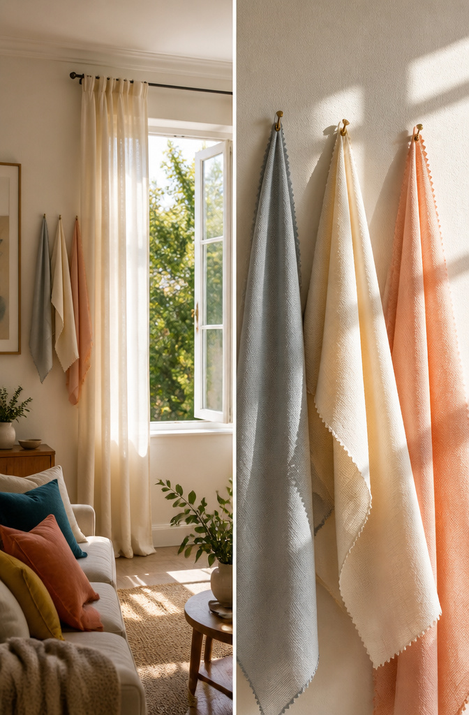
Morning sun and north-facing shade will read the same curtain color as two completely different fabrics. I learned this the hard way with a warm gray that turned greenish in my bedroom’s afternoon light. The swatch looked perfect in the store.
Lighter curtains will open up a darker room where natural light is scarce. They reflect what little sun you get instead of swallowing it. The opposite holds too: a sun-flooded space can handle darker curtains without feeling closed in. The color gains depth rather than turning flat.
Always test the swatch in your own natural light before you commit. Pin it to the window frame, check it at 9 a.m., at 4 p.m., and on an overcast day. The fabric you thought was warm cream might read peach, or worse, pink. About four dollars in swatch fees saves a two-hundred-dollar mistake in fabric that never quite works.
Color Mood
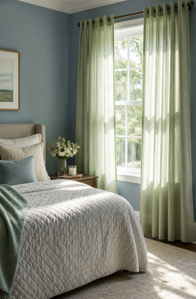
The color of your curtains isn’t just a finishing touch; it’s the mood you live in. Blue and green tones slow the heartbeat and read as tranquil, which makes them a natural fit for bedrooms or anywhere you want to decompress. Red, yellow, and orange do the opposite. They read as warm and energizing, and they work well in rooms where people gather.
The question isn’t which color is "best"; it’s what the room is for. A dining room or living room can handle more energy than the place where you sleep. Lighter blues and soft greens keep things low-key, while deeper, more saturated versions feel livelier even within the same color family. I’ve seen the same pale blue read as soothing in one space and gloomy in another, so the wall color, the light, and the fabric weight all have to pull in the same direction.
Neutral curtains, beige especially, solve this by sitting out of the conversation entirely. They let the wall or the furniture carry the mood, and you can shift accessories around them without starting over.
Fabric Weight
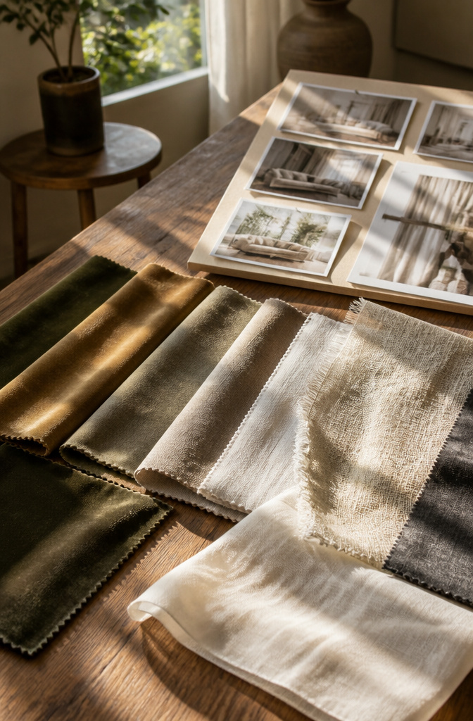
The same dye lot can read like two entirely different colors depending on fabric weight. A heavy velvet absorbs light and sits darker than a light linen would, even when both started with the exact same formula. That shift matters when you’re holding a small swatch up to a wall and imagining it across six feet of window.
I learned to hold samples at window size, not palm size. Tape a foot of fabric up and step back at dinnertime, when the light drops. Velvet will pool into something near-black; linen stays honest to its dye.
Light fabrics bounce more daylight back into the room, which can stretch a small space visually. Sheened fabrics do this even in darker colors. Matte fabrics like velvet swallow the light instead, which is the mood you want for a bedroom but can flatten a living room that already struggles for sun.
Practicality slides in here too. Velvet shows every claw mark if you have a cat who treats curtains as a ladder. Linen and cotton wear the abuse of daily life better, and they vacuum up without the nap fighting back. High-traffic rooms, or any space where a kid’s sticky hand might grab for coverage, want something you can shake out or machine-wash without the color going moody on you.
Curtain Fullness and Fit
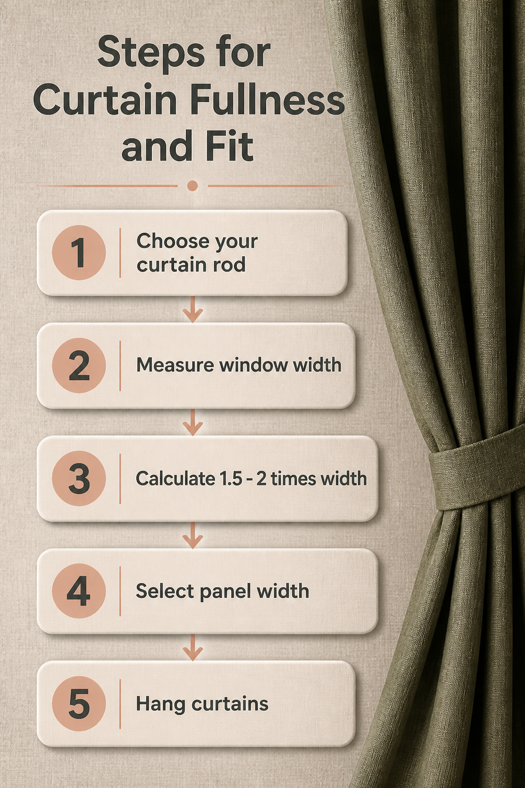
Curtain fullness changes how your color actually looks once the panels are up. Flat panels with no gather read cheaper, and the color itself can wash out because there is no depth for light to play against. Aim for 1.5 to 2 times your window width so the fabric bunches with some life to it.
I learned this the hard way in a first apartment, buying panels that matched the exact width of the rod and wondering why the sage green I loved looked like a flat shadow against the wall. The extra width gives the color dimension, shadows between the folds, and that sense the curtain was chosen rather than defaulted to. For renters especially, fuller panels on a single affordable rod look intentional without any commitment to hardware.
Frequently Asked Questions
What curtain color is the safest choice?
White or off-white is the safest bet for almost any wall, especially cream, red, or terracotta surfaces where you want to keep things quiet. Light neutrals let the walls stay the story and give you flexibility to shift accessories later without clashing. Beige works too if you want the curtain to step back entirely and let furniture carry the mood.
Should curtains match the wall color?
No, matching exactly usually falls flat. Same-value grey on grey looks like a mistake, and tone-on-tone green can make a small room fold inward on itself. The better move is subtle contrast: step two shades lighter or deeper, or pick up an undertone in the wall with a related color. The 60-30-10 rule helps here; let the wall handle the bulk and the curtains sit at that secondary layer.
What color makes a room look bigger?
Light-colored curtains stretch a space visually because they bounce daylight back into the room. This matters most in dim or small rooms where dark fabric would swallow what little sun you get. Sheened fabrics help even in deeper colors, but matte dark fabrics like velvet absorb light and close a room in.
How do I choose curtain color for my room?
Start with what the room is for, not what is trending. Bedrooms want blues, greens, or oatmeal tones that slow things down; living spaces can handle rust, mustard, or charcoal that adds energy and weight. Test a swatch in your actual light at morning, afternoon, and on overcast days before you buy, because the same dye turns greenish or peach depending on the window. Then check fabric weight at full panel size, not palm size; velvet pools darker than linen from the same dye lot.